Hashtag Organics Repackaging
Commendation

Category
GRAPHIC: Packaging
Company
Too Gallus
Client
Hashtag Organics
Summary
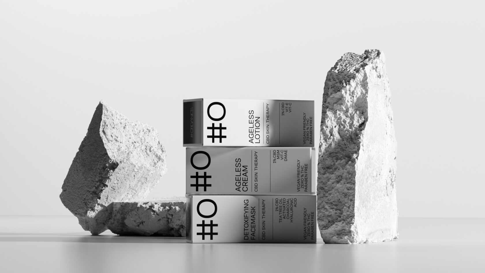
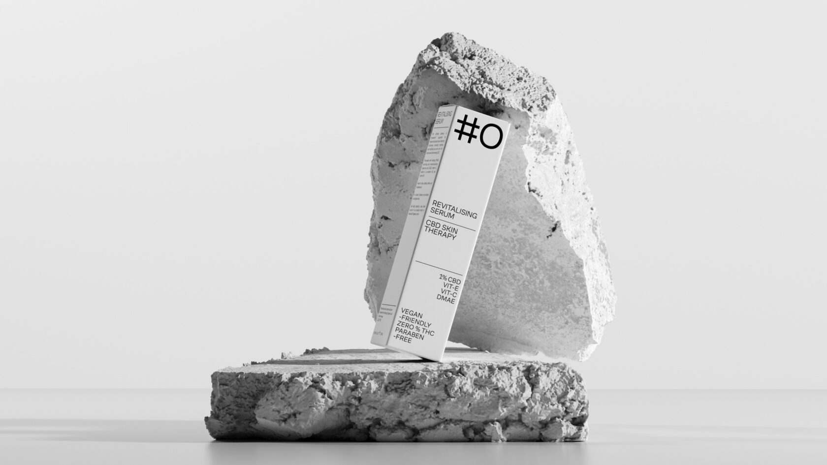
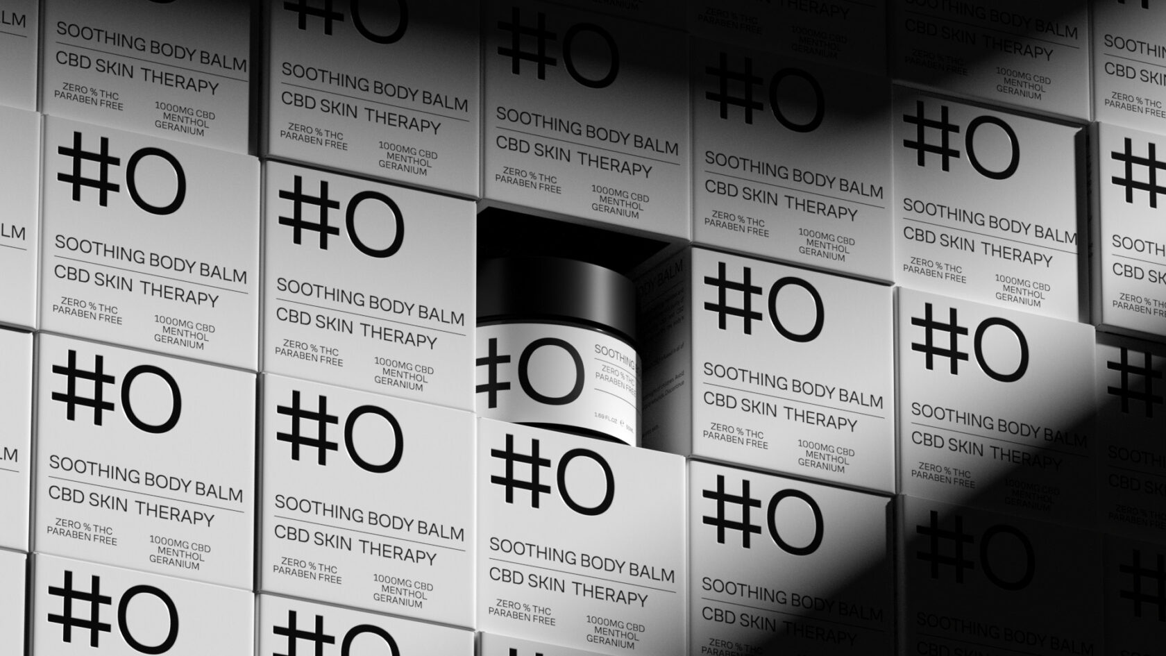
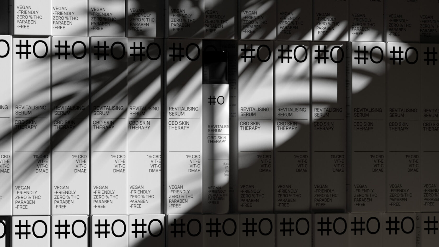
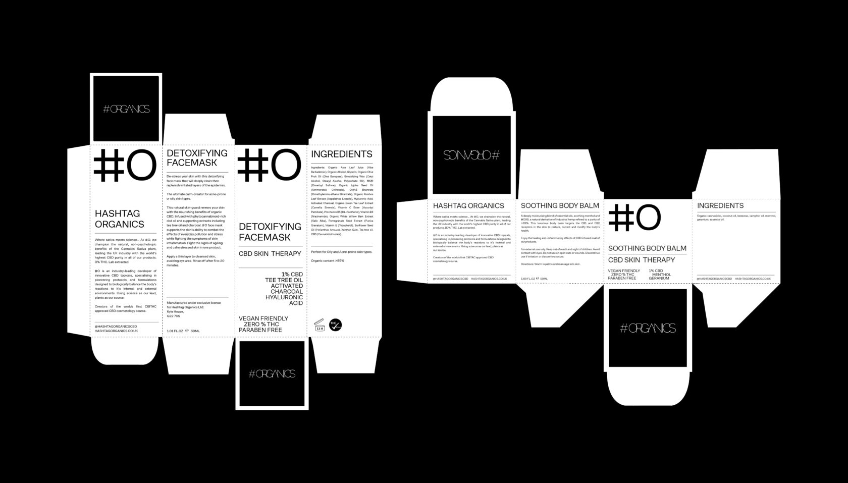
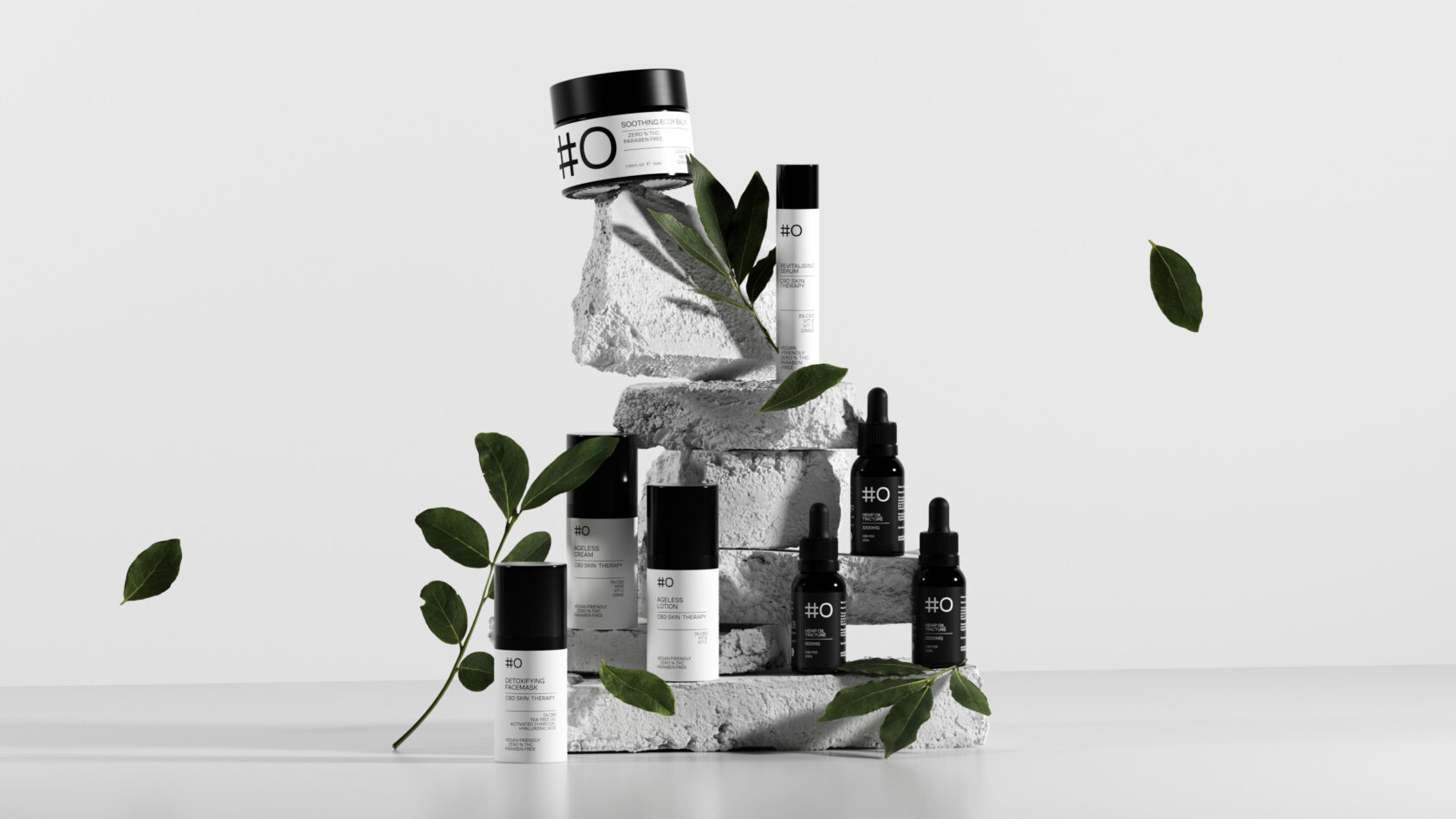
Too Gallus was enlisted by Hashtag Organics to rebrand and reposition their company to allow them to step comfortably into the skincare and cosmetics market.Too Gallus were tasked with creating a brand which framed CBD skincare in a way which felt approachable, professional and trustworthy. To achieve this they opted for a 1 font 1 colour approach, one which omits all of the normal cannabis-related imagery and iconography in lieu of a more pharmaceutical and medical lead approach. Having a very cannabis-focussed brand identity in the past this was a huge pivot away from their recocgnised design style but one which we felt was necessary to reconextualise the brand within its new market place.In answer to the brief Too Gallus opted to strip the brand back to its barest assets, favouring a strongly typographic approach across packaging and brand assets while allowing photography to do much of the heavy-lifting in bringing it into a cosmetics and beauty centric space. Due to the brand having such a wide offering, being available for retail in pharmacies it was important for us not to dilute or lose their current and loyal fan-base but to also open the brand up comfortably to new markets as it stepped into salon-treatment rooms, beauty clinics and spas.The result has been a simple, no-nonsense which puts the ingredients and quality of the project at the forefont, above all else.