Girls United Football Association brand identity refresh
Nomination
Category
Design for Good
Company
Fourtwentyseven
Play
Client
Girls United Football Association
Summary
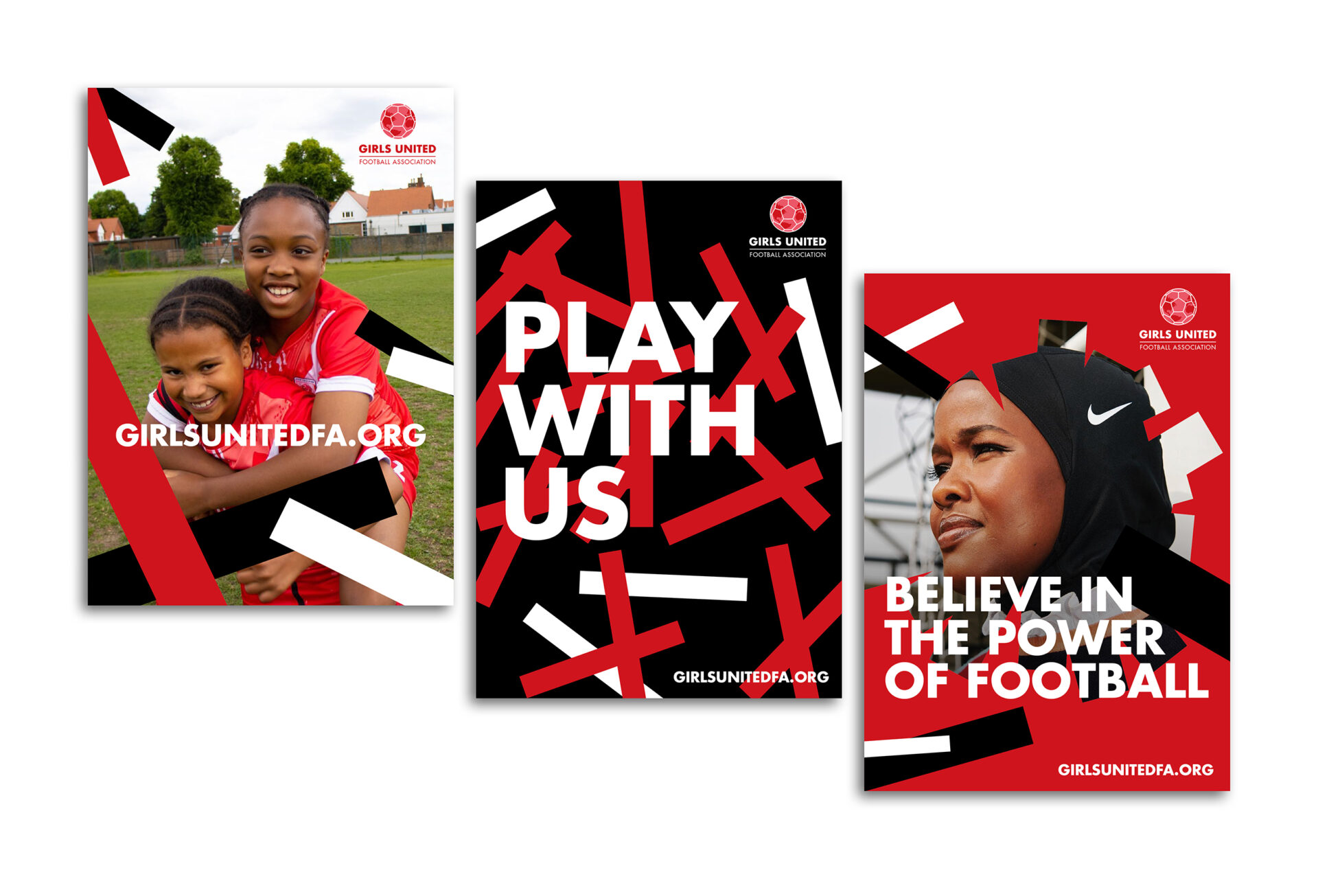
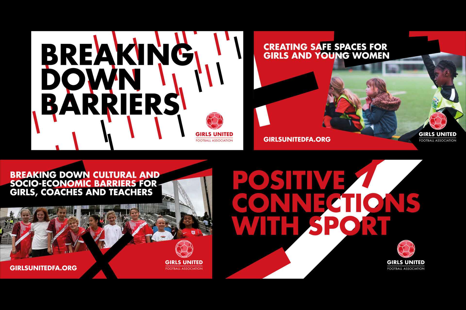
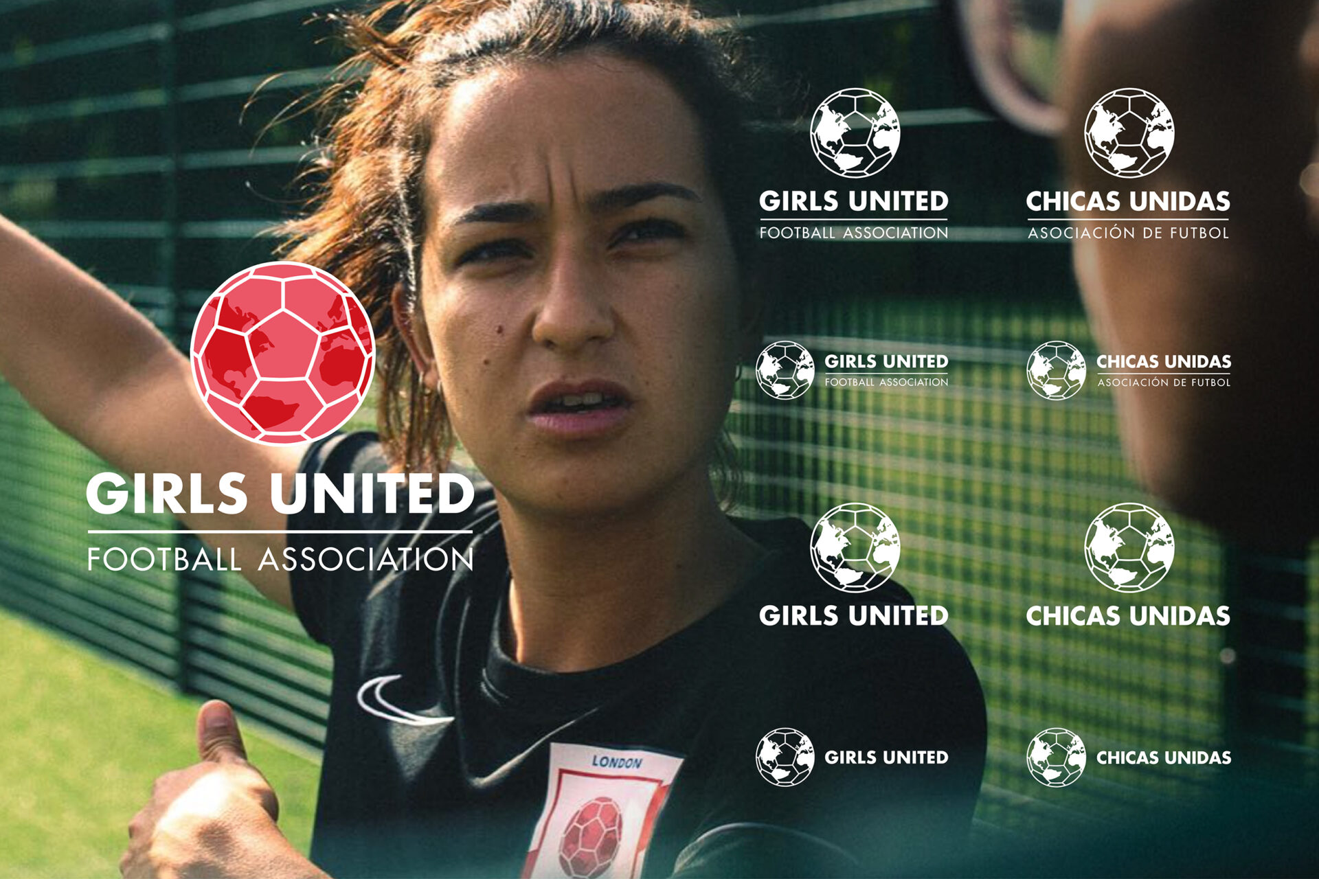
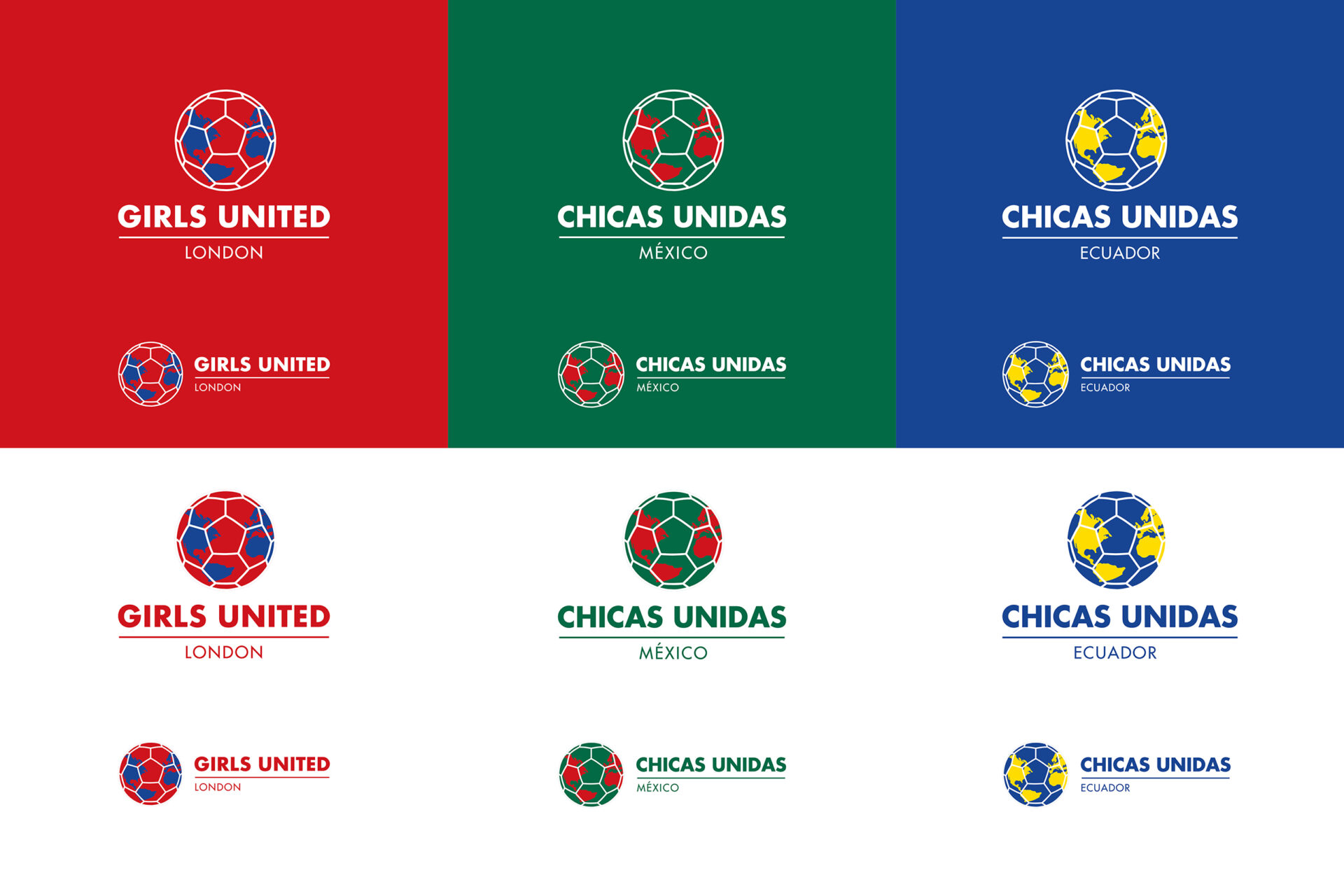
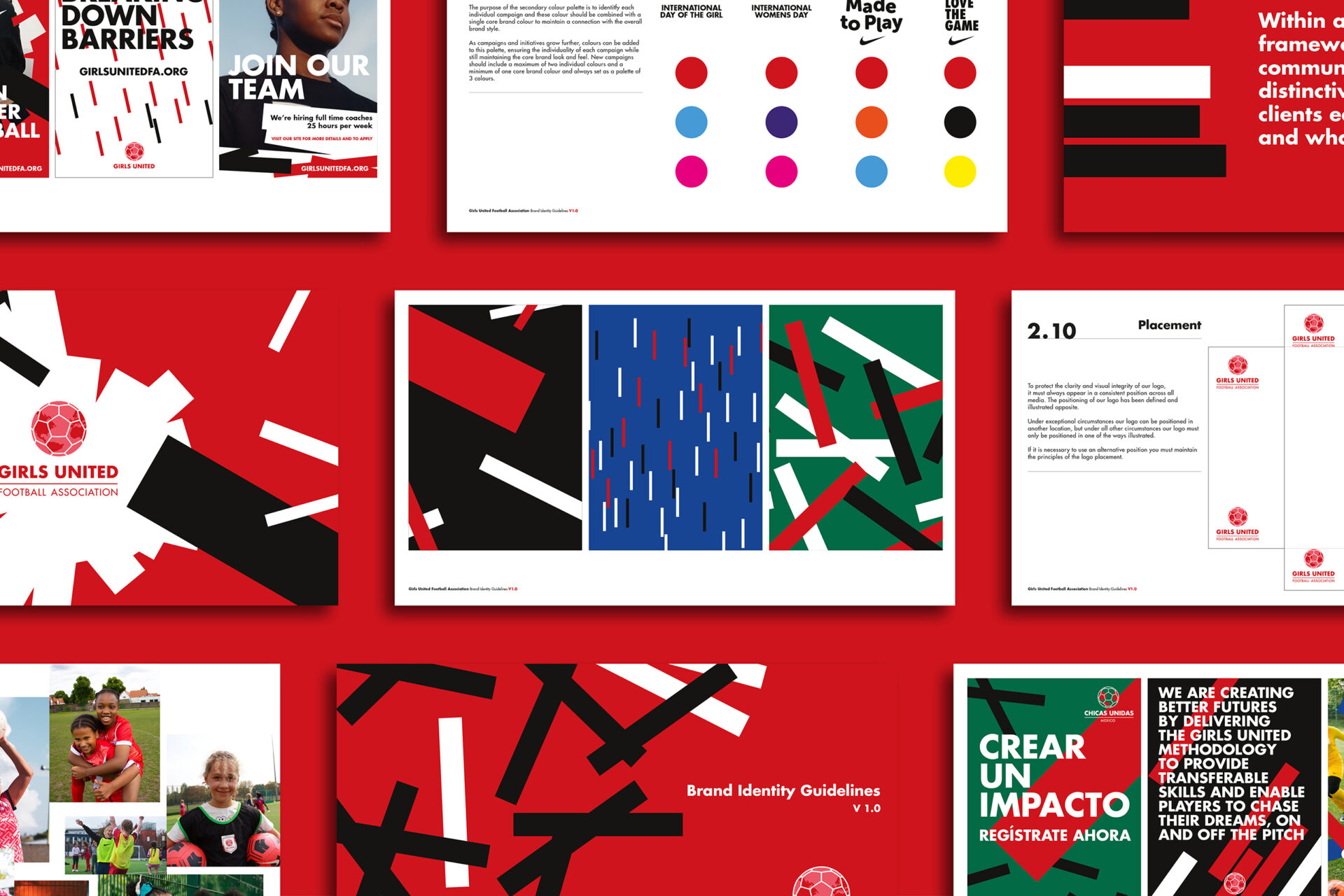
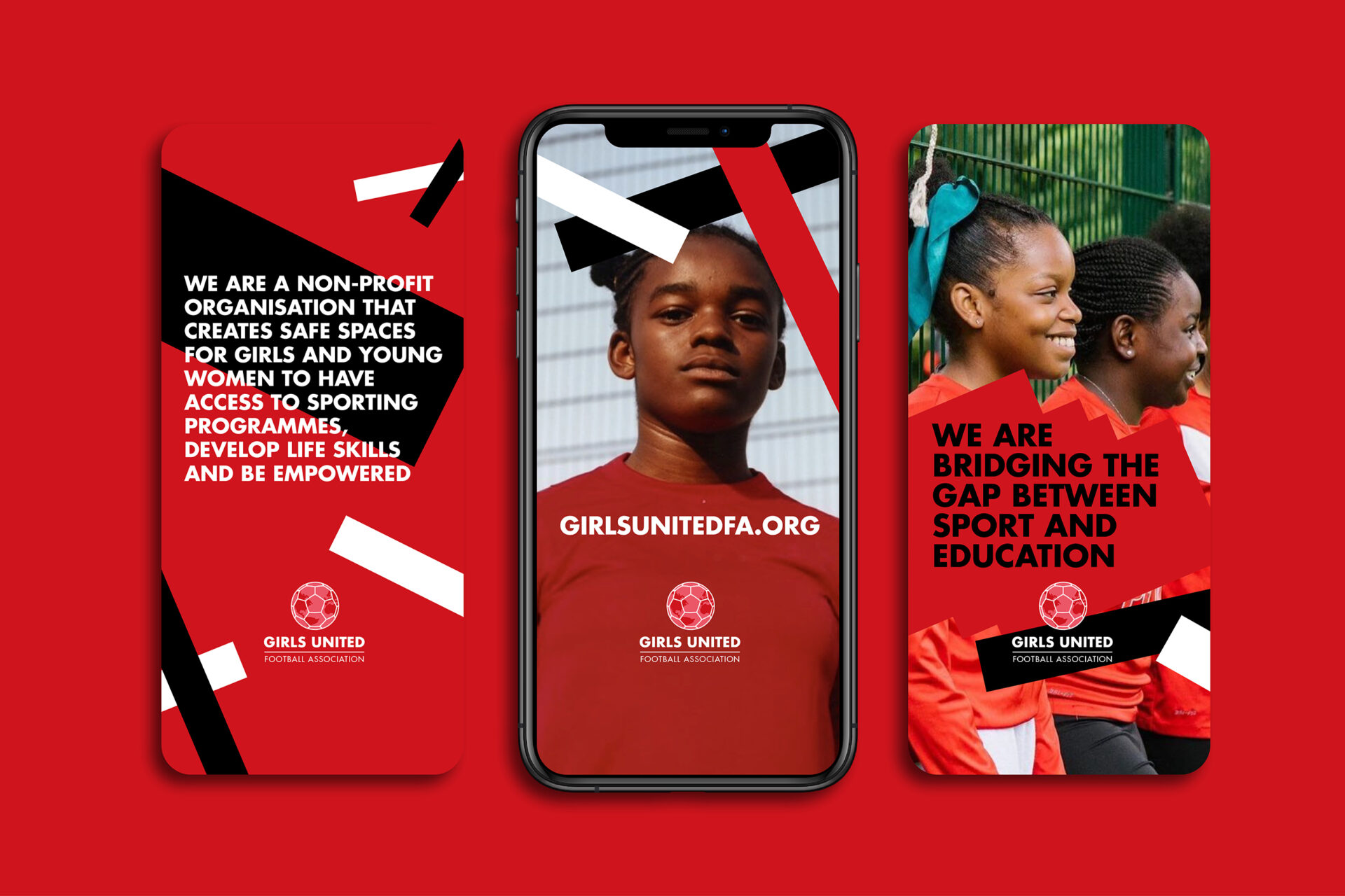
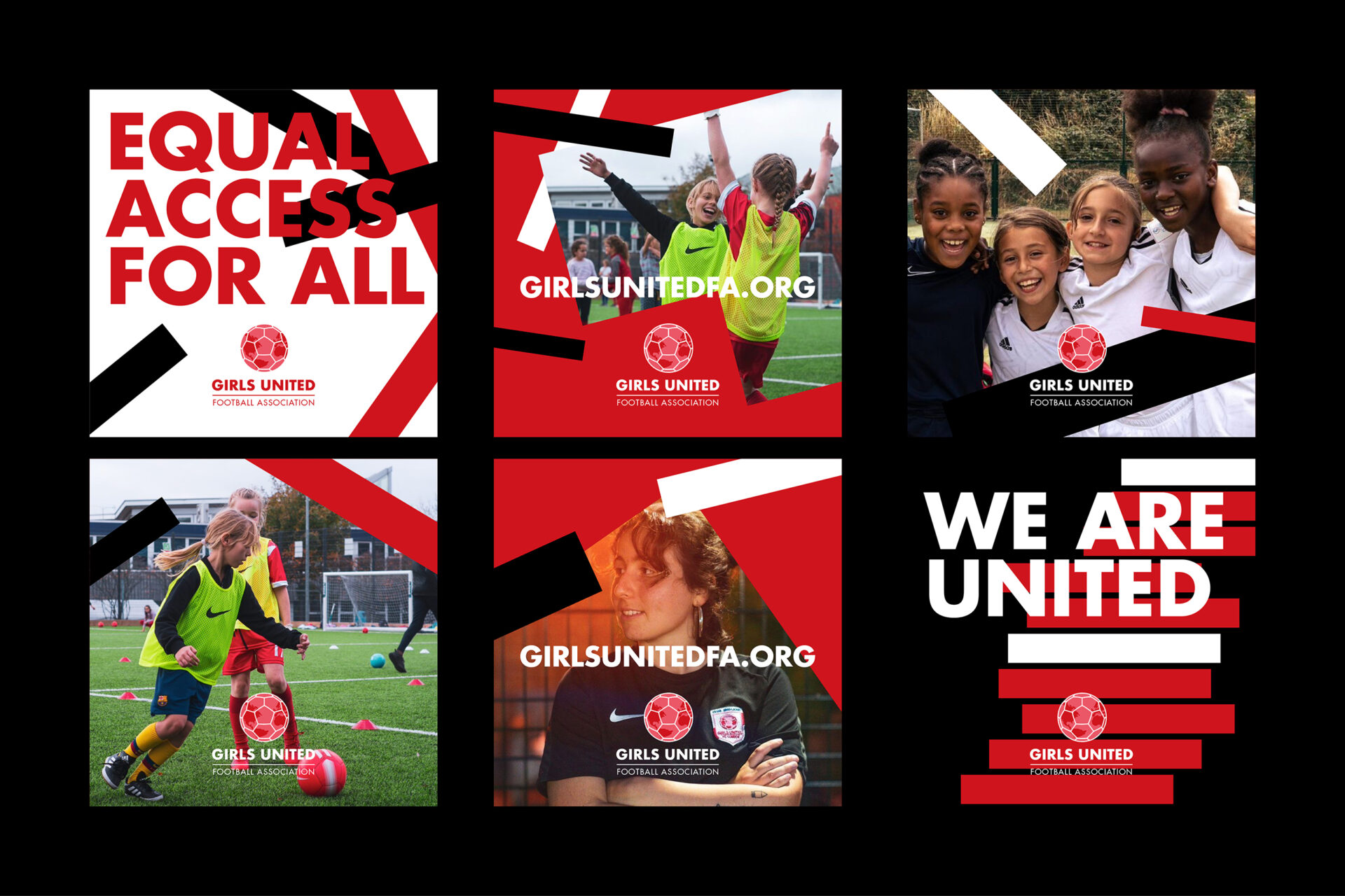
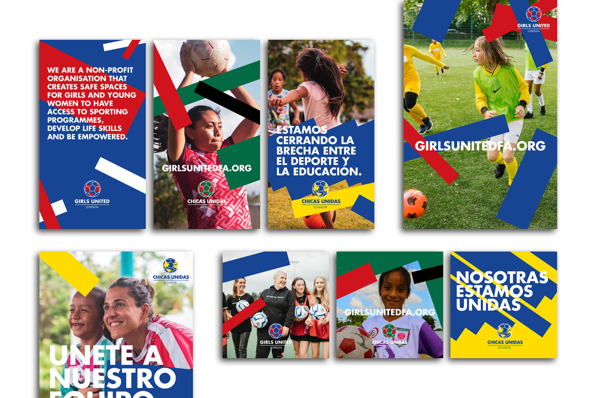
Girls United is a non-profit organisation based in the UK and Central America that has a vision for girls around the world to have equal access to sport and to provide them with skills that will allow them to fulfil their potential, on and off the pitch. Due to negative stereotypes and limiting gender roles, girls and women do not have access to the same opportunities, resulting in gender gaps that go beyond the pitch and into society. Girls United’s vision is for girls and young women around the world to have equal access to sport and to provide them with skills and abilities that will broaden their opportunities to participate in education and in the economy. In 2022 we identified Girls United as a perfect partner for our ‘Good for nothing’ initiative. Good for nothing is a programme that we undertake as a studio to support third-sector organisations who are looking to grow their brand and creative output, providing good design on a strictly pro bono basis. As part of our support for Girls United we undertook a brand audit of the collateral that already existed and it was identified that a redesign of all their assets and architecture was required to help them move forward. From top to bottom we looked at how the brand could be updated and improved upon. We provided a system that brought a new level of consistency and flexibility, allowing it to be used reliably across all the global spaces that they currently work in. With a vision to expand the charity into further worldwide locations it was identified that a structure was required to allow for multiple language and geographical applications. We developed a flexible and creative brand architecture that allows Girls United the scope to create elements that talk in the same visual language, regardless of spoken language, while still maintaining an individual look that doesn’t feel repetitive. It was important to create a structure that communicated a sense of excitement and fun, reflecting the aims and values of Girls United. The brand style was developed across elements that form the core over-arching brand and also expanded to provide an individual treatment for each of the location specific communications. The architecture delivers a robust structure for current and also future plans of the organisation, providing a suite of logos, typographic treatment, colour and a visual language that can all be expanded across time as needs change.