Capturing the uniqueness of Harmeny
Nomination
Silver Award

Category
Brand Identity
Company
Daysix Ltd
Client
Harmeny
Summary
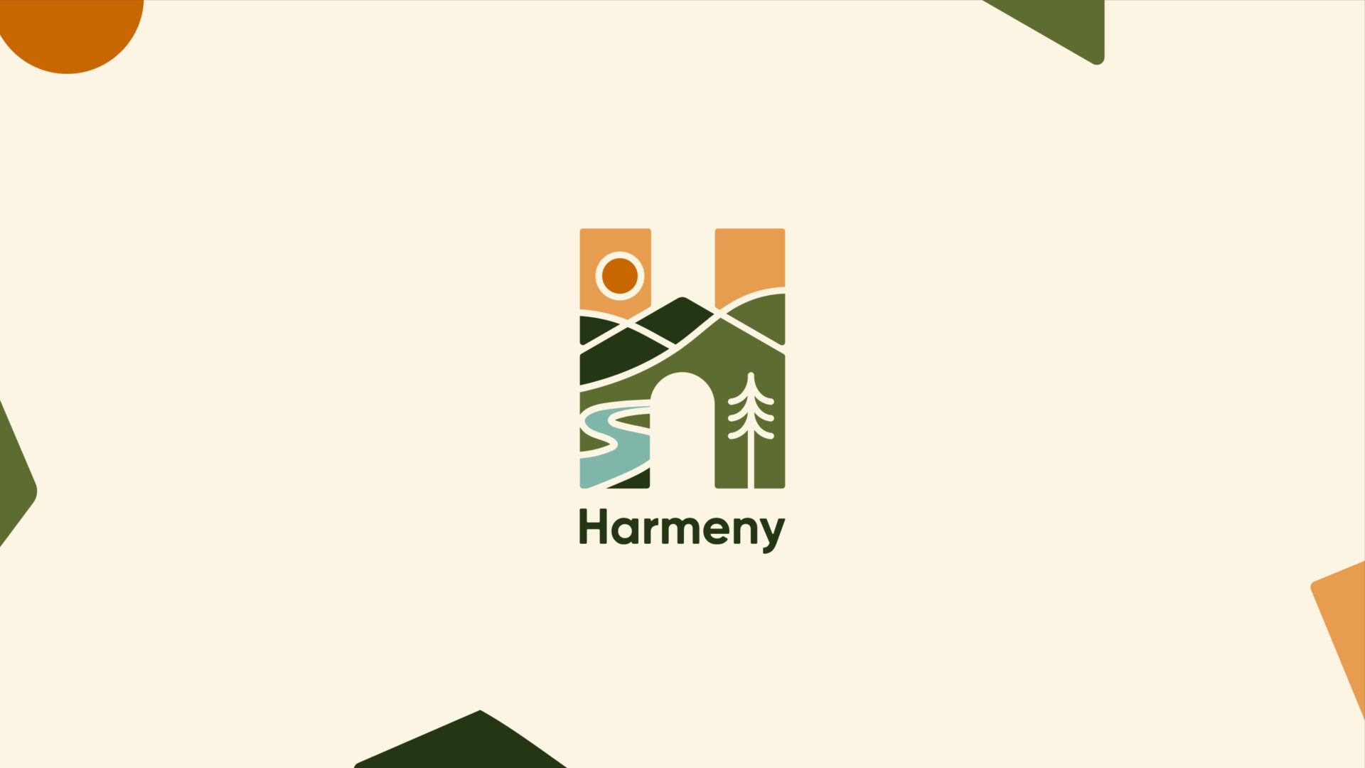
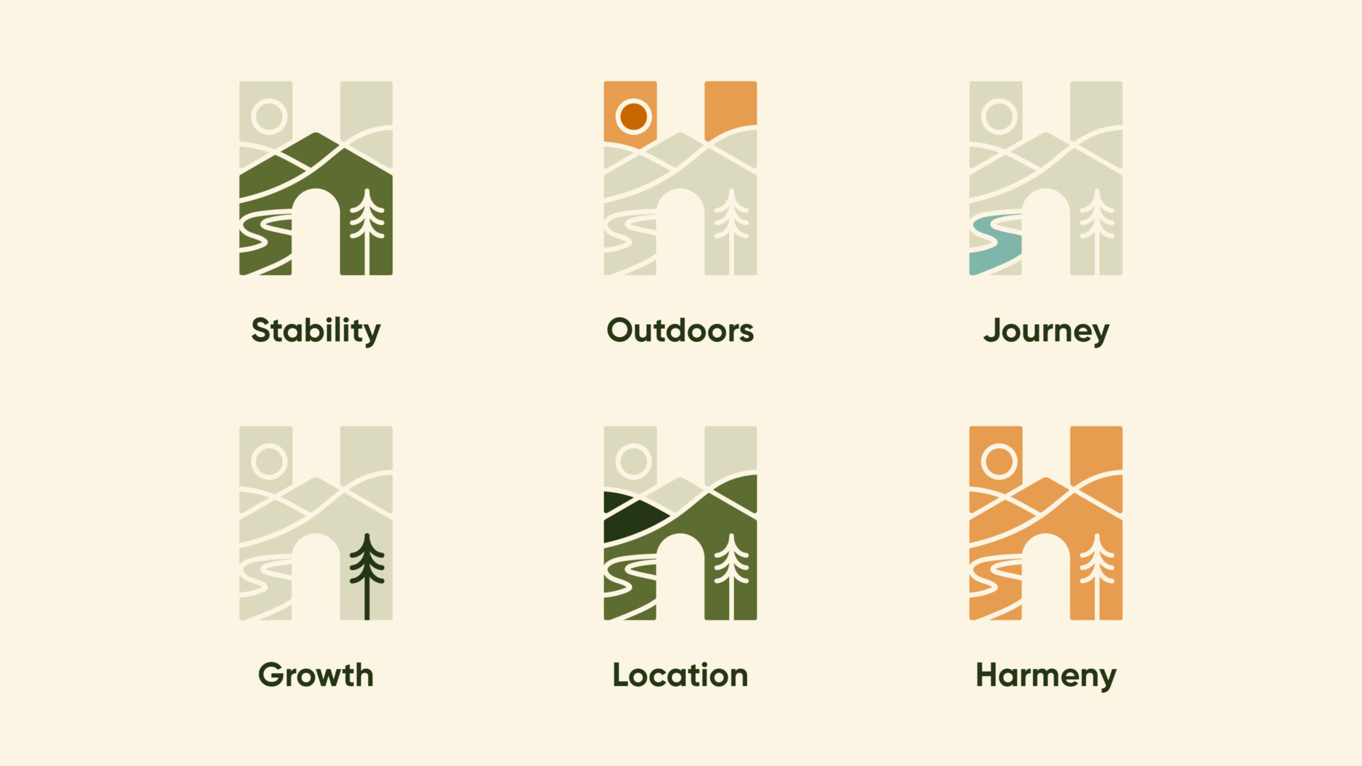
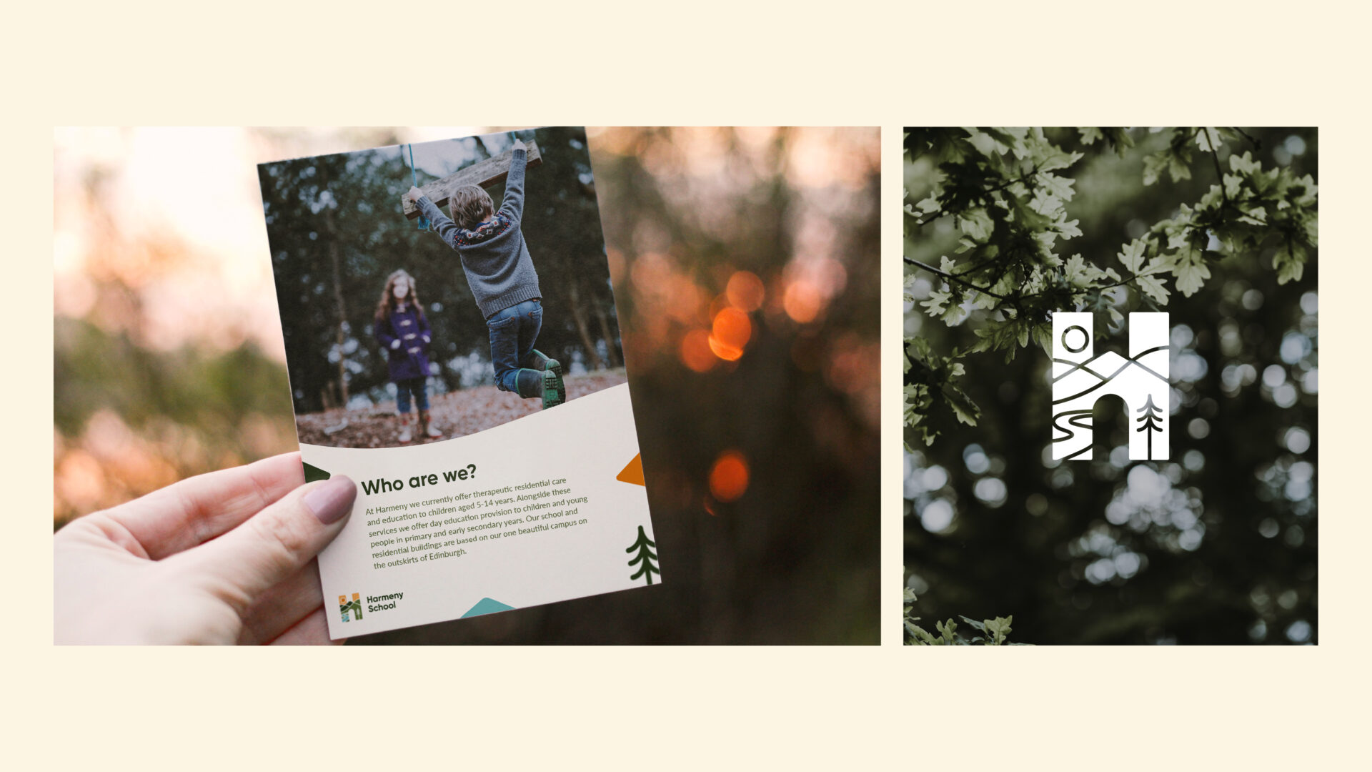
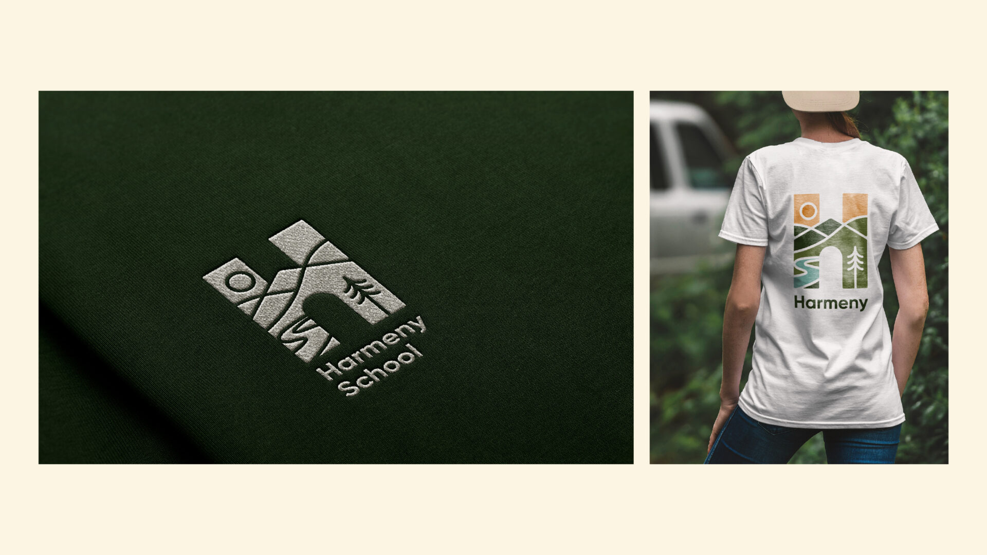
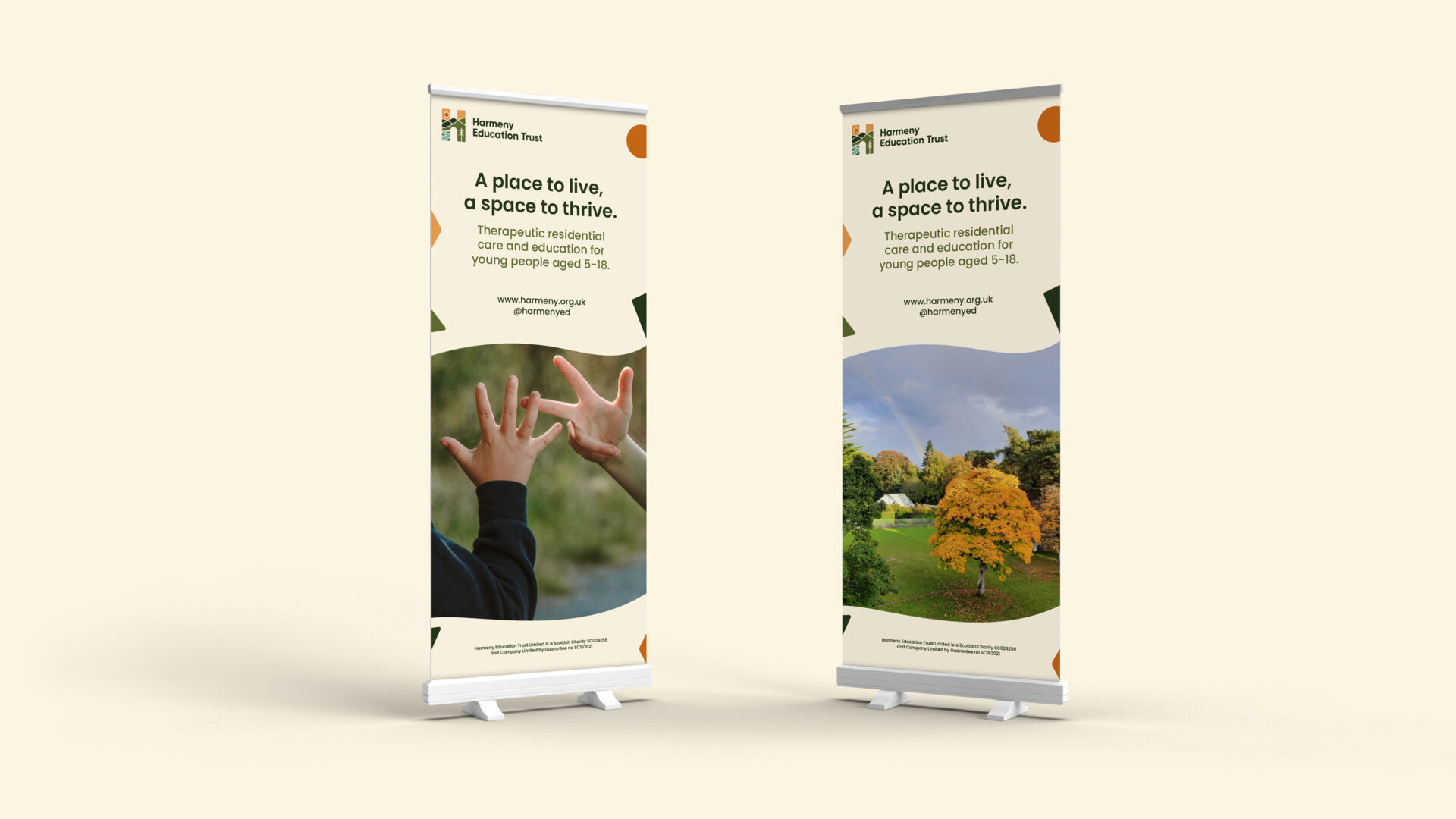
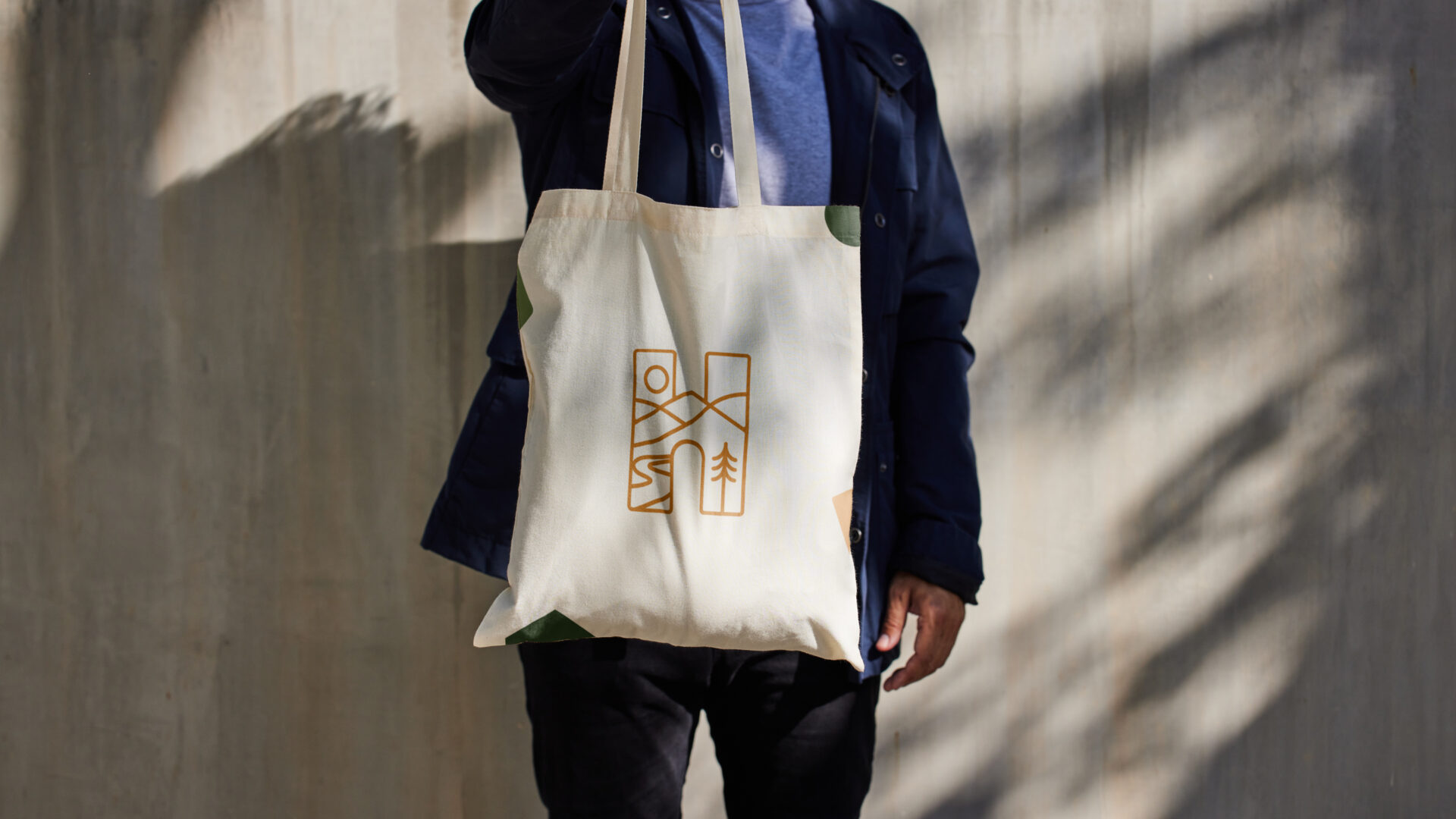
Harmeny is a unique residential school on the outskirts of Edinburgh centred around therapeutic care. Daysix was appointed by Harmeny to carry out a sensitive rebrand to respond to changes in the sector and an ambition to present their school and approach to a wider audience. On visiting the school, we quickly realised this was a special yet complex design task, and would be a total privilege to work on. Children showed us their space, workshops were carried out with staff and stakeholders to gain insight into the school and its unique offer. Harmeny is both simple and complex; both playful and serious. There was a design challenge to capture this successfully. Looking out onto the Pentland hills, the school holds a unique location, and the outdoor space is so connected to the ‘who’ and ‘how’ of Harmeny. At Harmeny, there’s an incredible admiration and respect for the children from the staff. We could see love and care in the small interactions, and a desire to offer relationship in lives that have missed that. Harmeny is a home for many of the children, and a place of stability in their lives. We wanted to reinforce that in the new identity. After a series of creative rounds, gaining feedback from the children and Harmeny team along the way, we all landed on a final identity that captures Harmeny and the nature of the care and education provided. The outdoor space of the Harmeny grounds not only gives children a place to play but it is also woven into the curriculum, something unique to Harmeny. The mark is simply an H but each element holds meaning: Tree - growth / roots / outdoors / natural shelter River - a favourite place for many of the children we spoke with / a journey Hills - freedom of space Sky - opportunity Home - structure / stability / safety Routing the mark in the H places the emphasis on Harmeny and the uniqueness of how they care for children and the holistic nature in which they learn and develop. “Bringing the brand to life has reinforced how well the brand works to bring together the many strands of our work. The way the logo contains the shape of a home has been particularly powerful when helping us tell our story, an aspect that has been really highlighted through our brand launch animation.” Alison Acosta, Fundraising & Communications Manager, Harmeny