Eas Fors
Nomination
Category
Brand Identity
Company
My Creative
Client
Eas Fors
Summary
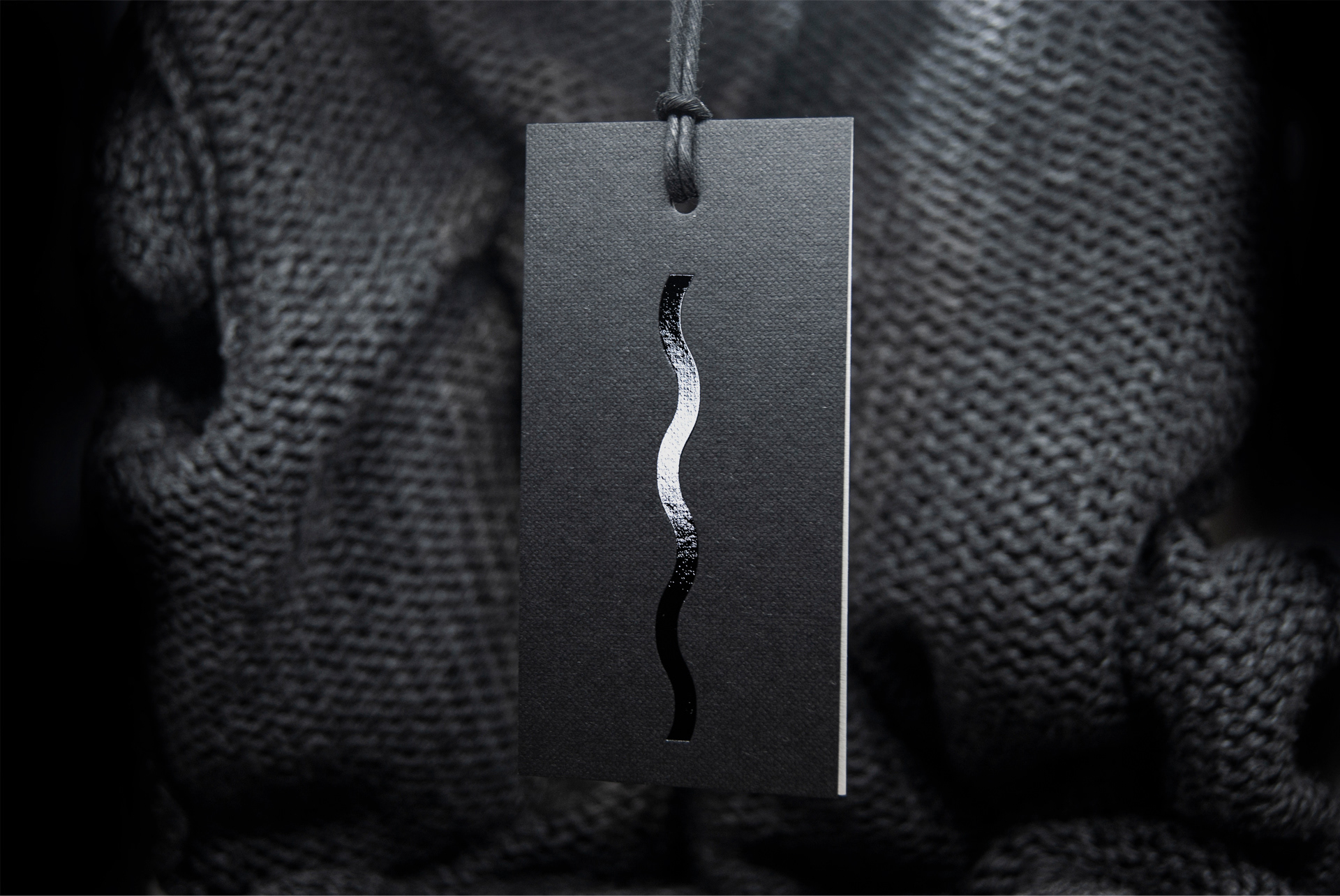
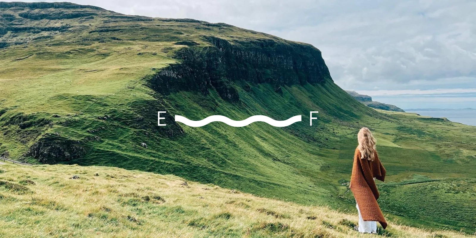
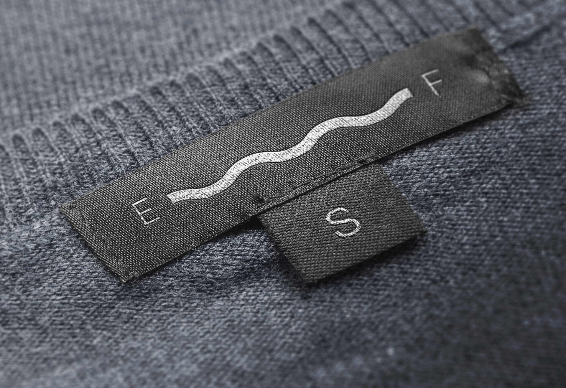
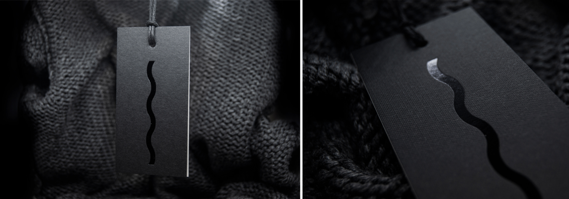
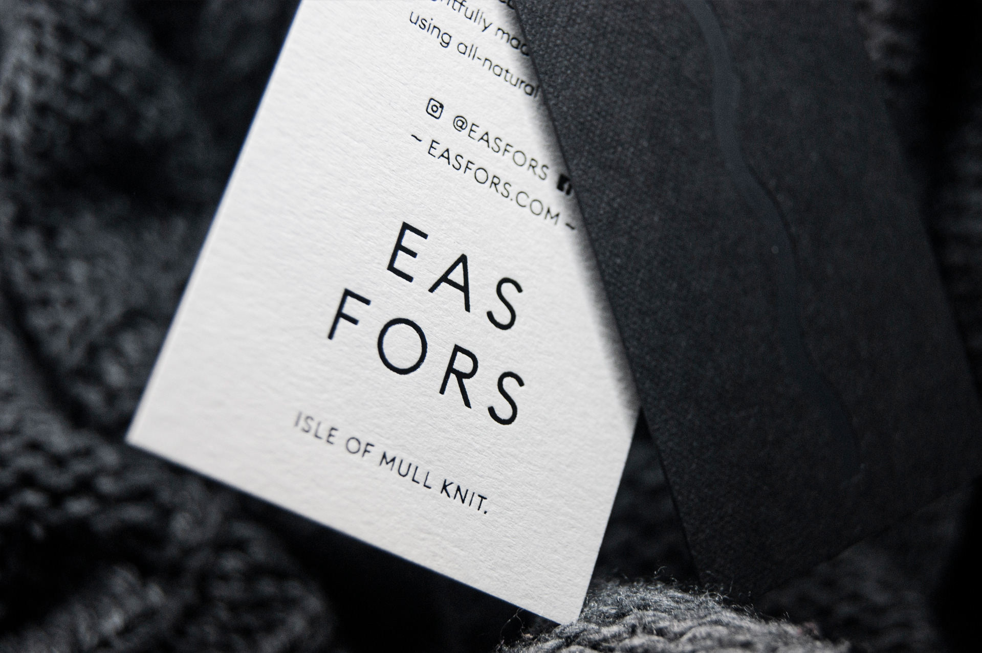
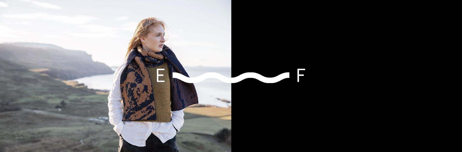
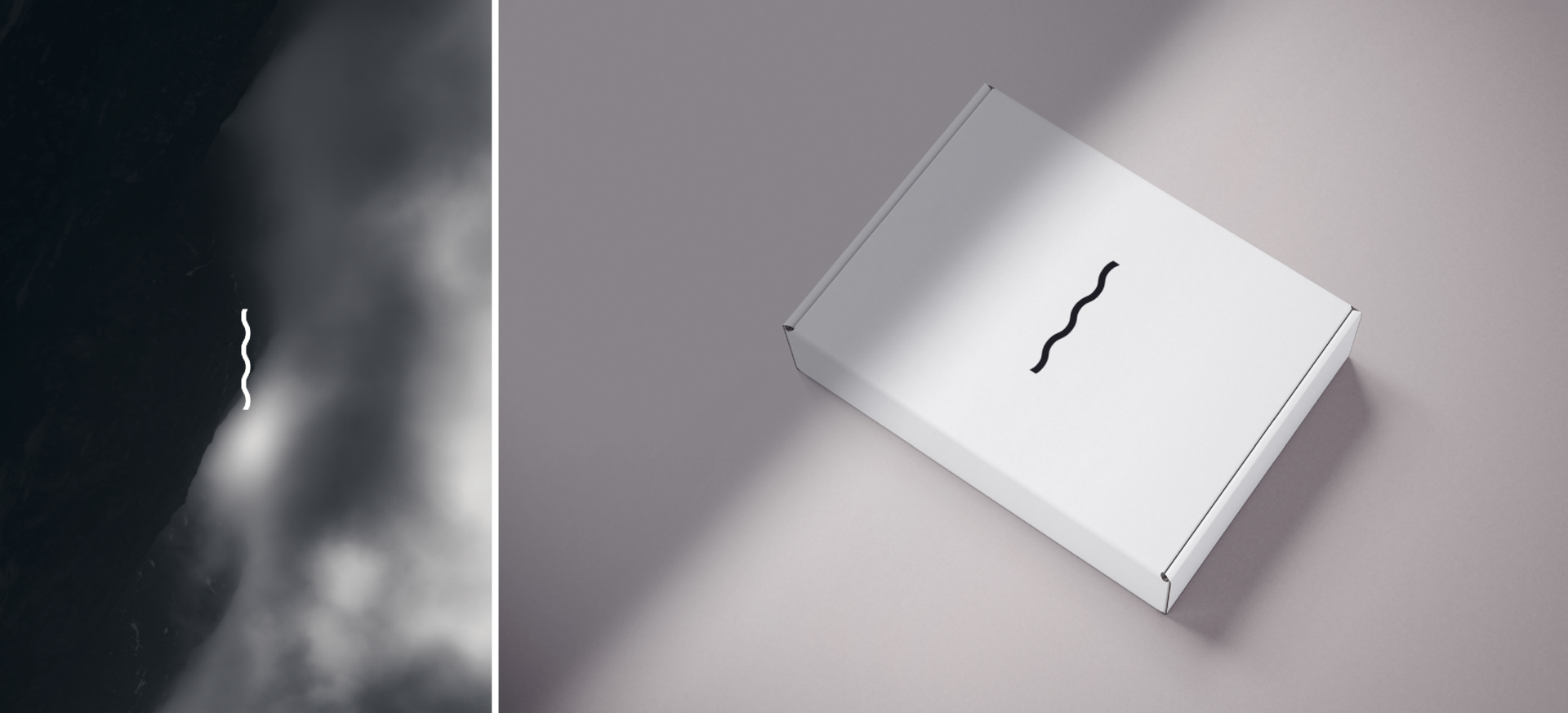
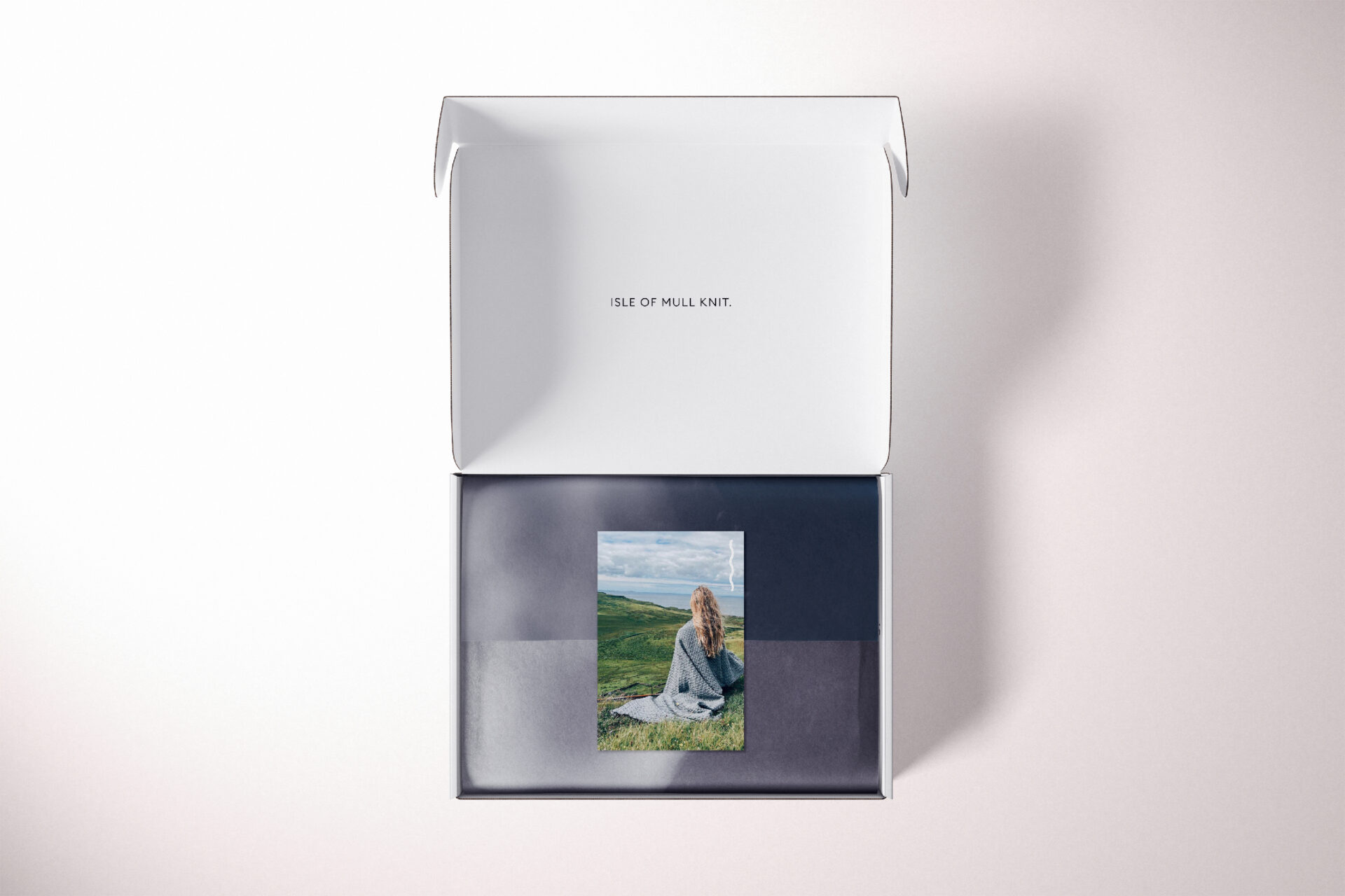
- Eas Fors : is a new design-led knitwear brand from the remote Scottish Isle of Mull. Reflecting the spirit of Hebridean islands, pieces are thoughtfully made on a small scale using all-natural wool fibres. The businesses was co-founded by brother and sister Joe and Flora. The name Eas Fors is taken from the local area, meaning Waterfall/Waterfall in both Scots Gaelic &Norse. Were both cultures thrived off the land & sea. My Creative worked with them to create a bold and dramatic image. Using wild photography and strong graphic marks. Exploring Nordic runes before creating our own symbol. This became the core motif for the brand representing both a woven wool strand and the flow of water through the land, linking the source to the location.