Heehaw Rebrand
Nomination
Images

Videos
Direct link: https://vimeo.com/813477456/ee150cbc98
Direct link: https://vimeo.com/813485484/0de4886842
Category
Brand Identity
Company
Heehaw
Client
Heehaw
Summary
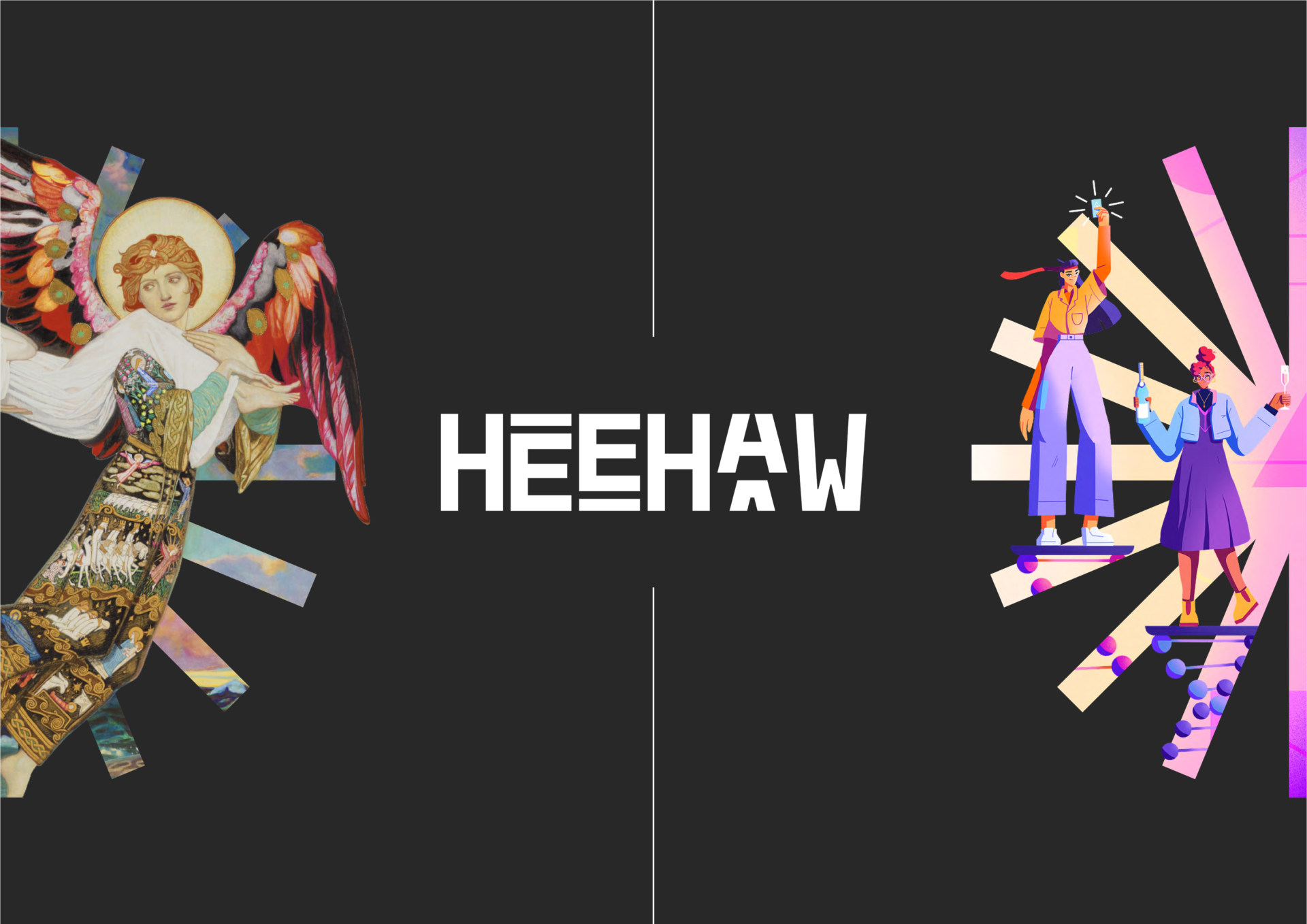
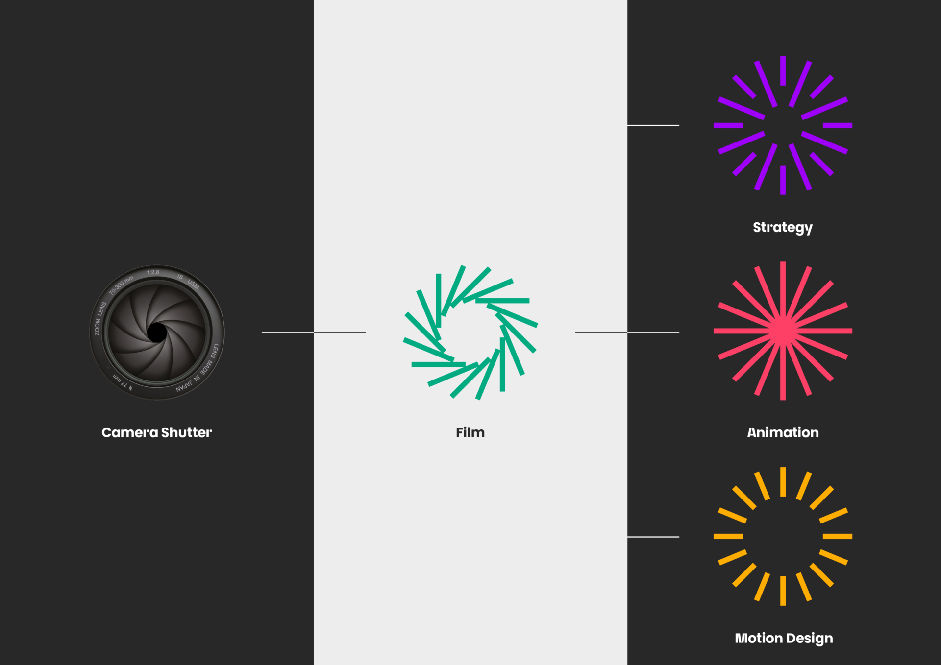
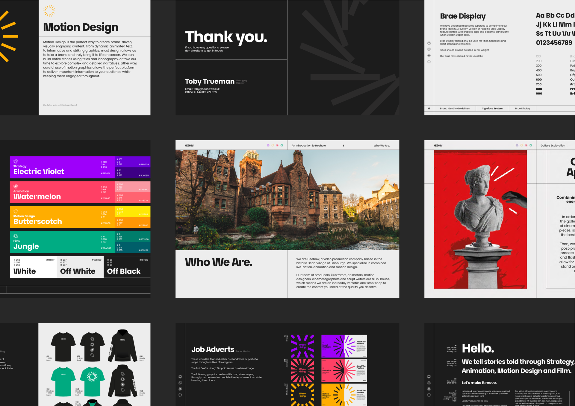
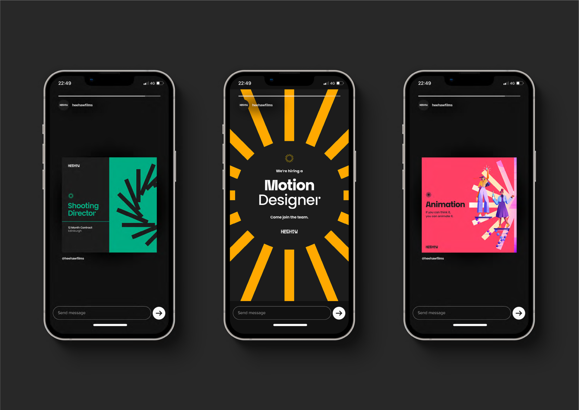
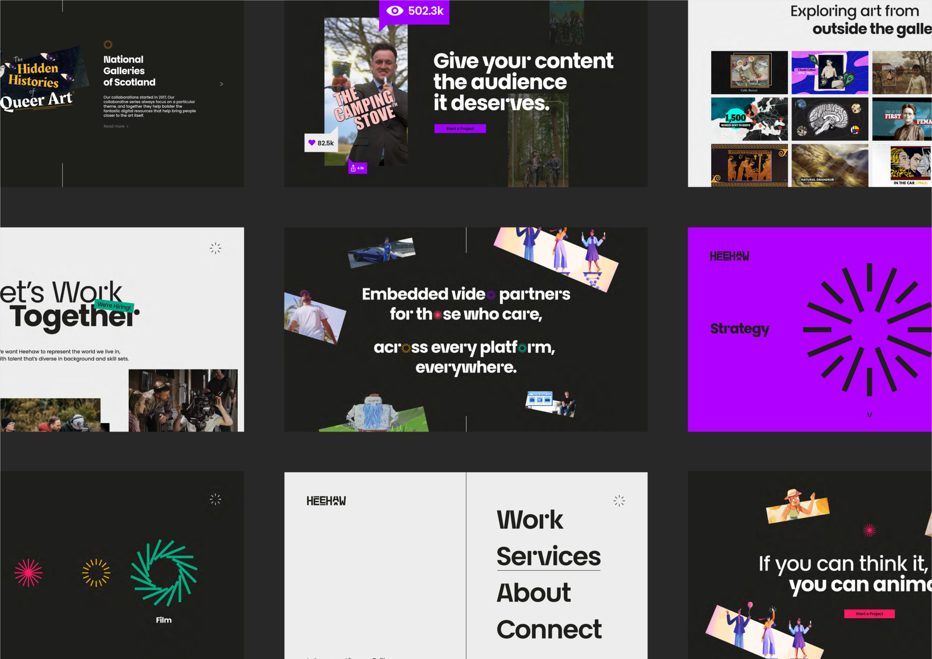
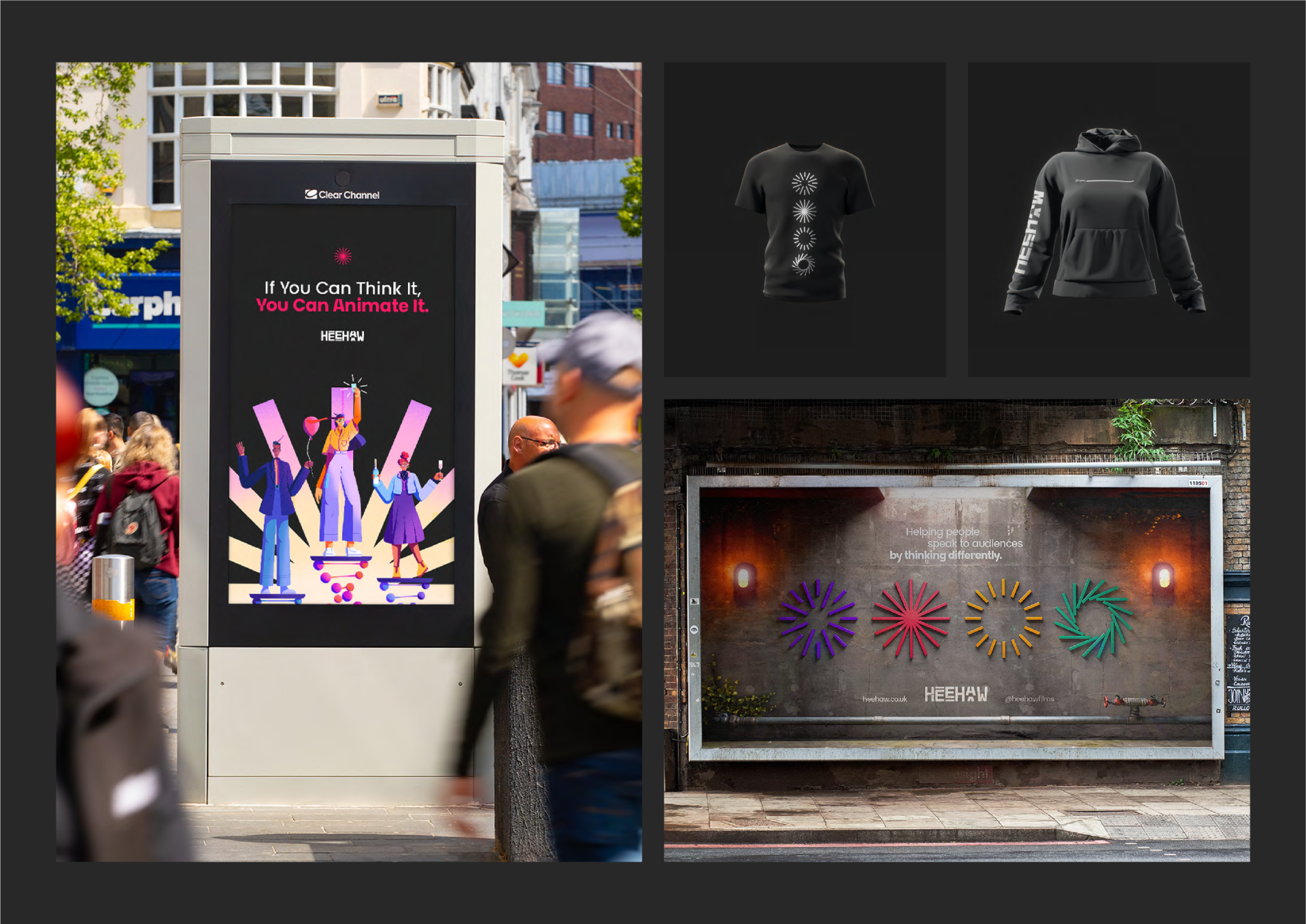
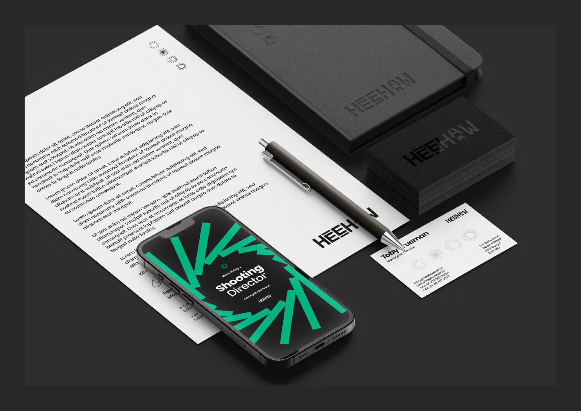
Heehaw is an Edinburgh based production company with a fully in-house team of creatives across every filmmaking discipline from Strategy and Animation to Motion Design and Film. Knowing how important our ‘shop window’ is to the company, some of our motion designers proposed the idea of creating a compelling rebrand that fully told our company’s story and transformed the way we looked for our clients. We wanted to feel bold, confident, and leave the playfulness of our last brand in the past. Our new company wordmark was designed to appear as if the letters are in a constant state of motion, in the same way we as a company create moving content for our clients. We also continuously push boundaries as a company that’s always moving forward. Creating the cropped lettering not only gives this illusion, but also plays with the symmetrical formation of the word itself. The inspiration for our department icons came from the idea of a camera shutter. Once we graphically represented that into the Film icon, we then created three other accompanying icons to represent Strategy, Animation and Motion Design working hard to form them in a way so as to morph into one another, keeping up with our theme of mobility, to ultimately show how our disciplines are all interconnected. A fresh, bold colour scheme tied it all together. We wanted each department to have a unique look while still being complementary enough to work as a whole. It was important to us that the colours were bright, eye-catching, and created a stark contrast against the developed off-black hero colour so that each colour encapsulated not only the nature of each department’s work, but also the dynamic team of creatives within them. Finishing the rebrand off with a fully comprehensive document folder with updated pitch templates, animated logo stings, social media templates, a brand new website, signage and merchandise, our new brand identity ticks all the boxes. We even commissioned a font designer to make a bespoke typeface inspired to bring the cropped letters of our wordmark to our website copy. Brae Display, named after the street our office is on, was our solution. The end result is something we’re all incredibly proud of. We just hoped that it would work exactly as we expected. And it did. We’ve had massive engagement from clients across the board and have officially left our old identity behind.