Caskshare
Images


Category
Packaging - Drinks
Company
Touch
Client
Caskshare
Summary
Sharing the spirit of community for a bold new whisky startup.
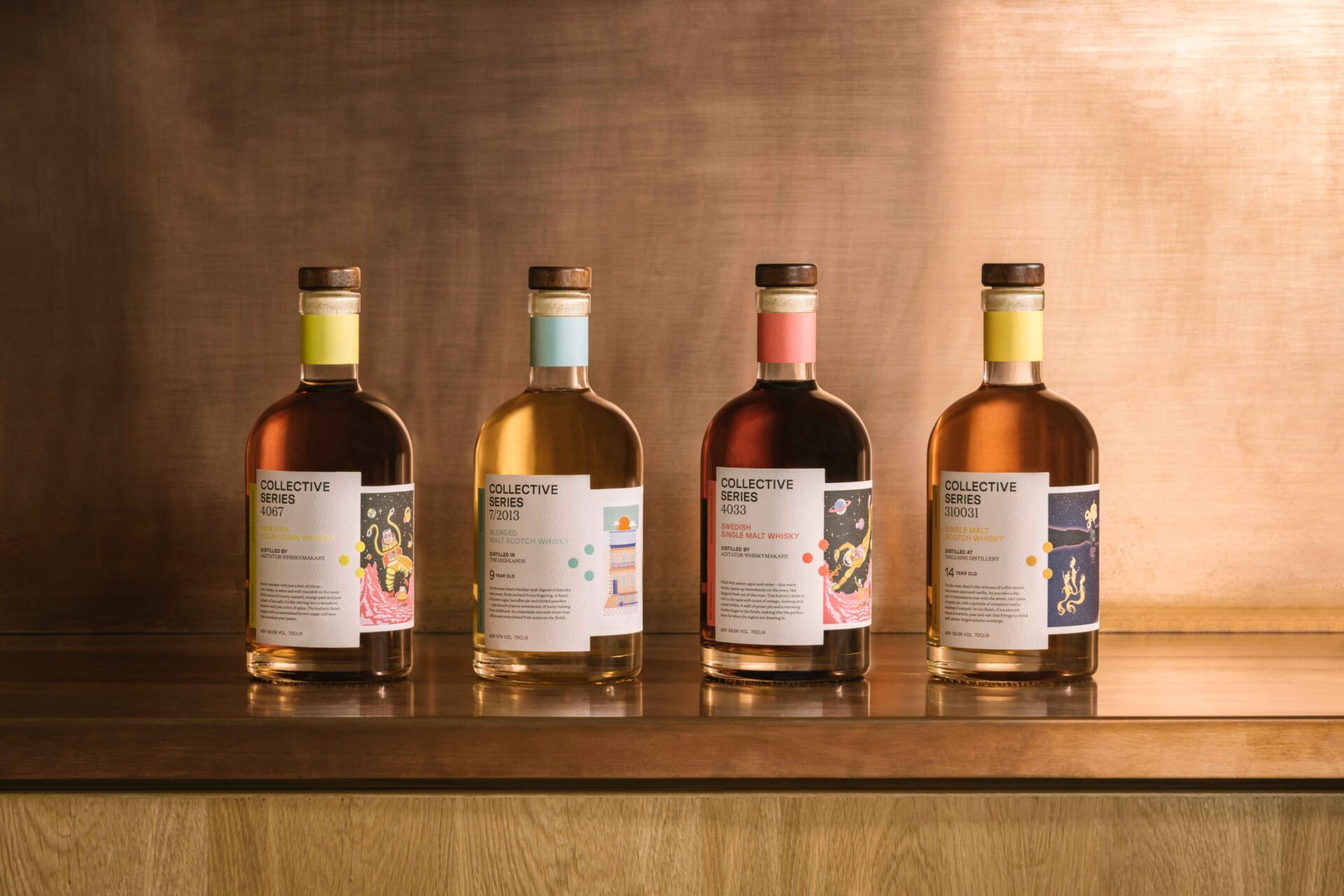
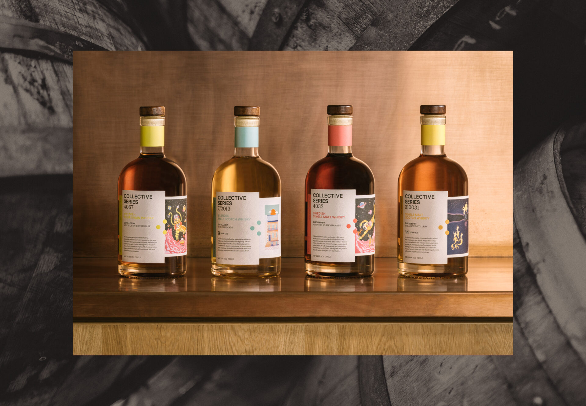
Caskshare is a whisky startup dedicated to making fine single malts more accessible to everyone. Working with a series of illustrators and the marketing team, we led the creative on their brand launch, building out their visual identity, art direction, tone of voice and labelling system as they prepared to roll out their inaugural Collective Series.
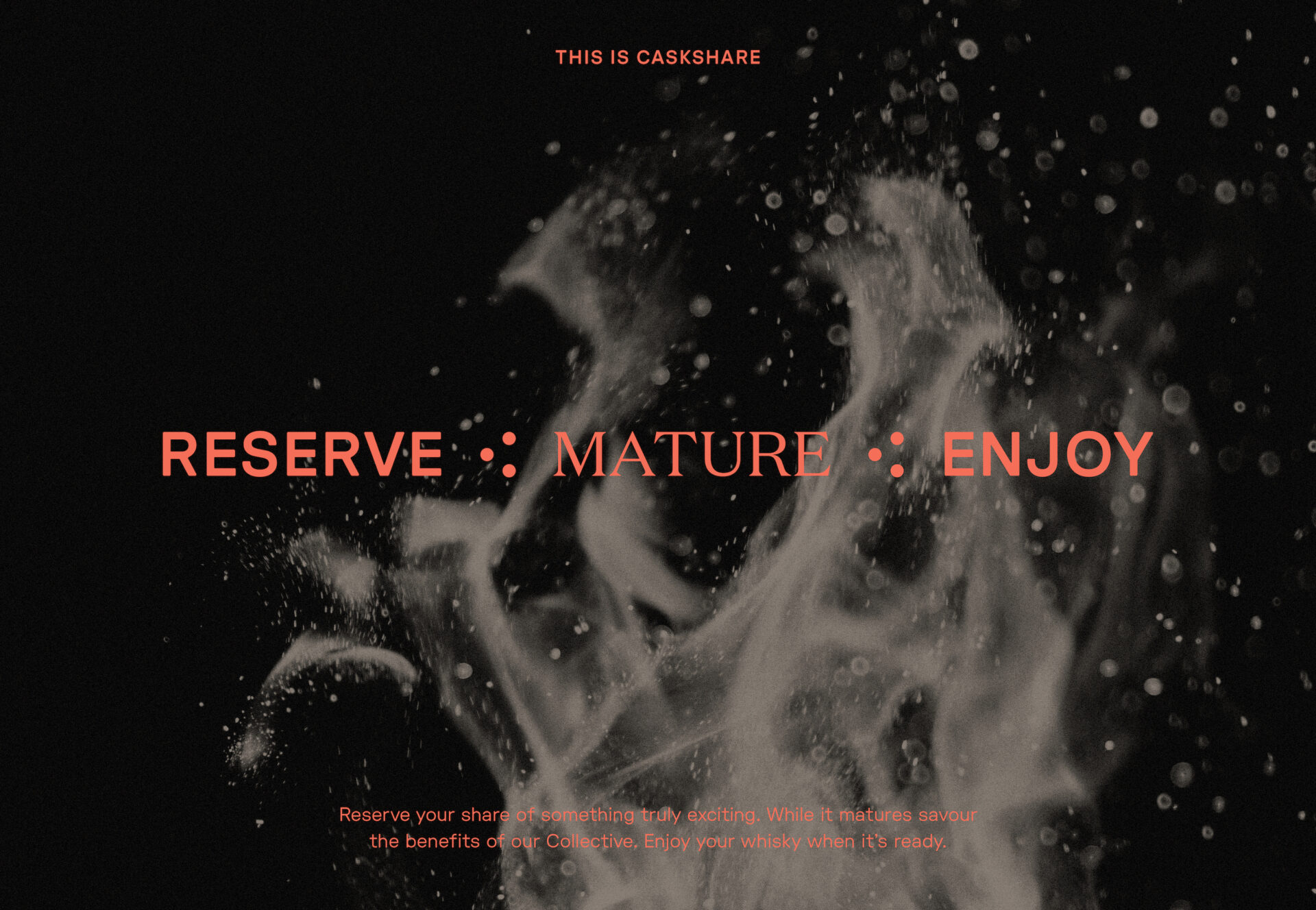
Inspired by the concept of shared moments and Caskshare’s core digital audience base?, we introduced a refined brand mark — a stylised C for Collective which also references the digital symbol for sharing. Each point within the symbol represents the key philosophies of Caskshare — Mature, Reserve, Enjoy.
When it came to the bottles themselves, the team at Caskshare reached out to a selection of illustrators for bespoke commissions themed around the brand and its values. In response, we developed a practical yet striking labelling system that would work in harmony with the eclectic artwork, while future-proofing the design approach for future releases and artist collaborations — all while helping to tell the continuing Caskshare story.
Credits:
Evie Grace https://www.eviegraceillustration.com/
Phoebe Phillips https://www.phoebephillips.co.uk
Martha Duncan https://marthaduncanstudio.com/
Photography https://www.murrayorr.com/