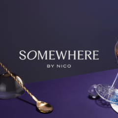
Somewhere was a visionary concept developed by the innovative Six by Nico group, a forward-thinking brand known for its bold culinary and design ventures. The brief for this new venture was clear: create an identity and experience that encapsulated the magic of a fairytale while offering a truly immersive experience for patrons. The concept was to envelop guests in a whimsical wonderland, drawing them into a world where imagination and indulgence seamlessly intertwined. The identity of Somewhere needed to evoke […]
Continue reading