Stepdown
Images

Videos
Direct link: https://vimeo.com/1061333240
Direct link: https://vimeo.com/1070291238
Direct link: https://vimeo.com/1070294310
Direct link: https://vimeo.com/1068058382
Direct link: https://vimeo.com/1063538583
Direct link: https://vimeo.com/1070289241
Category
Brand Identity - Civic
Company
Creo
Summary
Stepdown exists to create brighter futures for young people. At its heart, Stepdown is about supporting young people through life’s toughest transitions—guiding them from foster, supported, and respite care into independent adulthood. But with such an important mission, their brand needed to match their ambitions. It had to be clear, powerful, and unmistakably them.
It was accepted that Stepdown’s previous brand lacked personality was overly complicated and difficult to use throughout their communications materials. Despite the positive and uplifting nature of Stepdown’s mission, the brand felt negative. That’s where Creo Design stepped in.
The journey began with a Brand Workshop, in which we brought 20 key stakeholders together. Over two days, we listened, collaborated, and explored what Stepdown truly stood for, and most importantly we heard it directly from people on the front lines of the organisation.
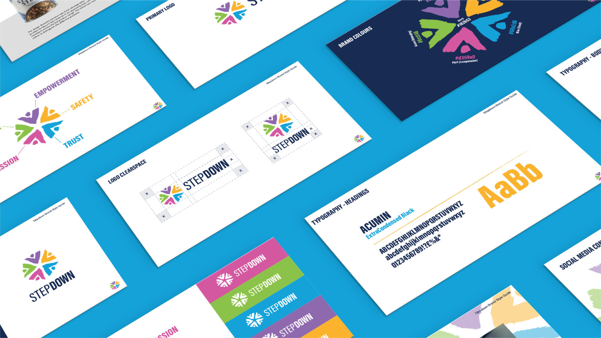
We defined their tone of voice, brand mission, vision, and values, creating a bank of written content to help distil years of incredible work into a brand that would resonate with everyone who encountered it.
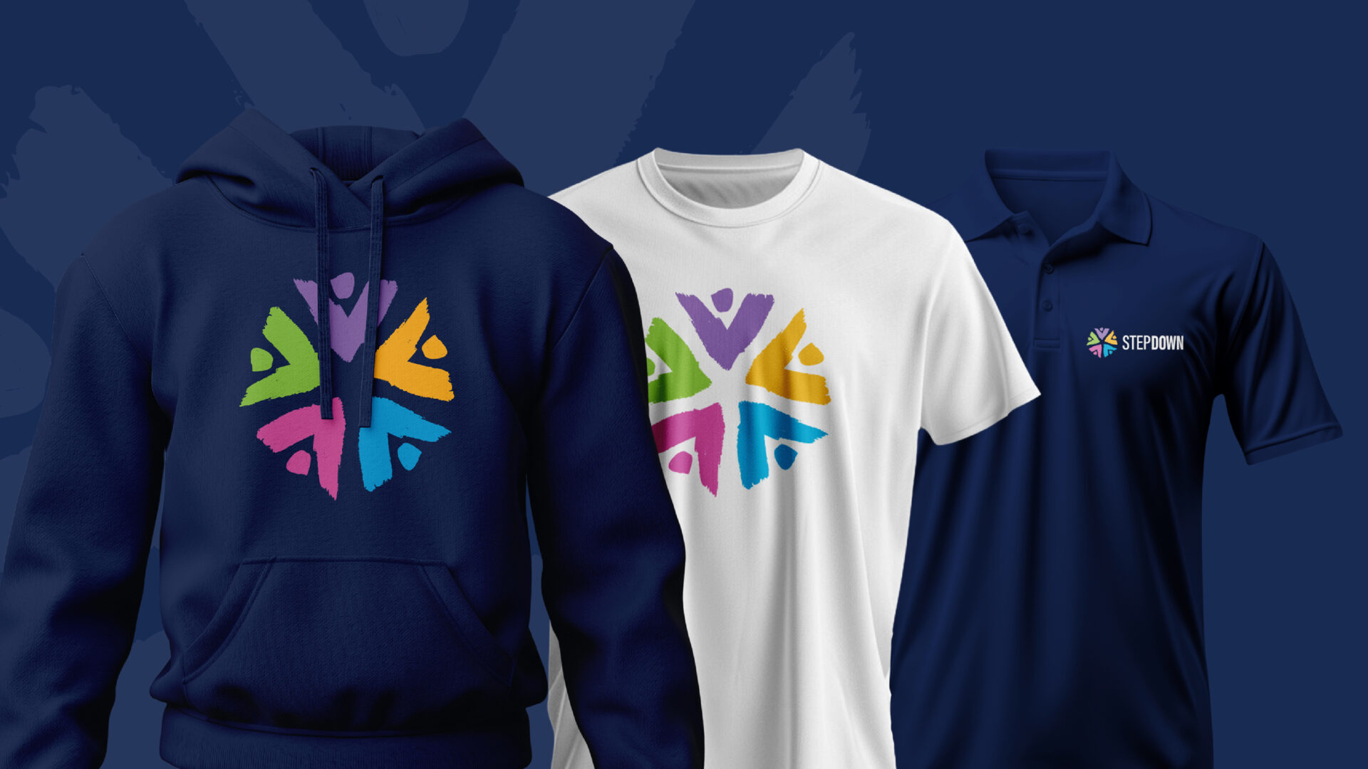
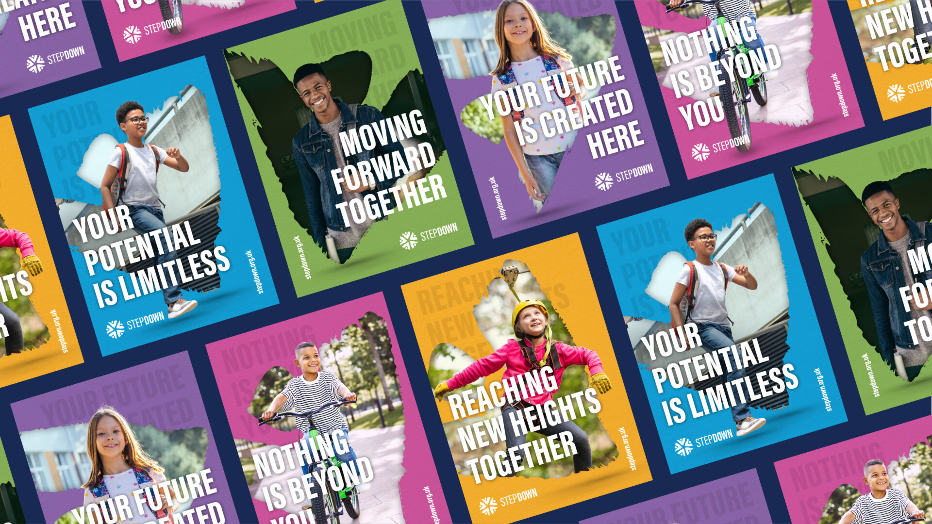
From this foundation, we set to work. A complete visual transformation was needed, not just a new logo, but an entire suite of brand elements, from colours and typography to tone of voice. Our aim was to create a brand that felt familiar but different, full of character and personality, while remaining appropriate to the charitable sector.
We wanted to avoid the new brand looking like something ‘off-the-shelf’. We wanted to take the warmth, professionalism, and dedication that already defined Stepdown and make sure this came across in the brand.
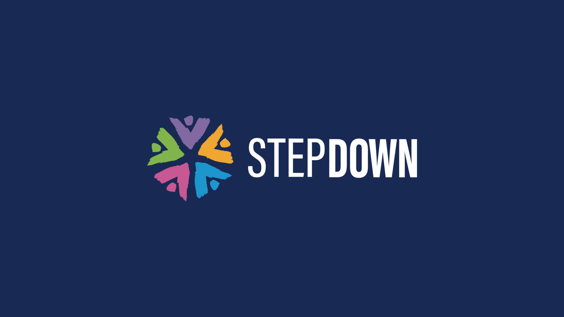
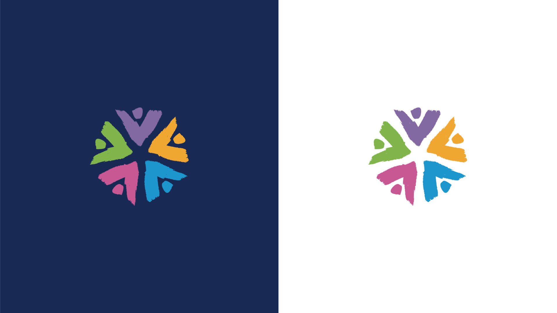
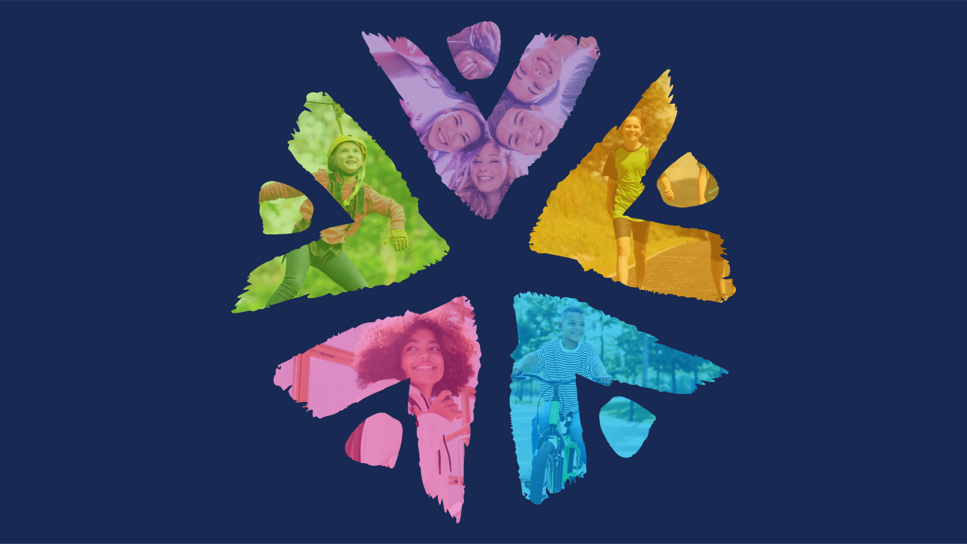
The new mark is abstract and expressive, with the colourful segments representing people coming together – a familiar motif used in charity brands, but the expressive nature adds character. The abstract nature of the shapes represent the brand’s new core values: Compassion, Trust, Safety, Empowerment, and Belonging.
The abstract, angular shape carries multiple meanings: it’s a human figure representing the young people Stepdown supports, an arrow signifying progress, a step reflecting growth, a heart symbolising care, and a roof offering shelter and belonging.
The new brand is fresh and accessible, bold and modern, expressive and versatile. Equally representing the organisation and the young people themselves.
This rebrand represented a bold step forward for Stepdown, who have the tools to tell their story like never before.