Mossgiel Organic Dairy Rebrand
Images
Category
Brand Identity - Consumer
Company
Mick McCabe Design
Client
Mossgiel Organic Dairy
Summary
Tasked with giving Mossgiel Dairy a "facelift," we faced the delicate challenge of modernising this Scottish brand while preserving its connection to Robert Burns and dairy farming heritage.
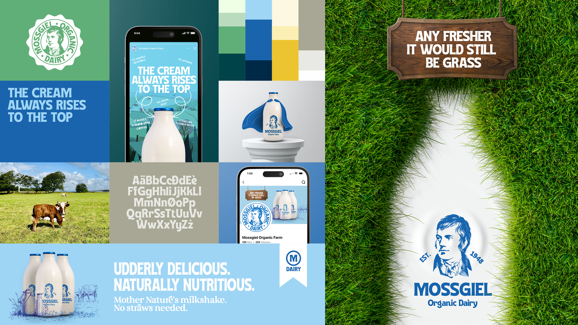
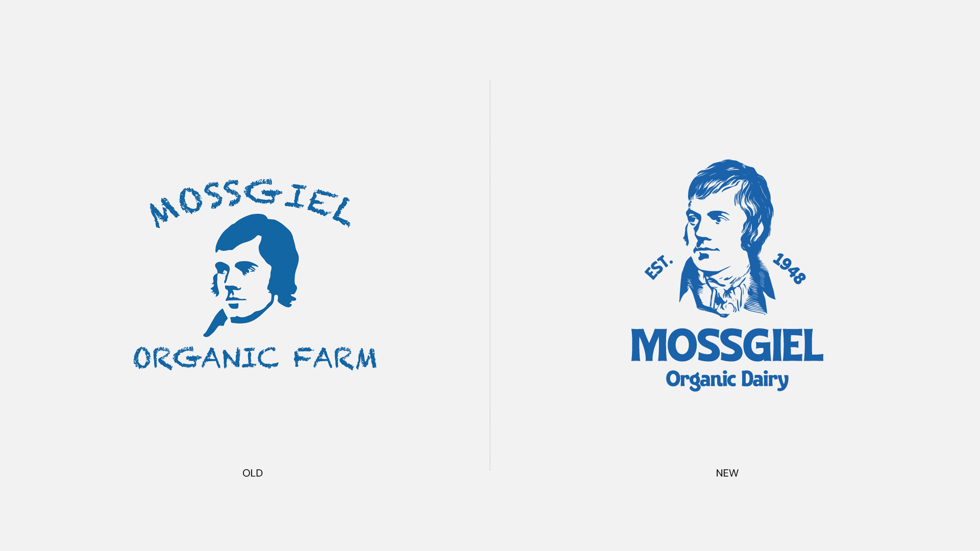
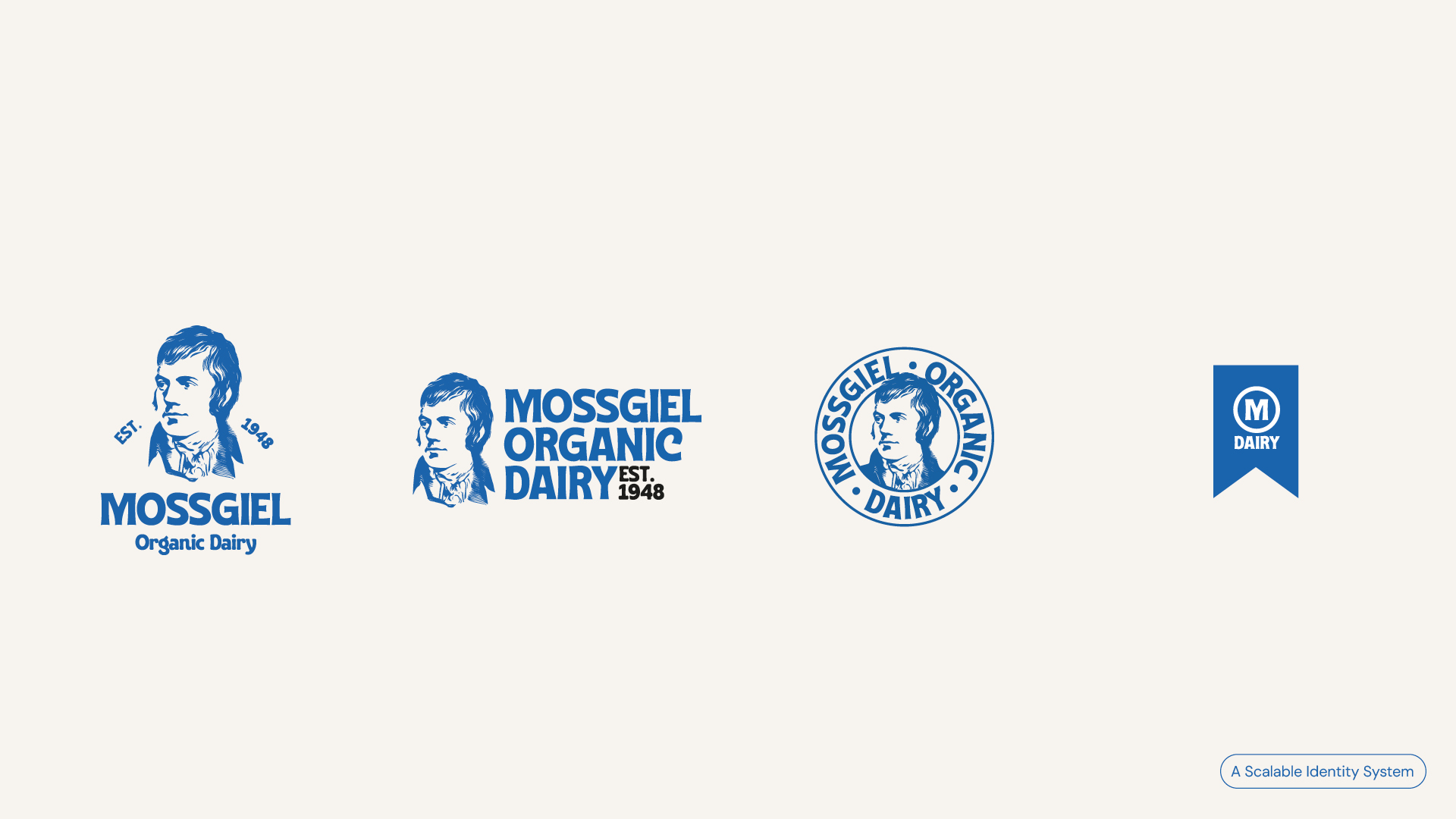
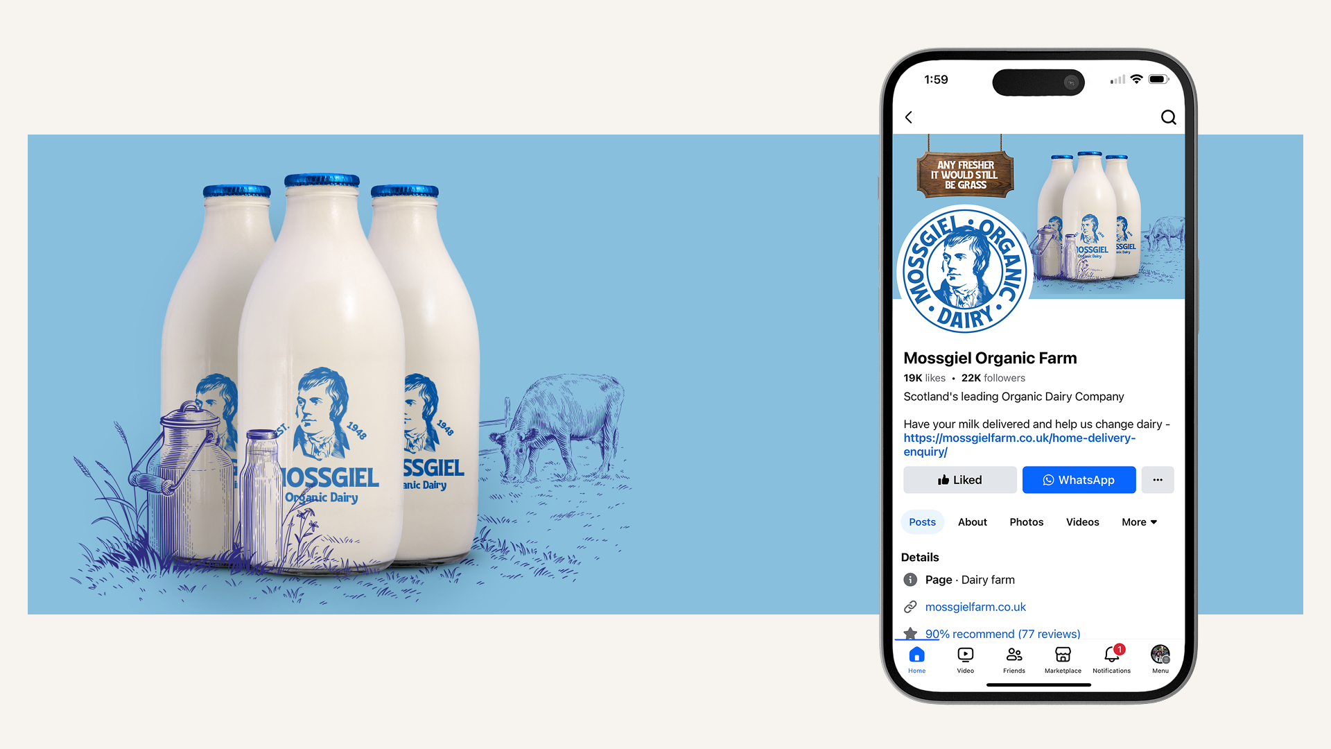
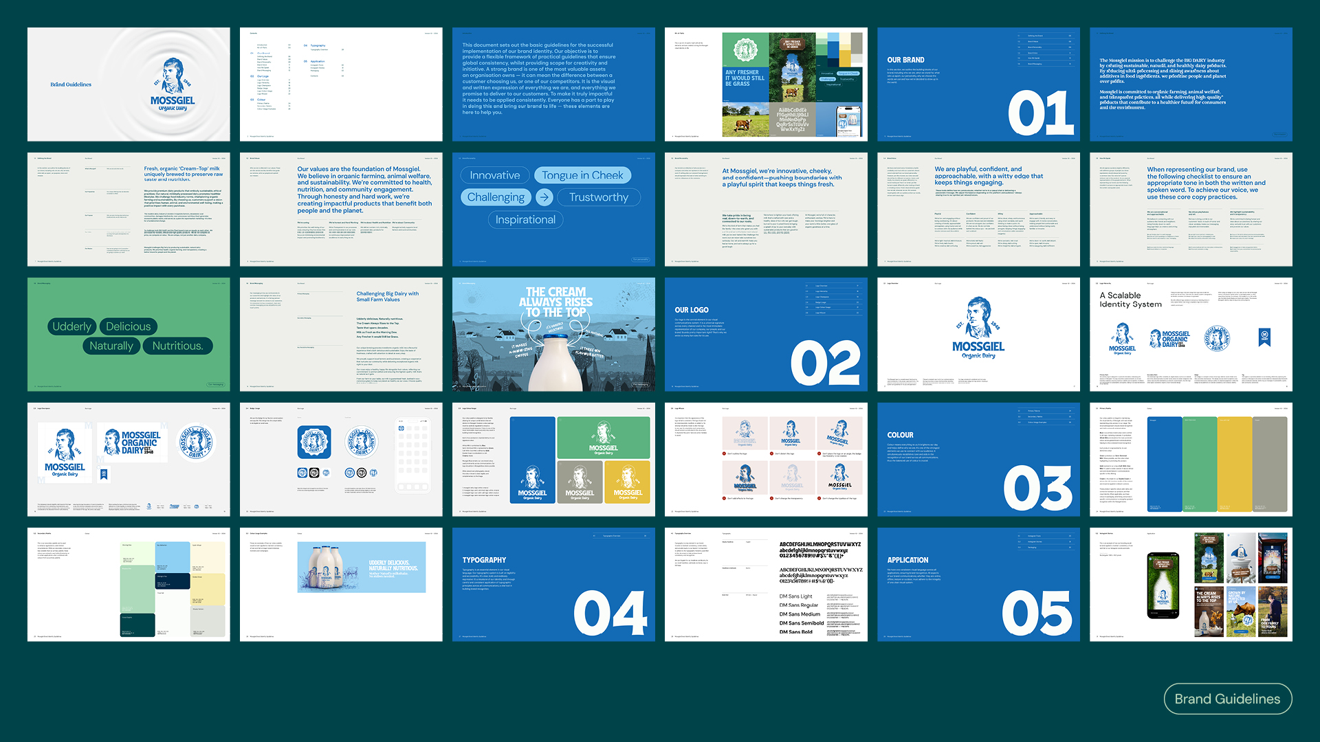
Process & Solution - Our approach began with redrawing Burns' portrait, capturing finer details while ensuring application clarity. This refined illustration became the centrepiece of a responsive logo system with landscape, portrait, badge, and tag variations to provide versatility.
Typography underwent a significant transformation, replacing a decorative but illegible chalk font with a bold, characterful typeface that improved readability while maintaining artisanal charm. We developed a strategic colour system featuring four primary colours tied directly to Mossgiel's main products, complemented by a secondary palette for flexibility.
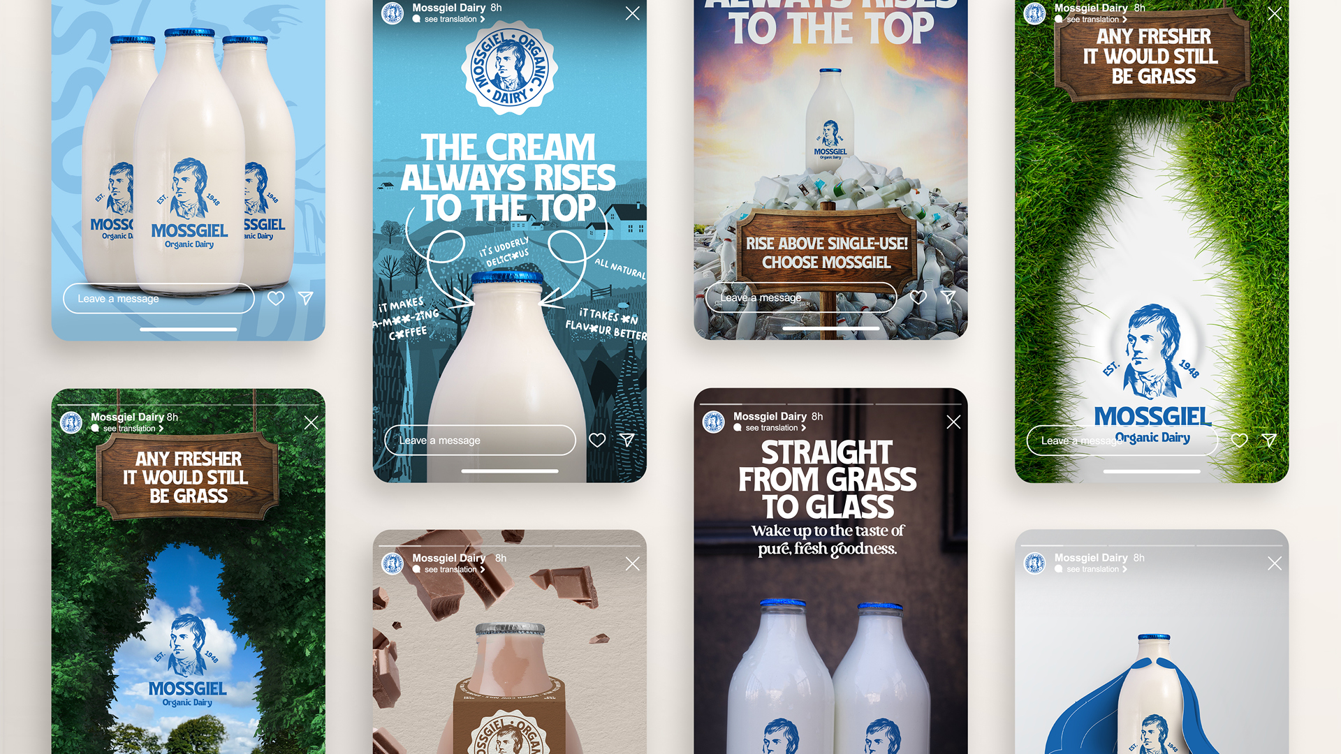
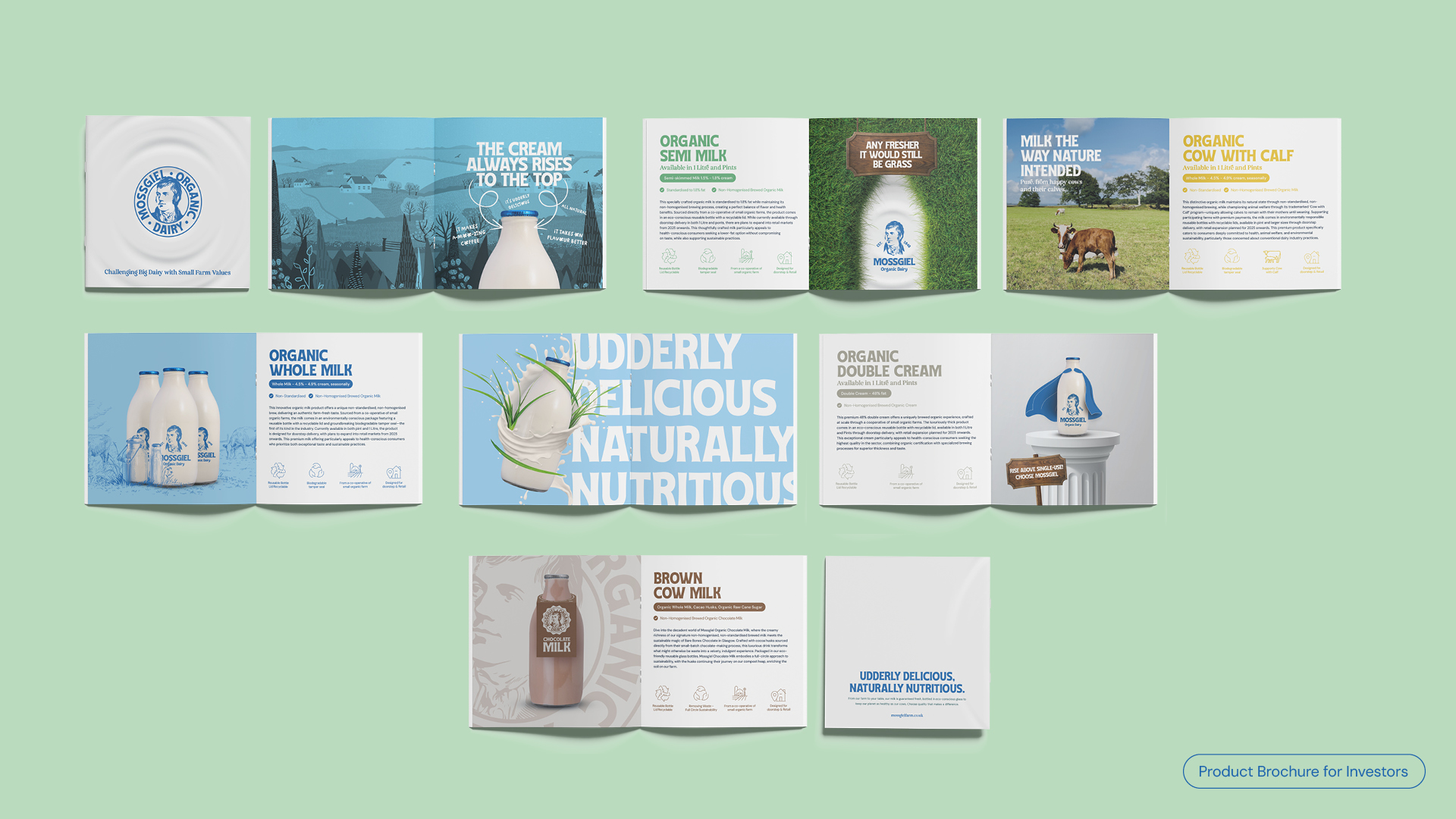
The brand voice evolved through a new messaging hierarchy that balances heritage with playfulness. Dairy-themed wordplay like "udderly" and meaningful taglines such as "the cream always rises to the top" reference their traditional cream-top bottles while adding personality.
Implementation followed a phased approach, beginning with social media where the brand has its strongest presence. A key innovation was introducing distinctive neck labels for their bottles, increasing visibility in the dairy aisle while creating a memorable consumer touchpoint. The rebrand continues to roll out across print materials, with the website being updated in the coming months
Impact—The refreshed identity has given Mossgiel Dairy a contemporary presence that honours its heritage while improving functionality. The responsive logo system and clear messaging hierarchy provide tools for communicating effectively across all channels. The new neck labels have proven particularly successful, helping Mossgiel products stand out in competitive retail environments.