Skintruth
Category
Brand Identity - Consumer
Company
Too Gallus
Client
Skintruth
Summary
When Skin Truth, a 20-year-old legacy skincare brand, came to Too Gallus for a revolutionary rebrand, they faced a unique challenge. As the trusted choice of professionals and a cornerstone of the beauty education industry, Skin Truth had built a reputation that spanned decades. But with ambitions for massive growth and the desire to enter the direct-to-consumer market for the very first time, the brand needed a transformation—one that would preserve its history while appealing to a new generation of consumers.
Enter Too Gallus.
Our team was tasked with capturing the essence of Skin Truth—its professional credibility, scientific expertise, and trusted legacy—while also crafting a fresh, modern identity that could resonate with everyday consumers. The result was a complete rebrand that encompassed strategy, language, visual identity, packaging design, web presence, and social media.
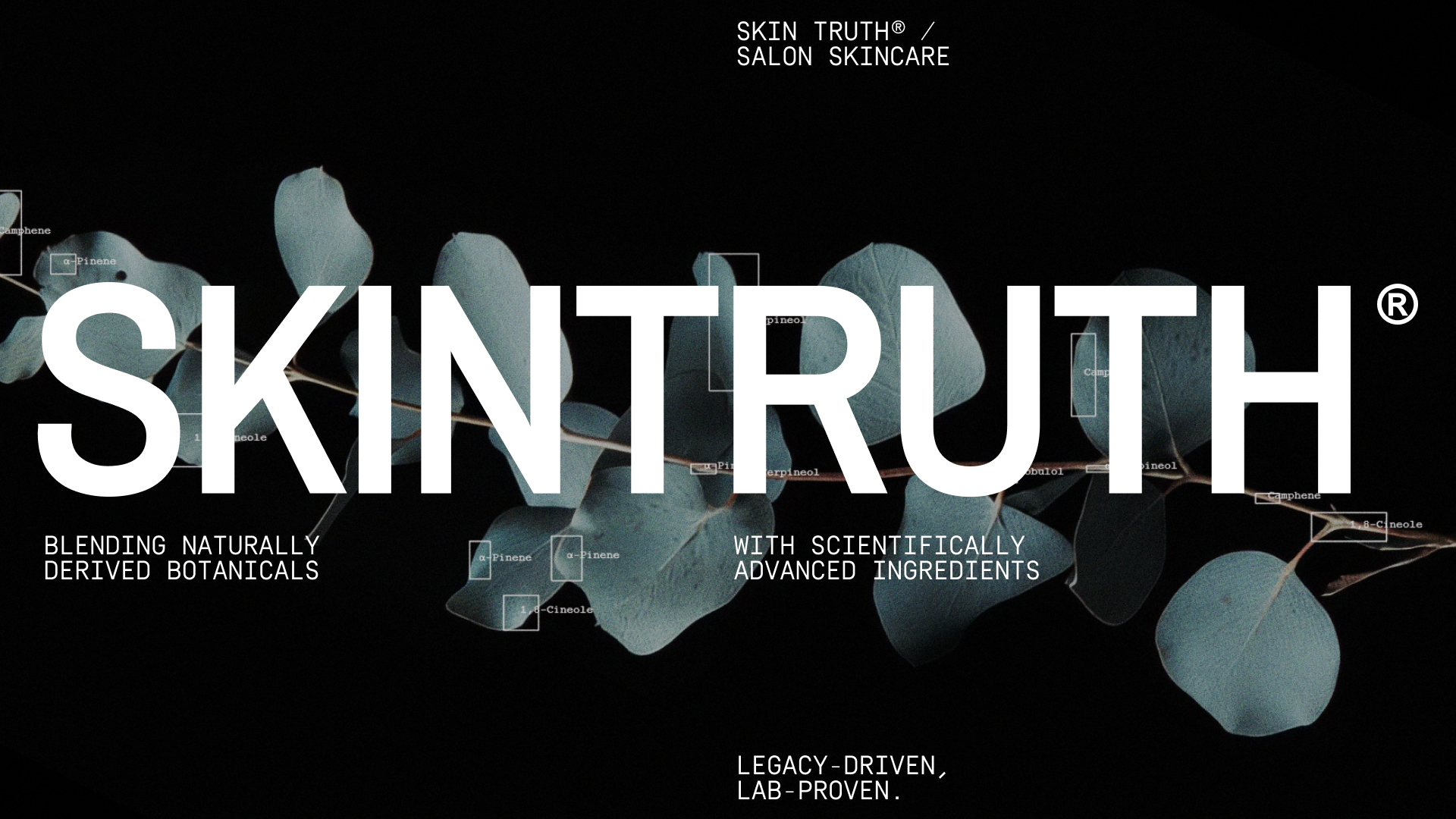
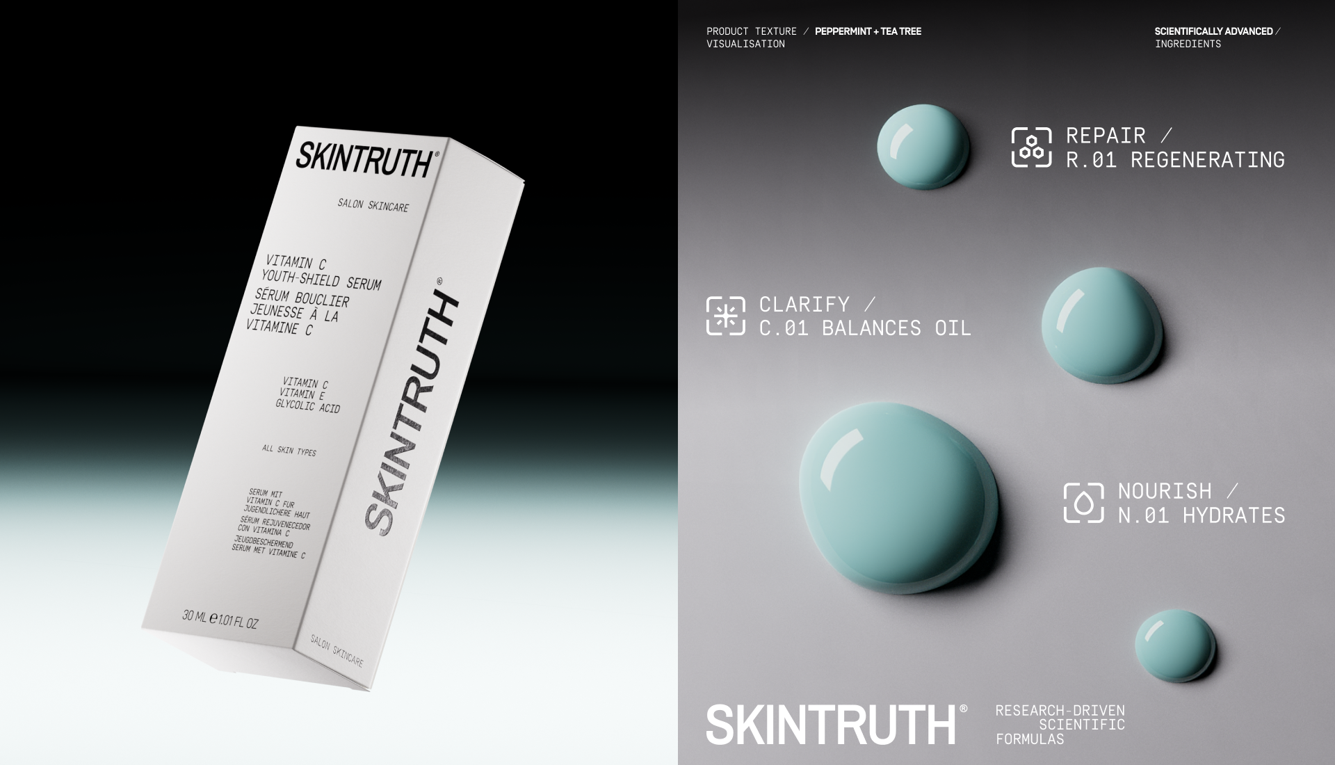
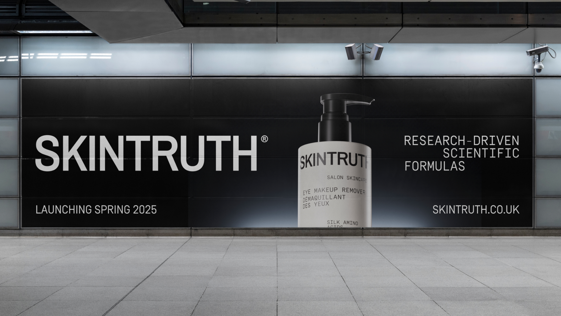
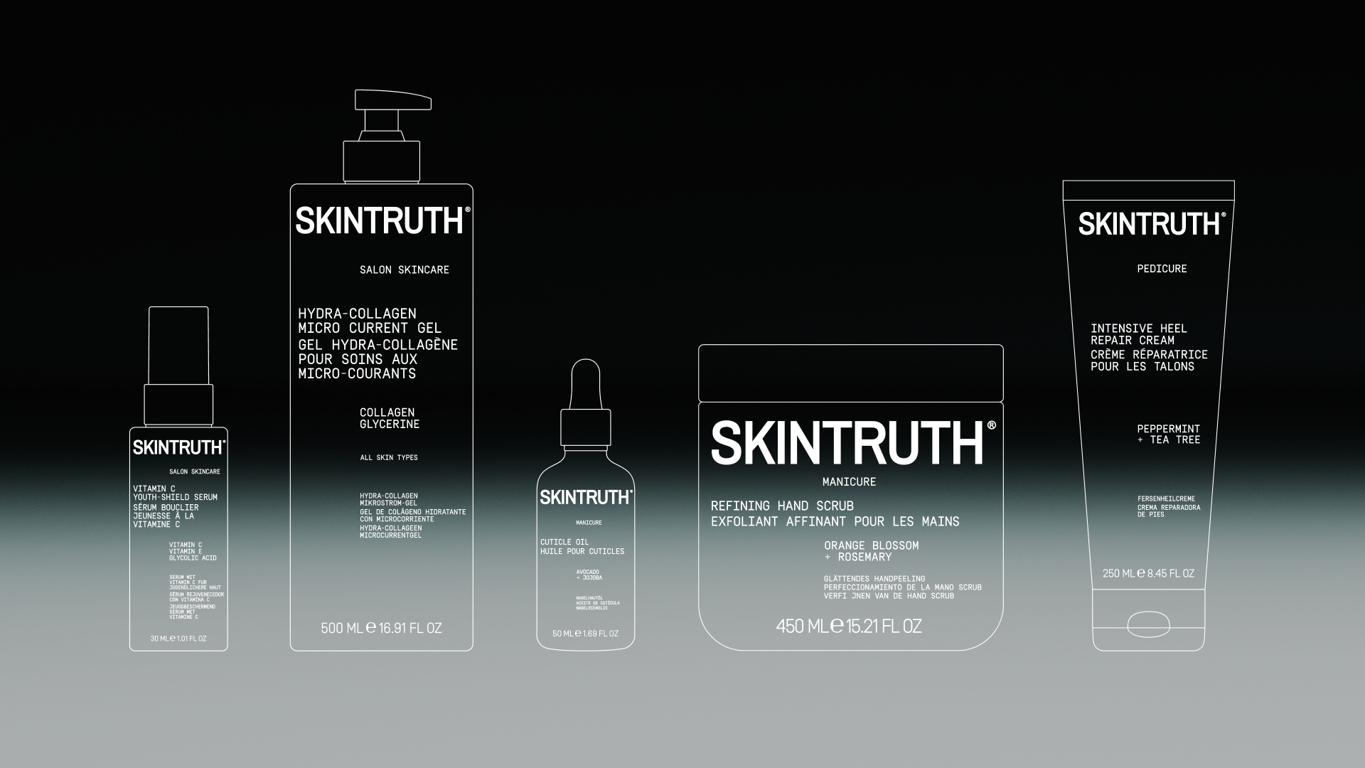
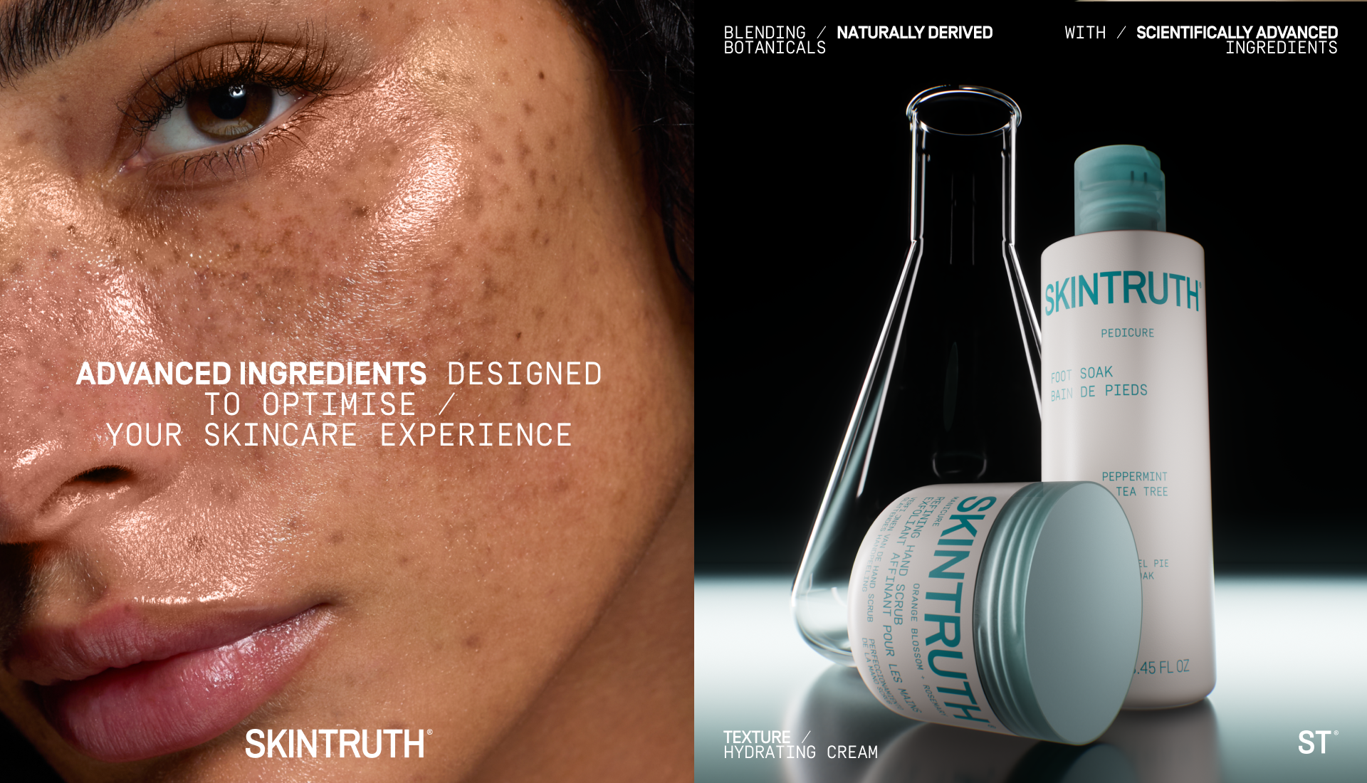
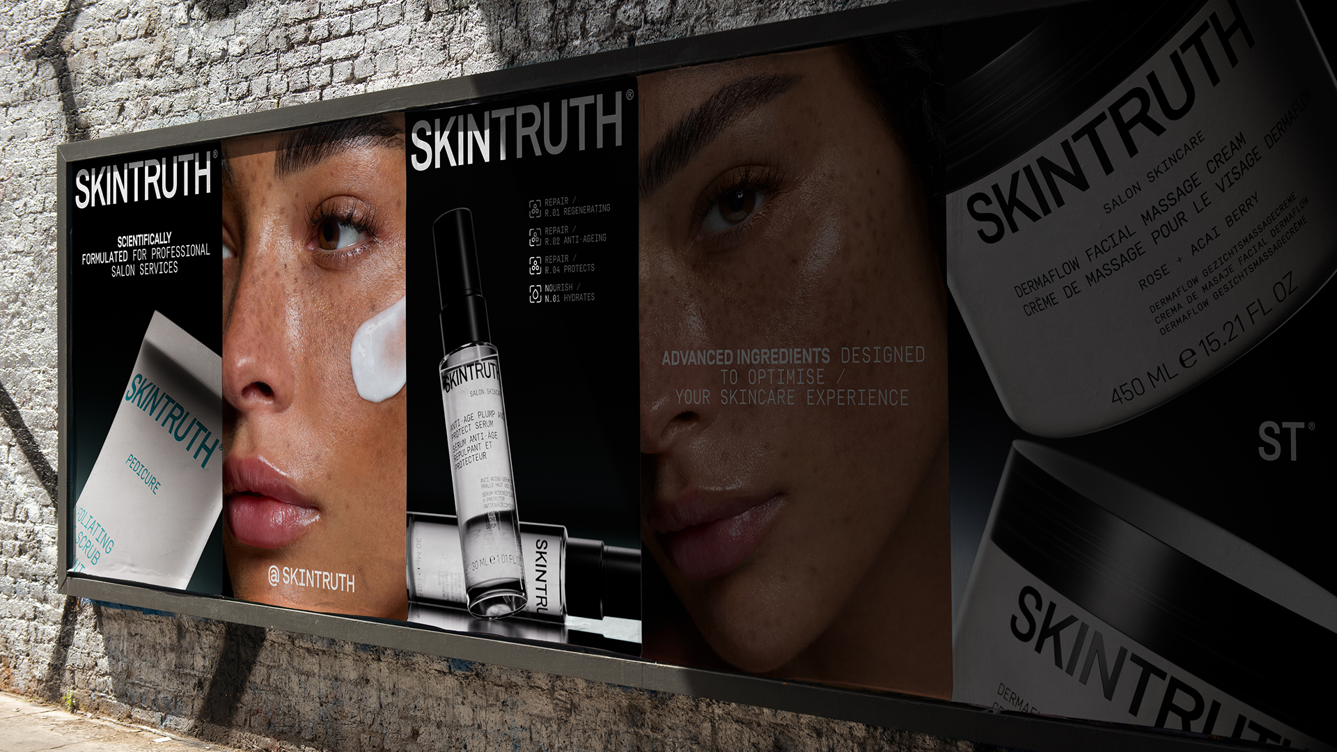
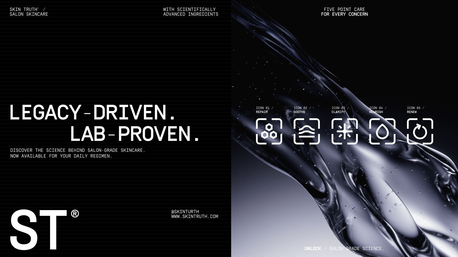
Skin Truth’s new identity bridges the gap between cosmetics and science, blending the brand’s legacy with the forward-thinking innovation that appeals to a wider, more diverse audience. The new visual language takes inspiration from lab notes, data, and research—establishing trust and reinforcing the brand’s credibility in the professional skincare space. From a complete overhaul of packaging for a 110 SKU range to a sophisticated and cutting-edge web experience, we redefined Skin Truth as a brand that leads the charge in skincare, defining the aesthetic for the next generation of professional beauty brands.
At the core of the design is a bold and structured type system. Using a grid-based approach, the typography offers flexibility while maintaining a strict brand aesthetic, allowing Skin Truth to create a striking, memorable look across all platforms. The system is expansive, adaptable, and scalable—enabling Skin Truth to communicate with a vast range of products and consumers, from professionals to everyday buyers.
The monochromatic colour palette serves as a strong, modern foundation, with the inclusion of two distinct accent colours derived from the brand’s legacy: a punchy teal for pedicure products and a vibrant orange for manicure offerings. These carefully chosen hues maintain a connection to the brand’s roots while providing the visual impact necessary for a bold new direction.
Skin Truth’s rebrand is more than just a visual transformation—it’s a strategic shift that has positioned the brand to thrive in the direct-to-consumer space while staying grounded in its professional skincare legacy. Too Gallus didn’t just redesign a brand; we reimagined its future.