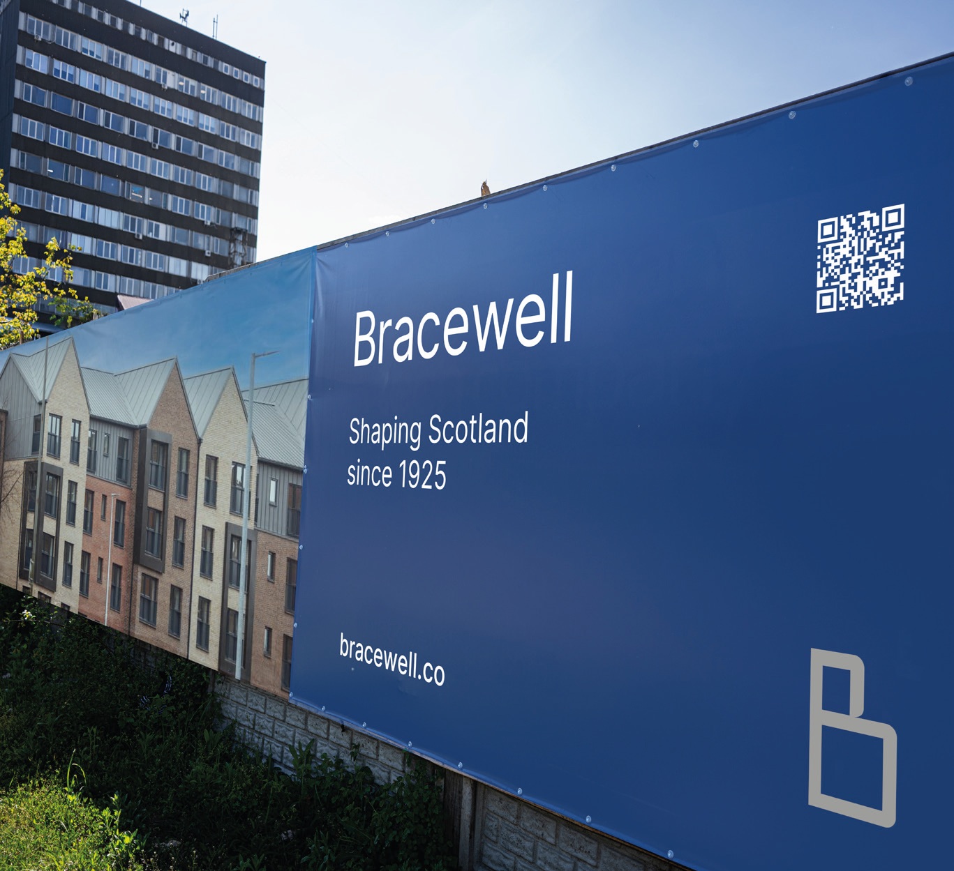
A well-established architectural business is looking to the future with confidence after unveiling a centenary rebrand to reflect its multi-service capabilities and rich heritage.
Bracewell, formerly known as Bracewell Stirling Consulting, has developed a more concise identity without losing sight of its roots as it goes through a period of rapid change.
Founded in 1925 by Arthur Bracewell, the business recently relocated its HQ to Stirling Business Park to better manage its expanding role in the masterplanning, energy and commercial sectors, a period which has seen its staff count jump from 21 to 31 over the past year to keep pace.
Bracewell senior partner, David Keith commented: “Bracewell is more streamlined and fitting with our vision for the future of the practice, while still staying true to our distinguished heritage and reputation for a quality service that our clients have come to expect.”
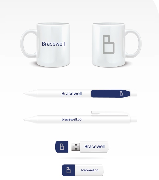
The new identity extends to signage, communications and centres on a new logo set in a distinct ‘inter’ typeface with a standalone graphic letter B to provide greater flexibility of application.
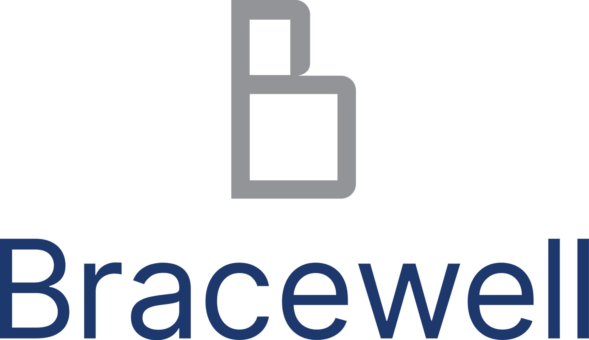
Gregor McNish, creative director at Tide Graphic, said: “Designing the new Bracewell identity was a collaborative process from the start. We explored a range of visual directions before landing on a hybrid system that balances a distinctive icon with a bold logotype, allowing each to work independently or together as the context demands. Bracewell were keen to play an active role in shaping the icon itself, and we worked closely to refine a mark that not only reflects their architectural heritage but also feels modern, enduring, and uniquely theirs.”
Bracewell Stirling recently joined investment firm GEG Capital as part of its consultancy group.