Heritage – Dear Green Place and the Emerald City
Commendation
Images

Category
GRAPHIC: Item of Self Promotion
Company
Fourtwentyseven Design
Client
Fourtwentyseven / Ken Dundas
Summary
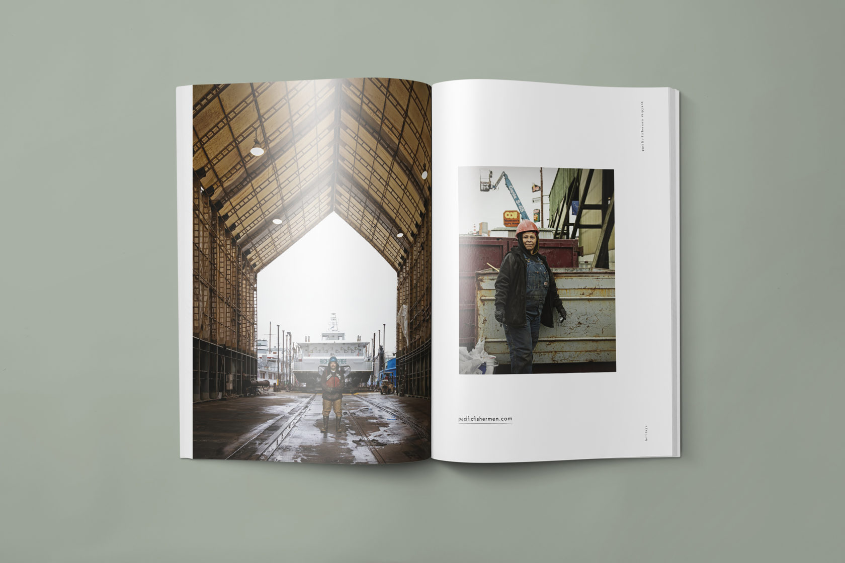
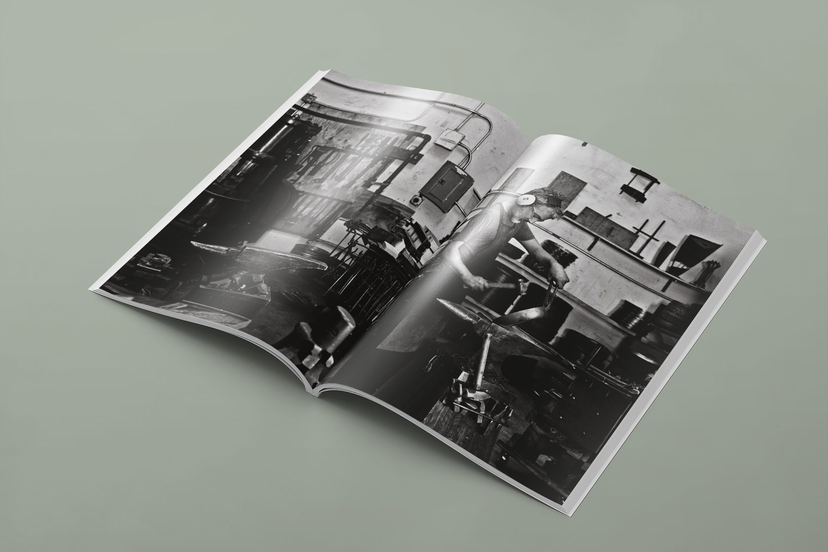
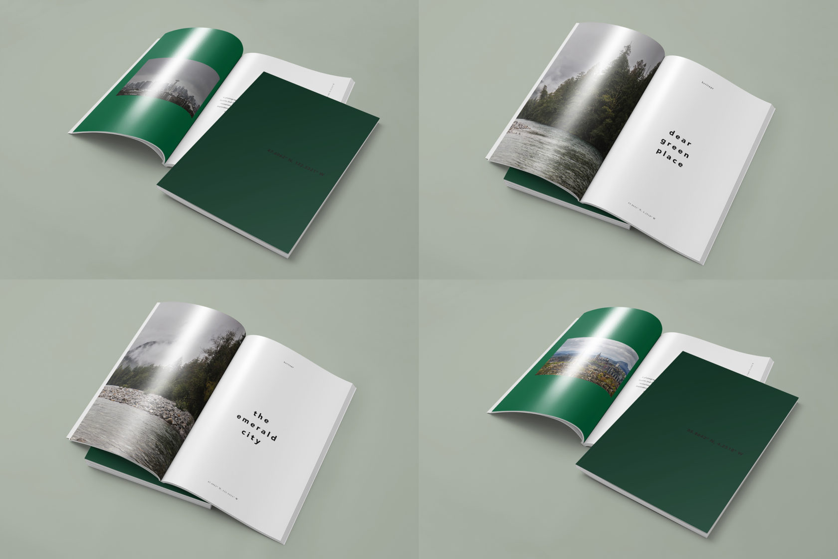
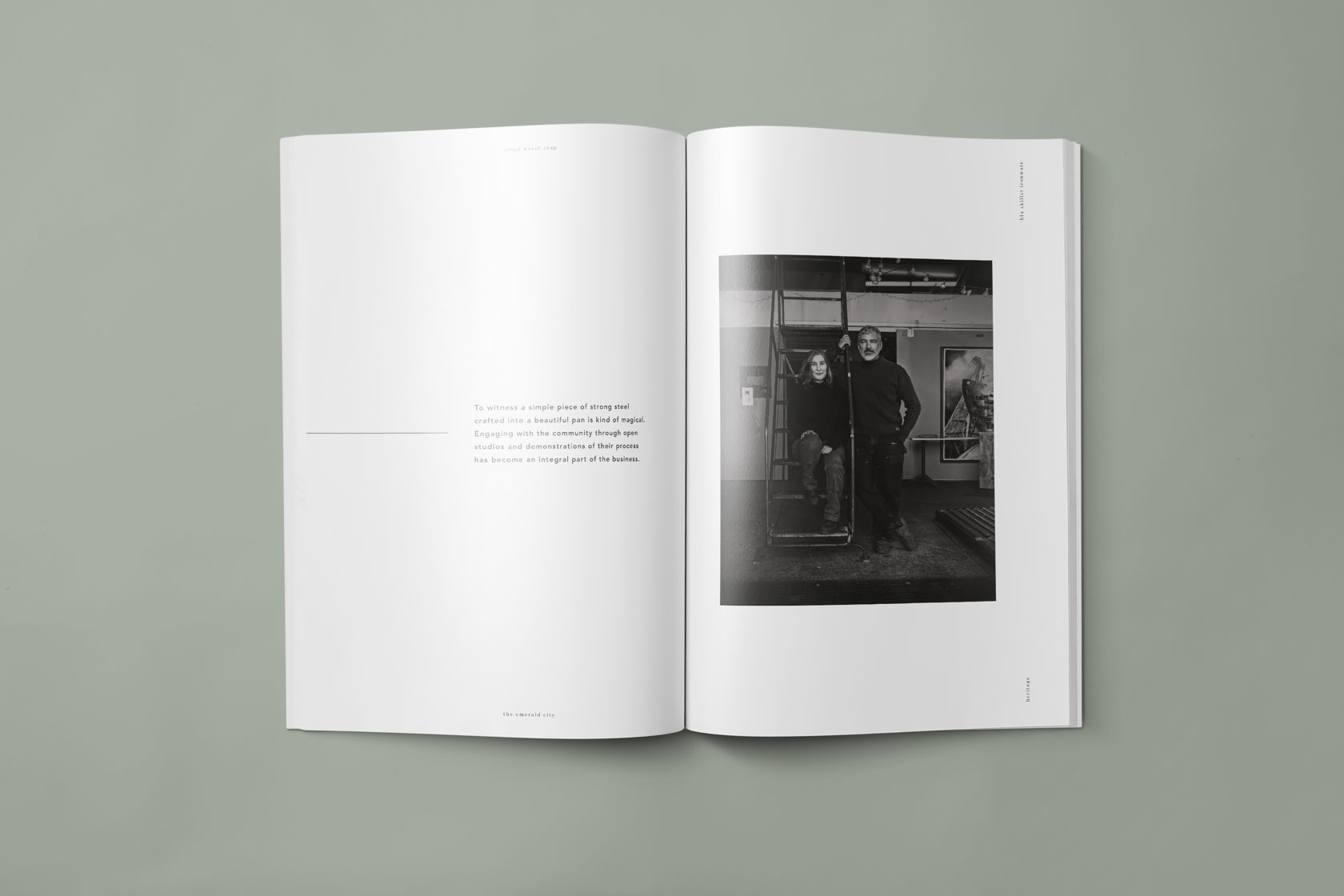
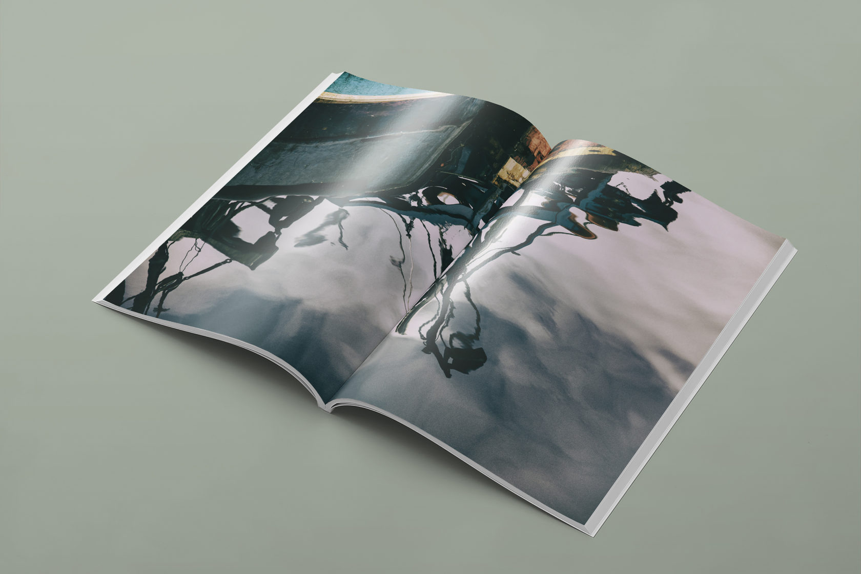
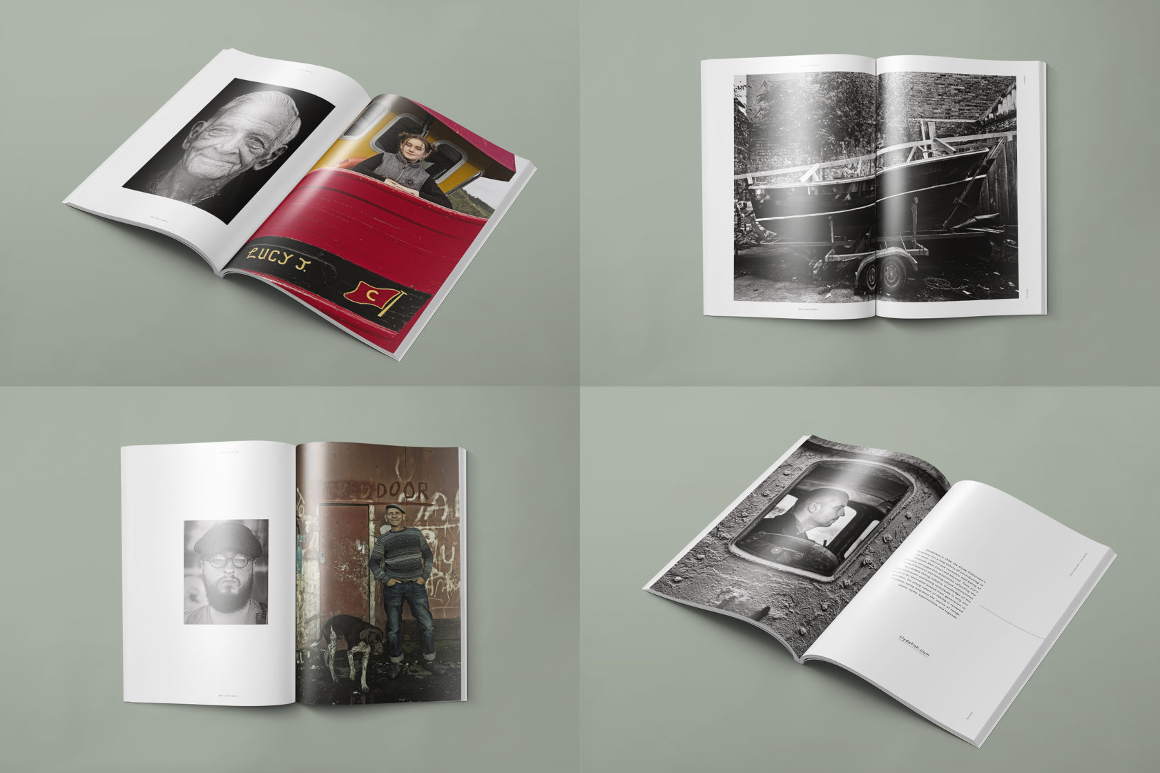
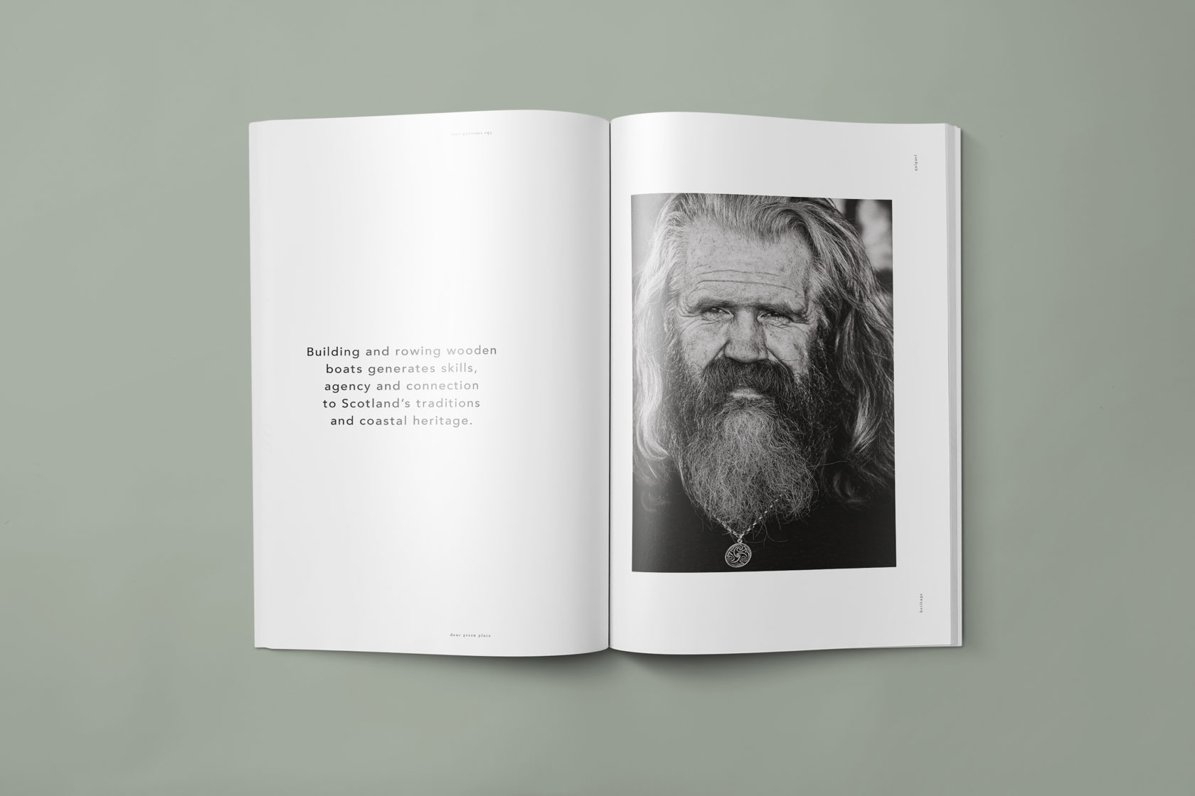
Heritage is a collaborative piece we undertook with Seattle based photographer Ken Dundas in order to promote our studio and the services that we can offer. Ken was the perfect portrait photographer for this project because we felt his distinctive style was a perfect fit for the tone of the concept and how we wanted to promote ourselves with this project.His gallery includes James McAvoy, Emma Thompson, Sam Heughan, David Lynch, Robert Carlyle and Alan Cumming. His work was celebrated in 2012 with a solo exhibition at the Scottish National Portrait Gallery and to date has his work exhibited there four times.We had developed a concept around the similarities between Seattle, The Emerald City, and Glasgow, The Dear Green Place. The project explores the connection between the two west coast locations. Inspired by the parallels between each location and the unique colour palette, climate, stylings and cultural history of each city.After discussions, the concept was refined into a project that sought to explore the indigenous trades from both cities. The sea plays an integral part in the development of each city and this was a thread that linked them directly. Natural resources abound in each environment and the industry in each location is innately crafted by and dependent on a green environment that defines the very nature of both Seattle and Glasgow.This project is a tale of two cities on the wet and wild West Coast, highlighting tradition, personality, expertise, superstitions and legends. They remain a home to highly skilled tradesmen, from shipwrights to carpenters, metalworkers and fishermen. Through documenting these trades and telling the stories of the individuals who carry on the traditions, the piece also highlights the people and essence that defines each locations character.We combined the beautiful imagery with a sympathetic layout, subtle typography and hints of green to point at the descriptors for each city. Quotes from interviews with the subjects was included with several small parts used as pull-out quotes to accentuate the design. The document is split into two parts, one for Seattle and one for Glasgow, which require the user to turn when halfway through, with the two covers featuring the latitude and longitude of each location.The final product was used as showcase of our studio capabilities and was sent out to our clients as a promotional piece.