Esker Gin
Images


Category
GRAPHIC: Packaging
Company
Parkhouse
Client
Esker Spirits
Summary
Having worked with Esker for a number of years, and having established their position as a premium Scottish gin brand with distinct branding and iconic bottle designs, the challenge was how to grow market share against the ever increasing number of gin brands coming to market.
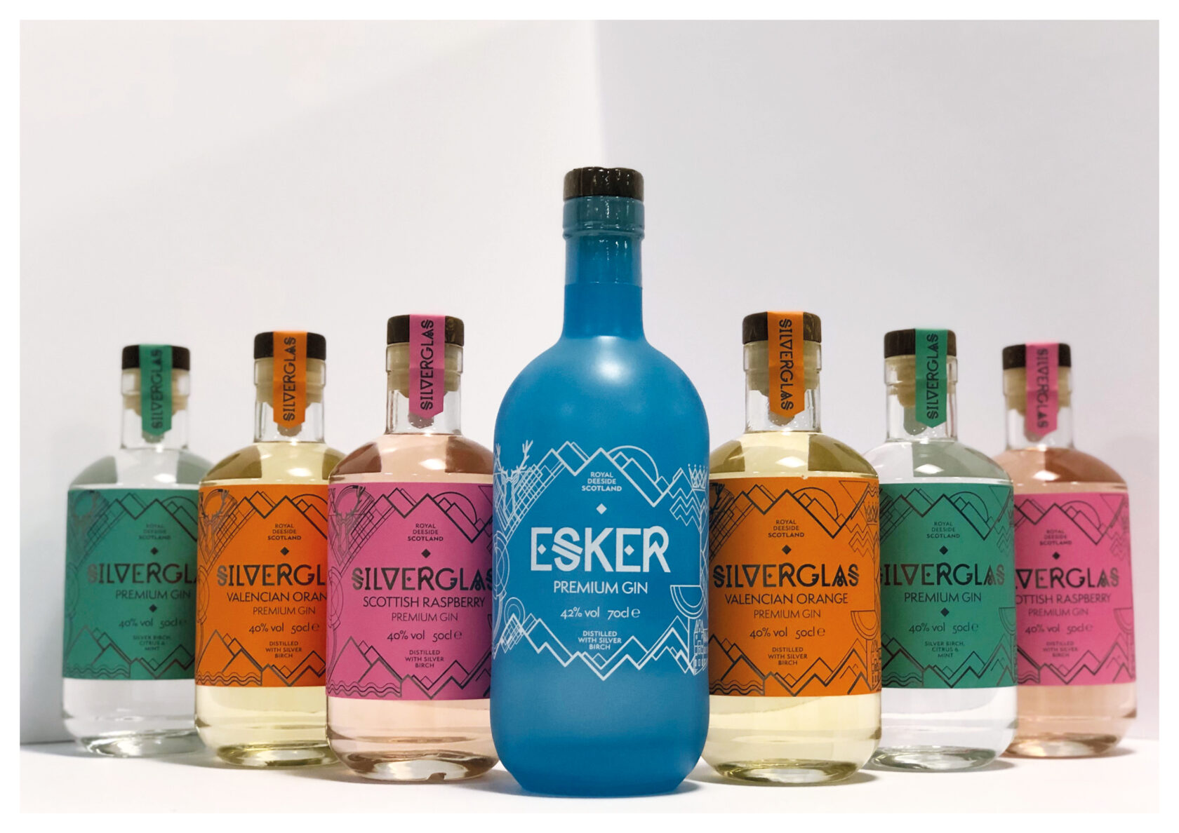
Esker expanded their product range, and to coincide with this, we revamped the design on the core Esker Gin bottle and extended the look and feel across their Silverglas range. The products are also being stocked in an ever increasing range of stockists, and now ranging up to large volume retailers.
The aim was to create increased shelf presence within these new retailers without losing all the qualities that have established Esker’s premium position to date.
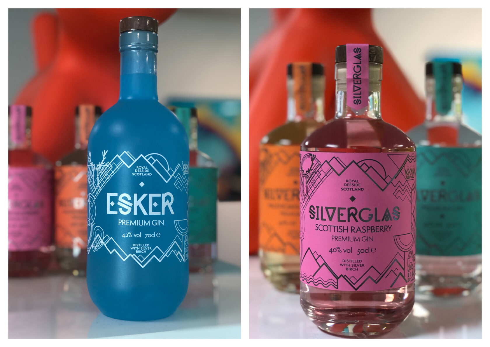
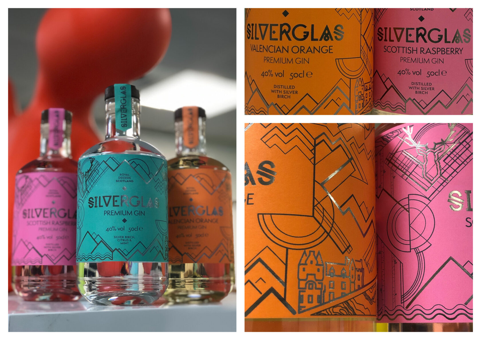
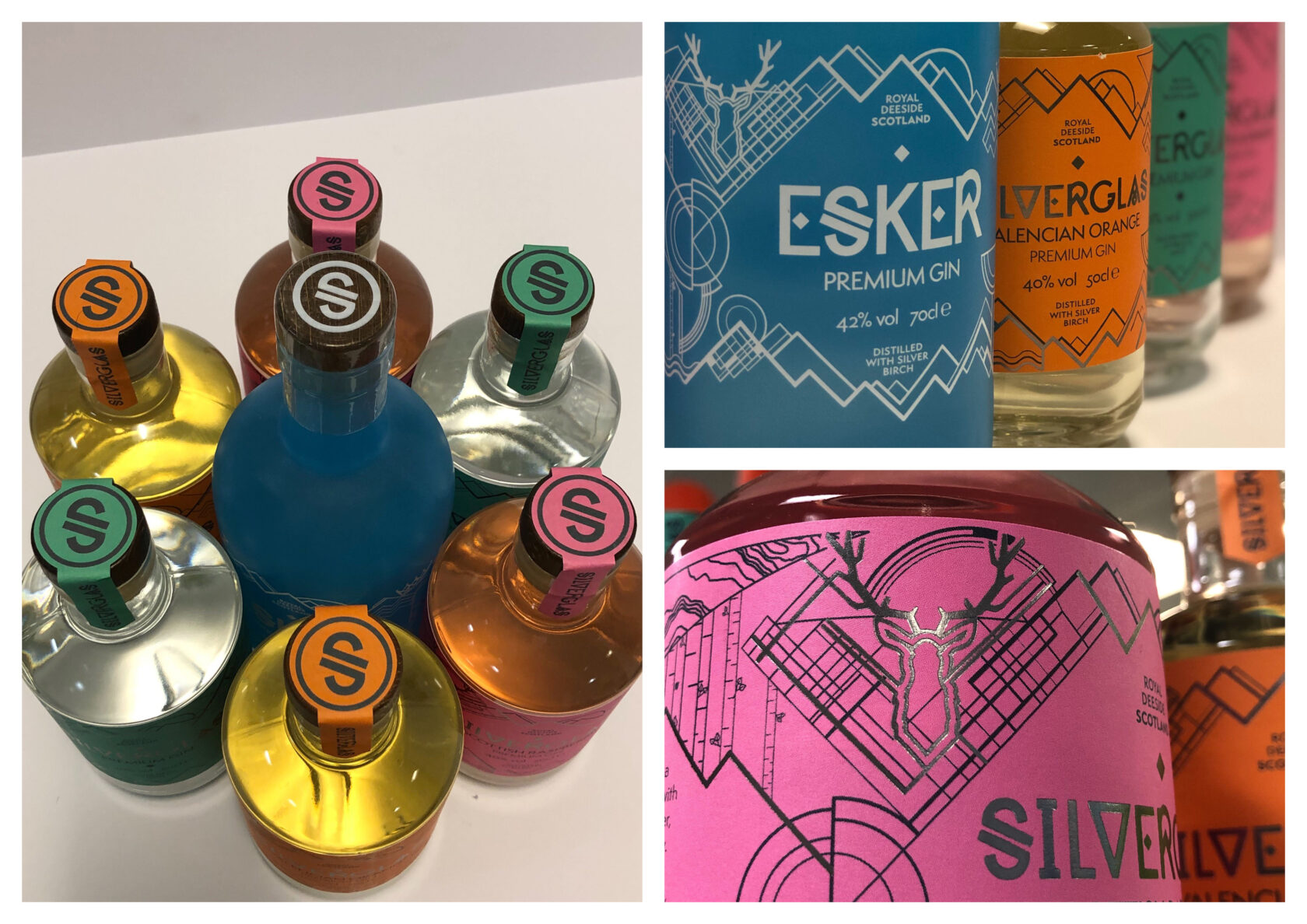
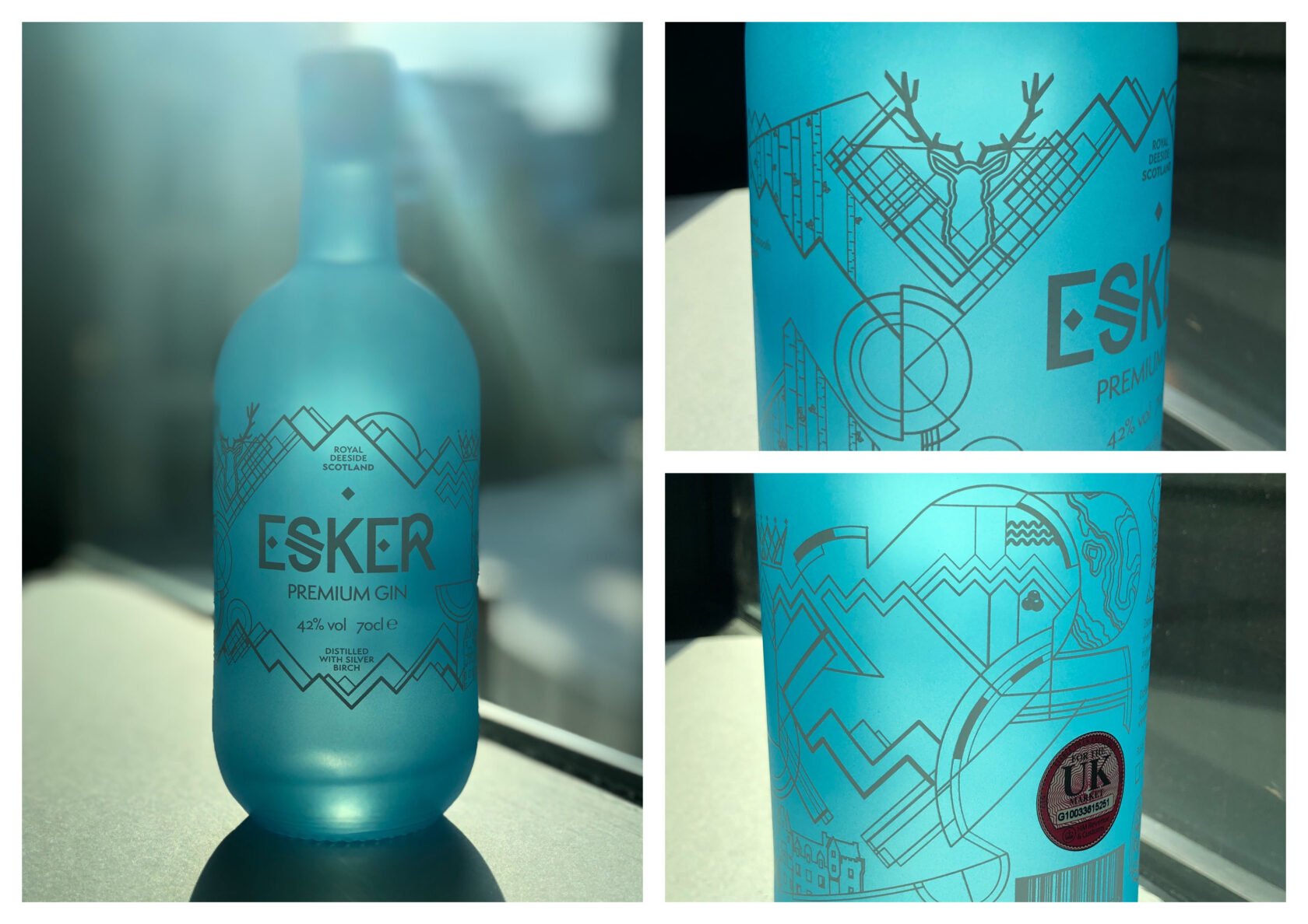
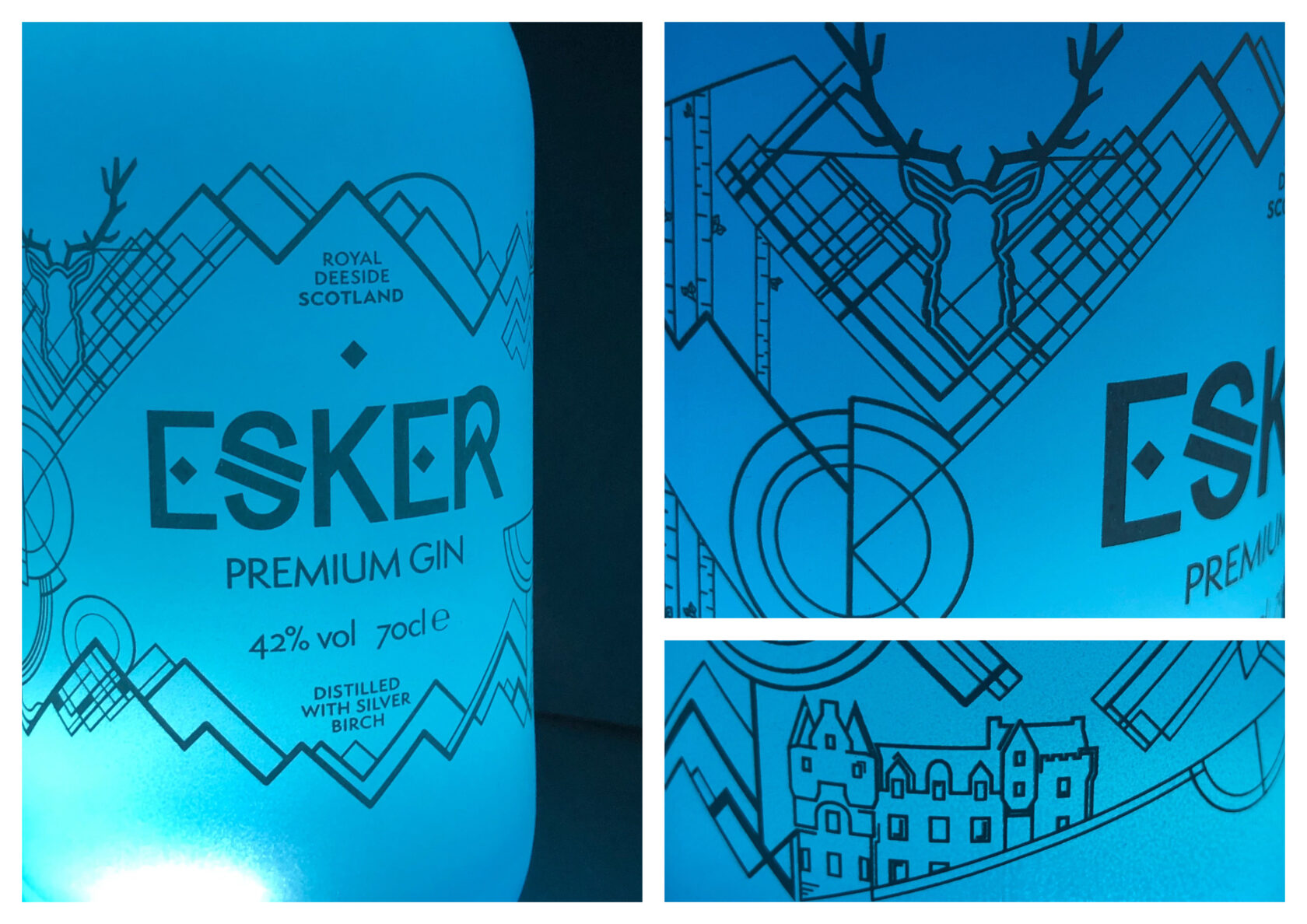
The illustrative pattern, inspired by the Esker name which describes the long glacial ridge (or ‘esker’) found nearby, was reworked with bolder lines and clearer representations of the local Cairngorm Mountains. New illustrative elements were created to represent Esker’s location. The stag and abstract tartan represent Scotland, while the crown and Kincardine Castle illustrations identify the Royal Deeside area that provides the locally sourced botanicals.
The bottle itself is finished in blue as a continuation of the core Esker brand colour, and of the crisp fresh mountain water used in production, and provides the strong contrast to the white, direct to bottle, printed design.
The design is adapted to the Silverglas range where the label colour reflects the flavour of the gin it represents. The Silverglas labels are finished with a dark grey foil and matching watchstrap seal.