Cycling Scotland poster
Images
Category
GRAPHIC: Poster
Company
Touch
Client
Cycling Scotland
Summary
We led the Cycling Scotland team on a series of brand workshops that gave us an insight into their organisational structure, opportunities and challenges in communicating with their audience.
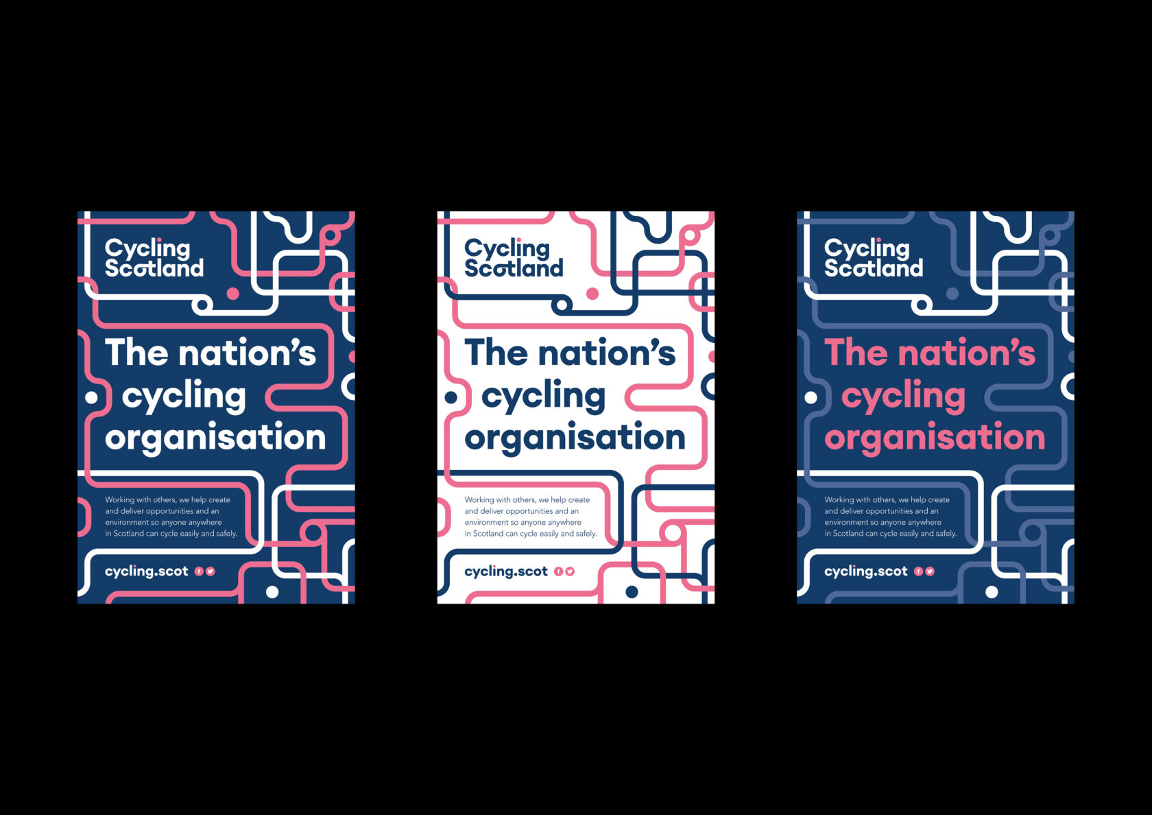
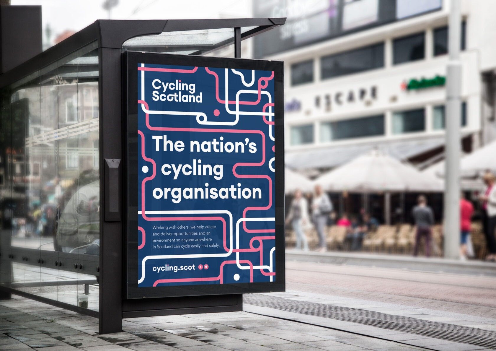
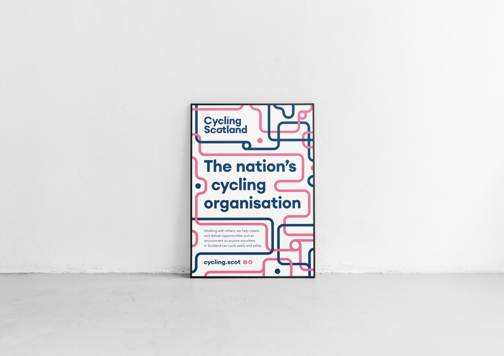
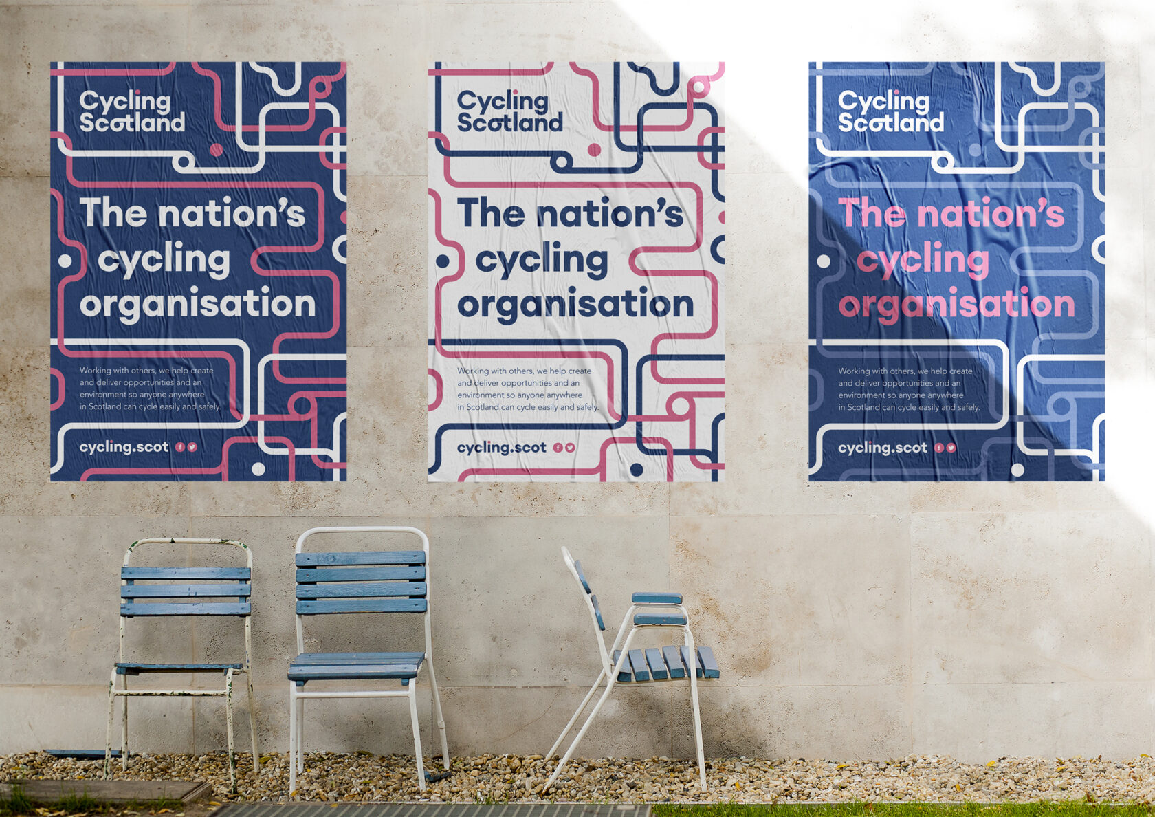
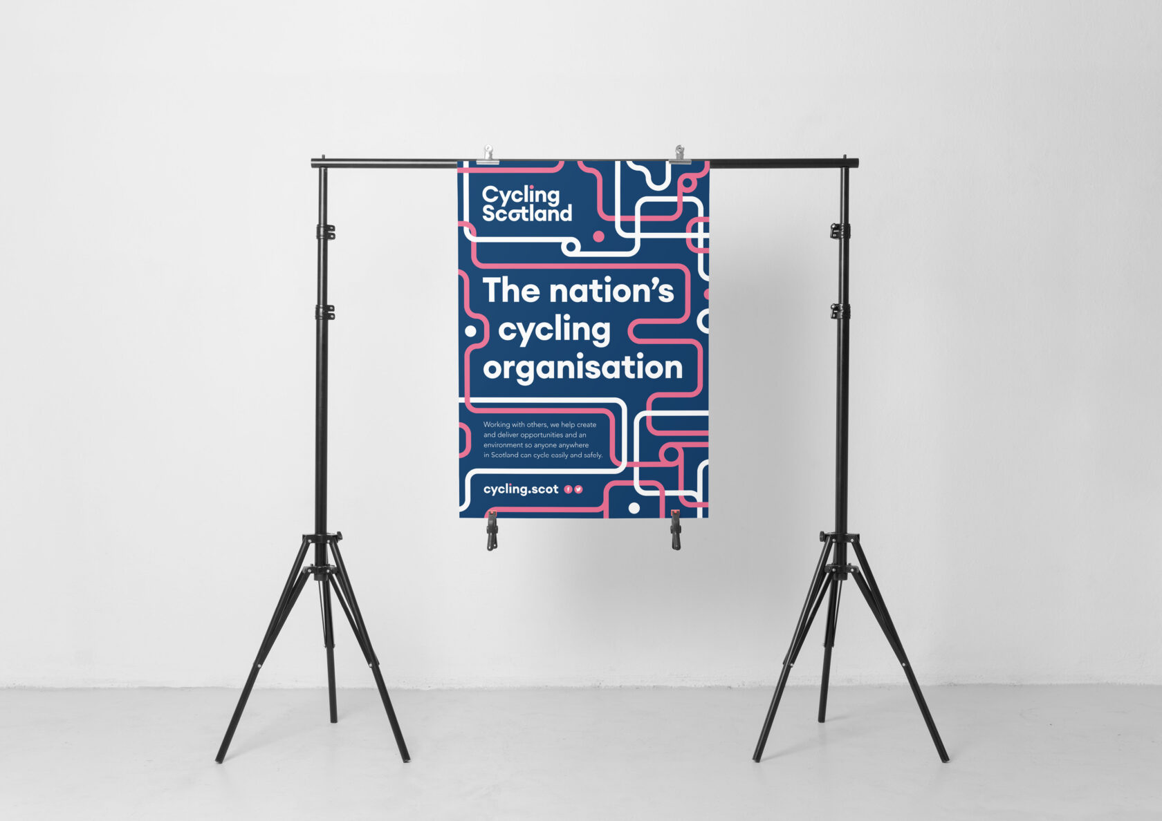
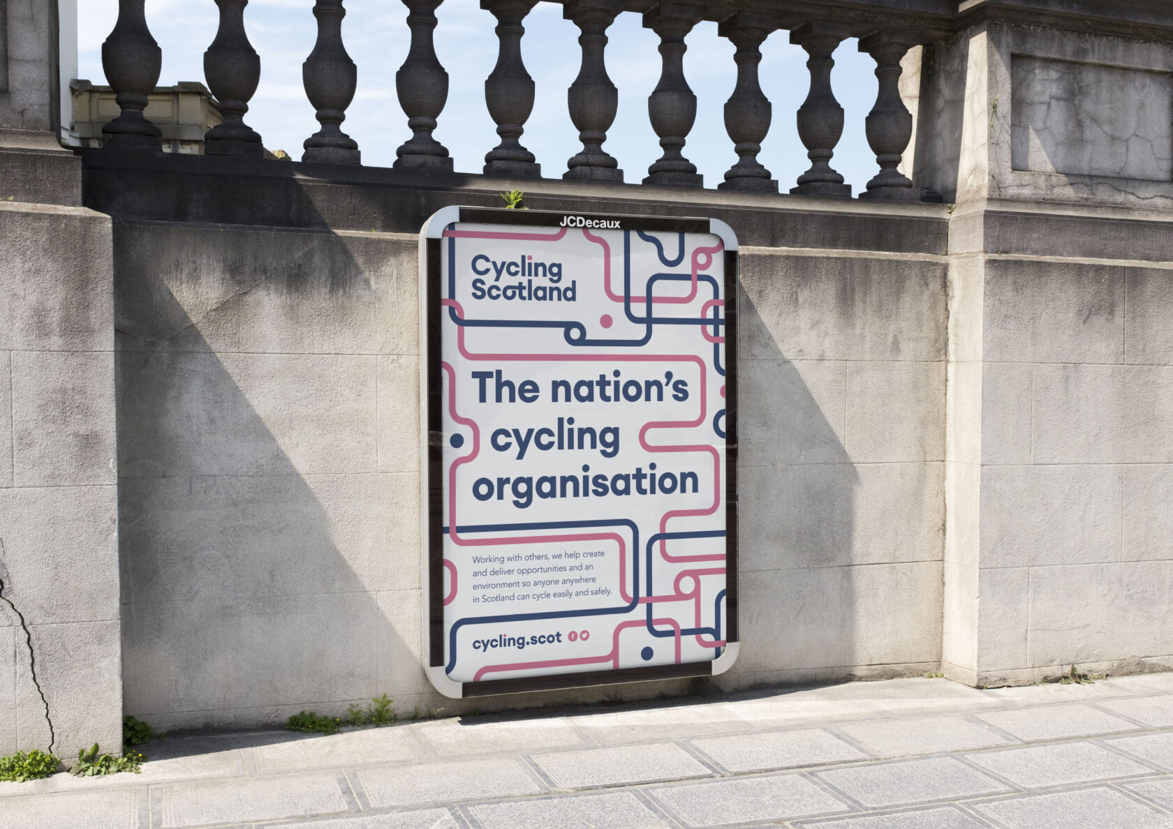
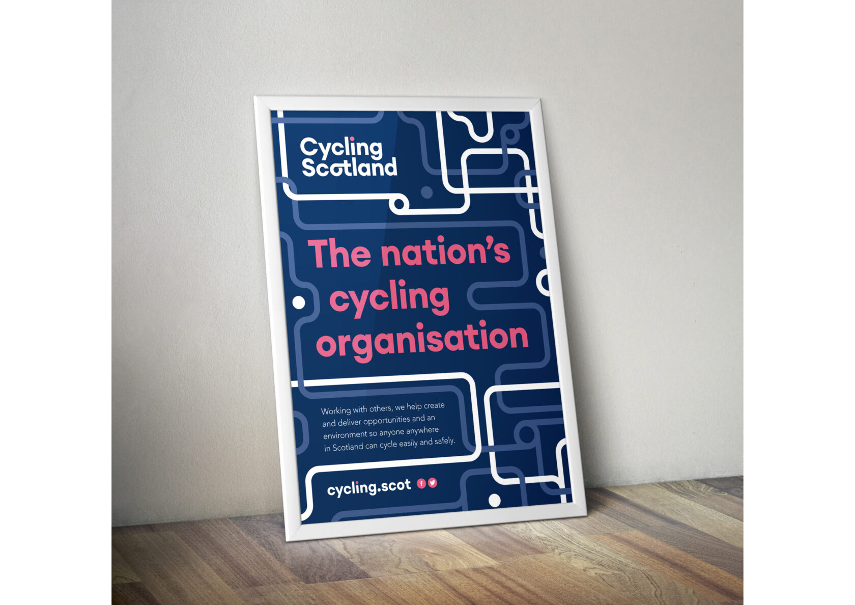
Inspired by connection and collaboration, the new visual identity employs modern, friendly typography, customised with ligatures that suggest connectivity. These provide the basis of a unique typestyle to bring unity to the organisation’s programmes and brand family. The predominantly blue colour palette reinforces Cycling Scotland’s position as the nation’s cycling organisation, with hi-viz pink elements providing highlights.
We balanced inspirational typography with statistics and results communicated in clear and engaging infographics. In keeping with Cycling Scotland’s values on sustainability, the printed posters are produced responsibly and certified under the FSC system.
0