The Scottish National Investment Bank
Commendation
Images


Videos
Direct link: https://vimeo.com/483041587/ea13afcdf1
Direct link: https://vimeo.com/483042088/77706af470
Direct link: https://vimeo.com/563639034/b43ead9626
Category
GRAPHIC: Brand Identity
Company
Freytag Anderson
Client
The Scottish National Investment Bank
Summary
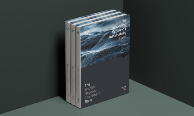
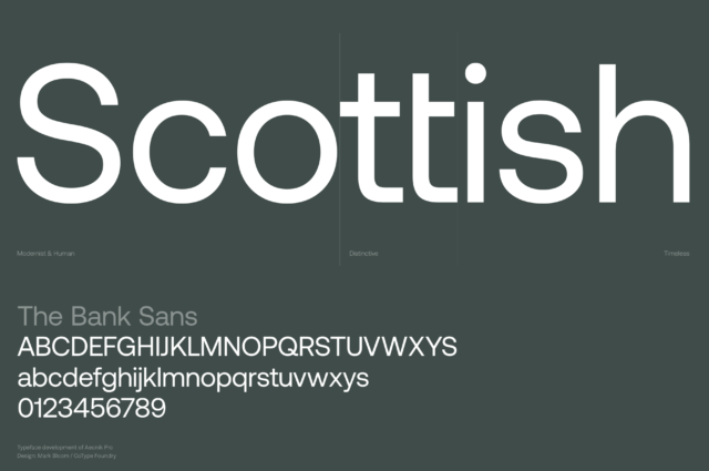
An ambitious new development bank for a better Scotland. The Scottish National Investment Bank is an entirely new mission-led institution for Scotland. Its primary objective is to invest in projects and businesses to deliver its missions and provide a commercial return for the benefit of the people of Scotland.As the name clearly provided a Scottish context, we wanted to avoid having any additional traditional Scottish cues. We felt that there were more interesting and original ways to express what it means to be Scottish in 2020. We wanted to create a contemporary vision of Scotland, new and positive but deeply connected to its people and natural environment.The name itself was a bit of a mouthful. In order to avoid people shortening it to SNIB, we placed 'The' at the front, thereby creating a shorthand version of the name - 'The Bank’. As an entirely mission-led institution, it was important that The Banks missions were at the heart of the brand. To do this we developed a dynamic and flexible identity system by highlighting the words 'The' and 'Bank', and placing evocative mission statements within the logotype.The logotype is supported by 'The Measure', an iconic graphic device inspired by The Banks primary missions of equality, sustainability and innovation, whilst also referencing the Scottish landscape. Colour, type, photography and a graphic framework combine to create distinct visual narrative for Scotland's first development bank.
