Finn Thomson Whisky – Craft
Images


Videos
Direct link: https://vimeo.com/699405339
Direct link: https://vimeo.com/699409066
Direct link: https://vimeo.com/699405445
Direct link: https://vimeo.com/699405495
Direct link: https://vimeo.com/699405237
Direct link: https://vimeo.com/699407403
Direct link: https://vimeo.com/699403097
Category
DESIGN CRAFT: Craft - Incorporating: Photography, Typography, Illustration, Copywriting
Company
Form Digital
Elsk
A total creative collaboration - Elsk & Form
Creative Director & Strategist, Reeve Rixon, Elsk
Creative Director, Mark Gordon Form
Special collaboration partners
Creative Director Tom Lane ,
Creative Producer, Tom Booth
Account handler, James Young
Cinematography, Will Gardner / Simon Williamson
CGI Director, Peter Moore
Client
Finn Thomson Whisky
Summary
Eye On The Past, Vision For The Future
Bringing the Finn Thomson Whisky brand to life required boundary-pushing bottle packaging and manufacture. We worked closely with production partners across both industries to defy expectations and authentically reflect the brand’s unique identity.
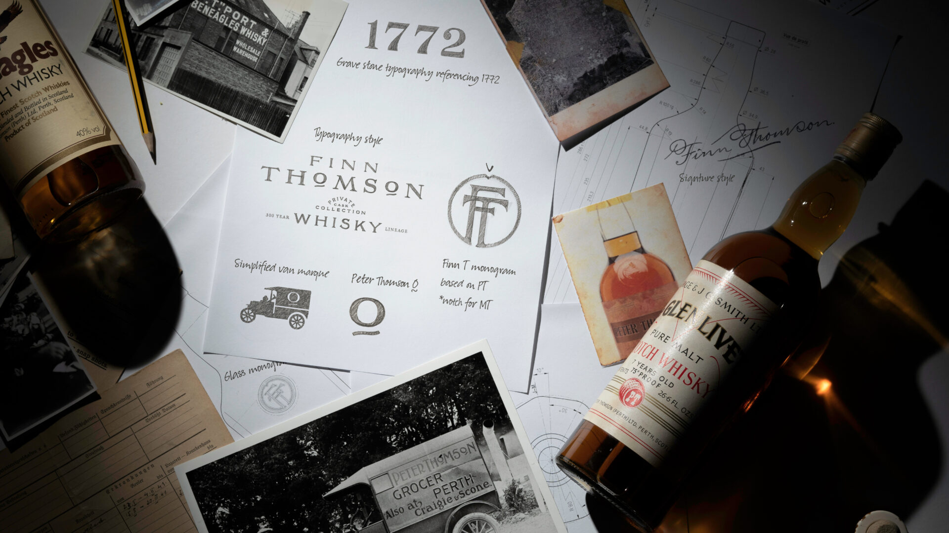
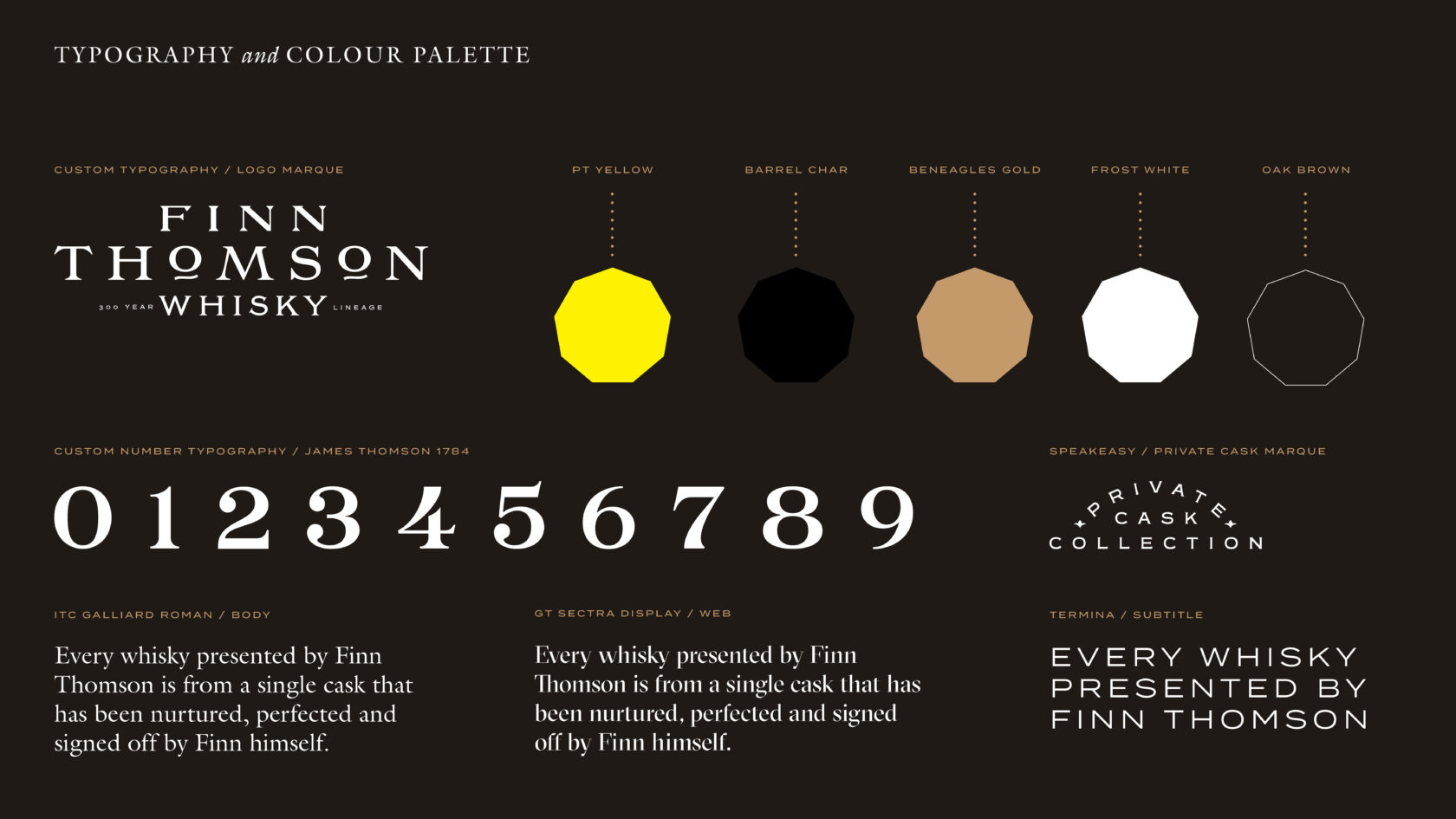
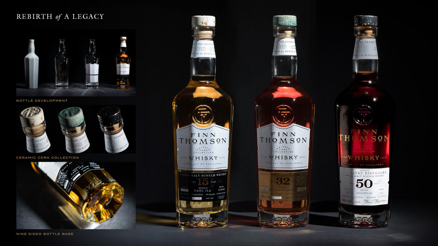
Finn Thomson’s whisky lineage is at the heart of both the brand and its products, so we wanted to ensure that it was represented in the physical bottle. We created handcrafted typography and monograms inspired by the historical archives, as well as a bespoke nine- sided glass bottle – the first of its kind – a side for each generation. The bottle tapers in at the bottom into the shape of a nonagon sunburst, symbolising the moment when Finn and his father resolved to reignite the family business under a sunset in the Cairngorms. We felt it was important that this bottle retained a distinctive whisky silhouette, a testament to the family’s unwavering whisky story. After many iterations and 3D design prototyping, the final finish was refined slightly for manufacture in glass, while still delivering our ultimate objective of creating a timeless but contemporary bottle.
Creating nine-sided packaging for the Rare and Core ranges was a real challenge. We disregarded the traditional tube bottle shape because we wanted the unique nonagon to become synonymous with the brand. We ended up working on nine-sided cartons for the Core range, iterating and improving several prototypes to ensure the shape and finishing complemented the blackened wood textured paper stock and the unusual angles of the nonagon.
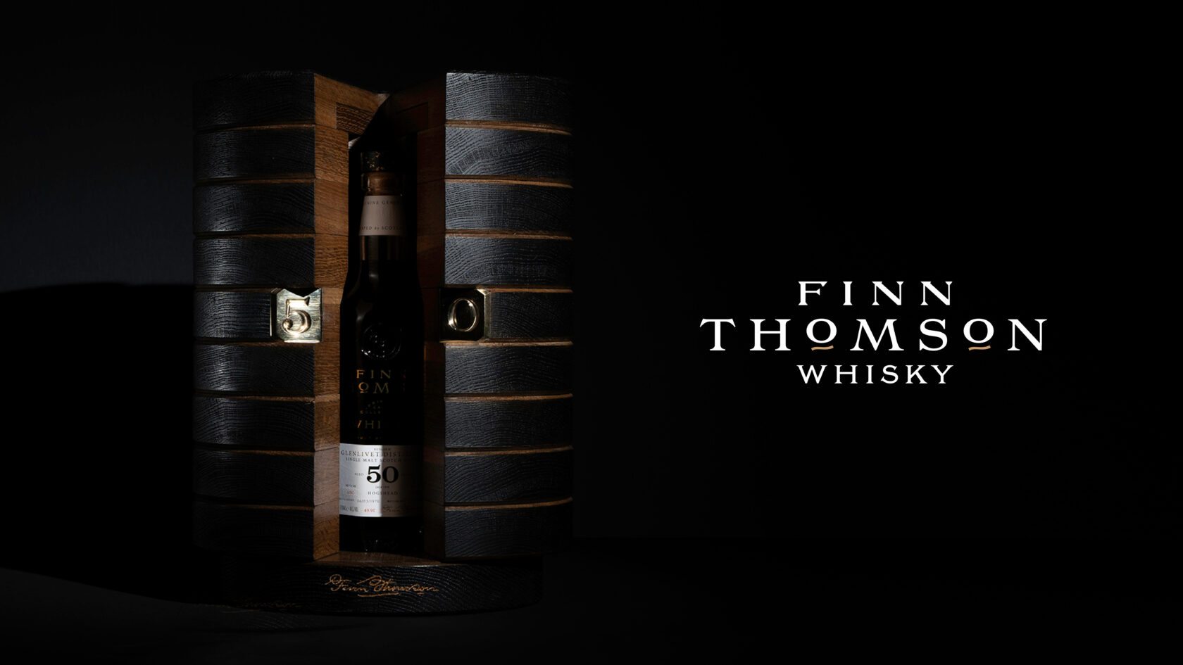
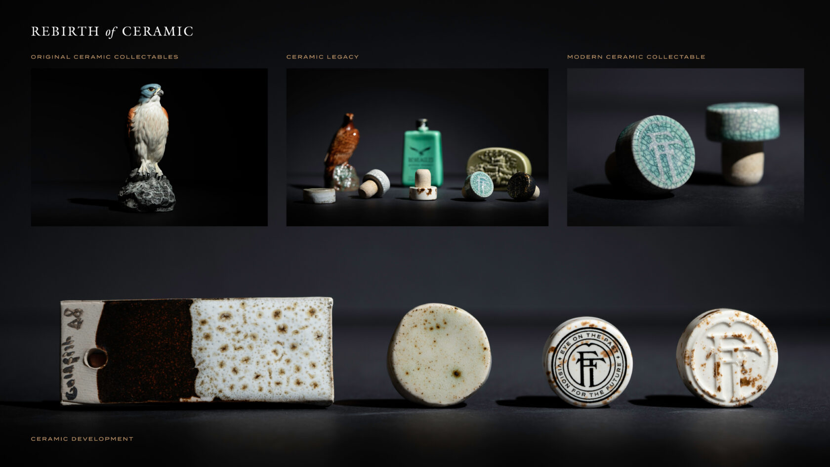
Prestige whisky is often overtly glitzy, so we wanted to present the Glenlivet 50 Year Old in away that was true to the brand itself: stunning, understated, no shortcuts. The Crown packaging was crafted in Scotland using exclusively Scottish materials, the nine opening layers brought to life by Scottish artisan carpenter Joachim King. We even channeled Scotland’s reputation for engineering to design a box and bottle that suspended the whisky in solid oak, with a seamless opening function. We extended this disruption of convention as far as the creation of the bottle stoppers, transforming the lids into collectible ceramics. We created a bespoke mold to set the FT hand-drawn monogram into the top and experimented with different finishes to convey the personality of each range. Handmade and therefore unique, the use of ceramic was inspired by the ceramic whisky vessels pioneered by Finn’s grandfather in the 1960s.