Fruitmarket
Category
GRAPHIC: Brand Identity
Company
Touch
Client
Fruitmarket
Summary
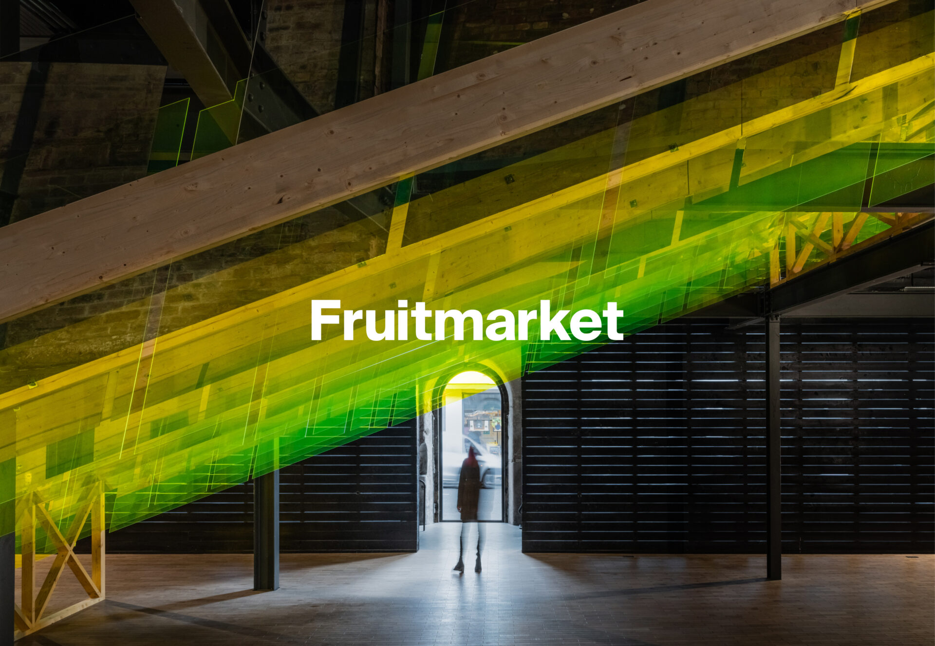
Reimagining the identity for one of the country’s best-loved art spaces.
For over forty-five years The Fruitmarket Gallery has been a key part of Scotland’s cultural landscape, sharing world class modern and contemporary art with ever-increasing audiences.
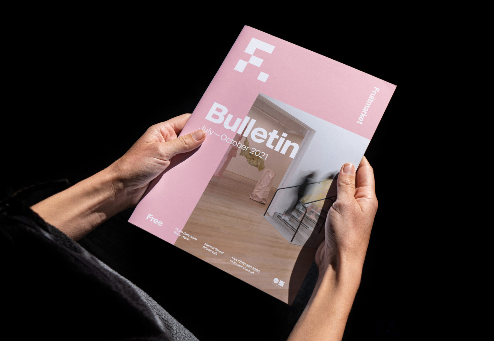
We worked closely with the Fruitmarket on their values, brand strategy, visual identity, and website as they opened out their space into the warehouse adjacent to their existing gallery.
As a leading cultural venue that welcomed thousands of visitors annually, the Fruitmarket had a unique opportunity to reinvigorate their existing gallery and build an inspirational new space for creative and collaborative working.
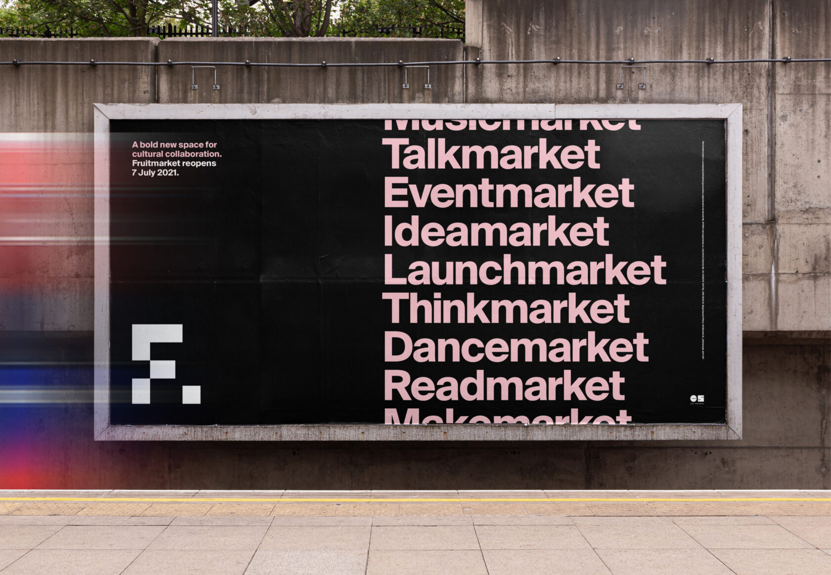
We rose to the challenge of creating a flexible, inclusive and welcoming brand identity that would not only reaffirm the Fruitmarket’s world-class reputation as a cultural space but also build upon the venue’s rich visual legacy.
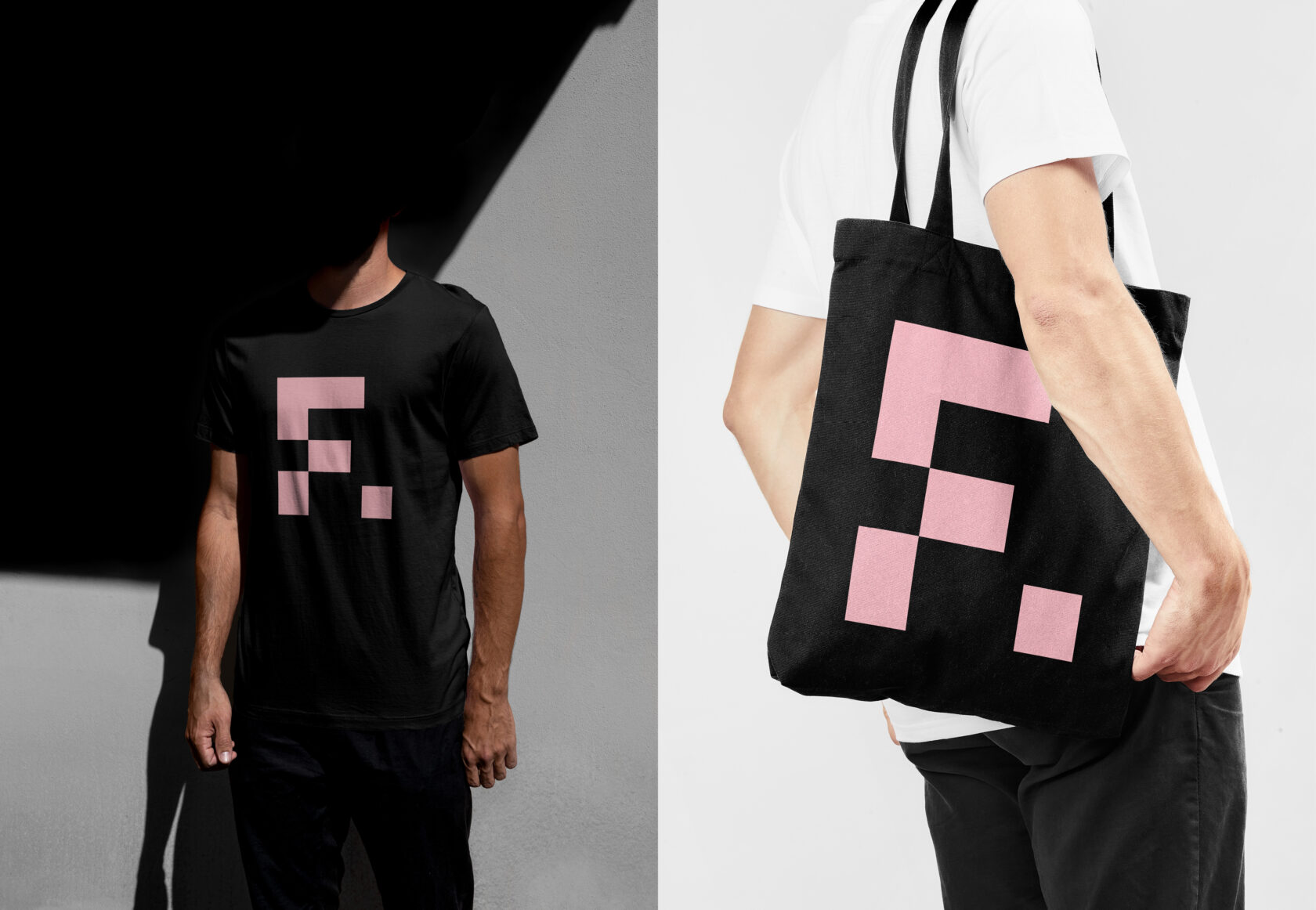
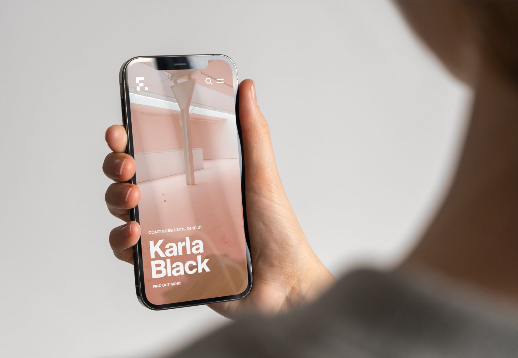
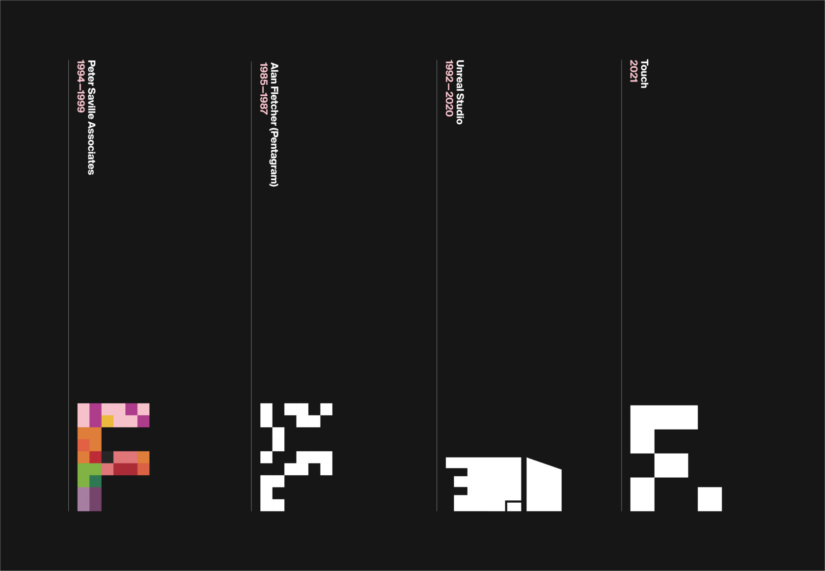
Drawing on a design lineage that included Peter Saville, Alan Fletcher and Unreal Studio, we explored identity concepts based around a bold geometric ‘F’ form.
Simple, bold and iconic, it is a continuation of the rich visual lineage of the previous identities. The new marque represents the physicality of an ever-evolving space that serves as a container for ideas.
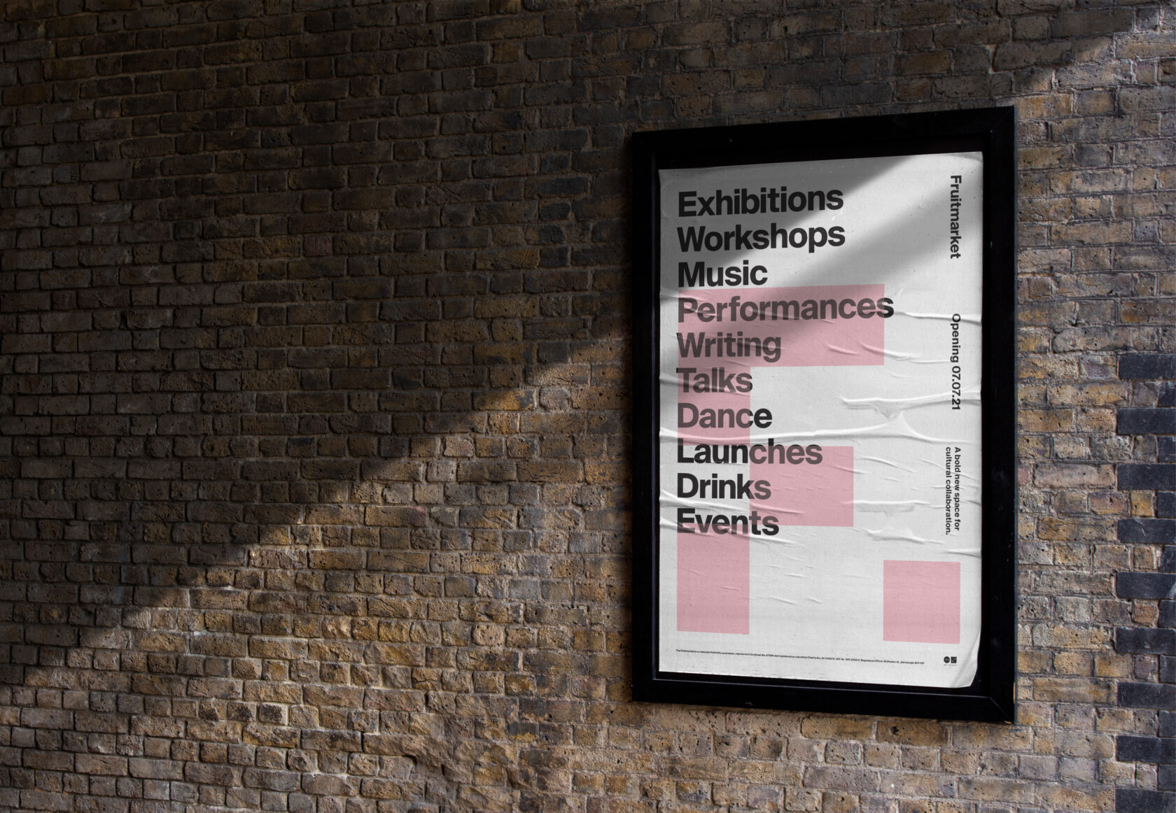
The iconic Fruitmarket pink colour lives on in brand applications, while signage and outdoor adverts are simple but striking.
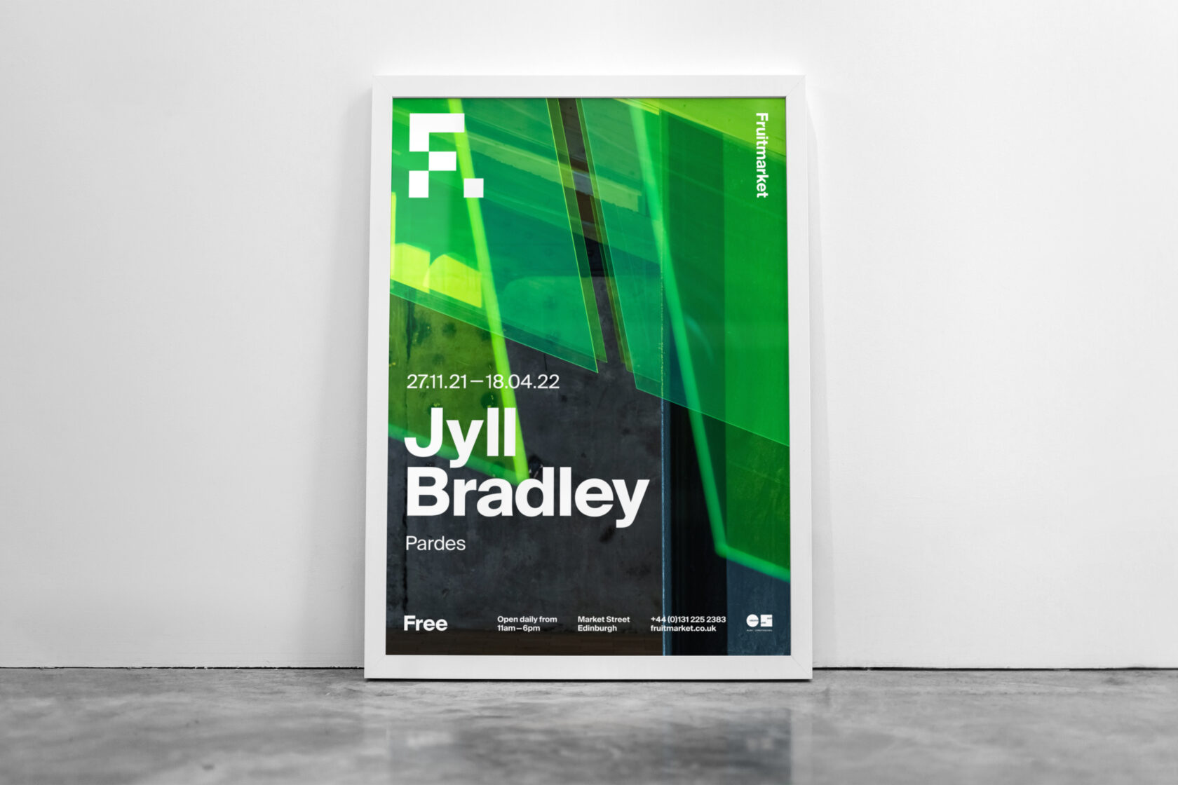
It was quite the journey from workshopping brand values with the Fruitmarket team to delivering finished assets for print, digital and social, so we were delighted to finally experience the inaugural exhibition from Scotland’s own Karla Black in July 2021 and the acclaimed installation from Jyll Bradley