Woven Whisky
Category
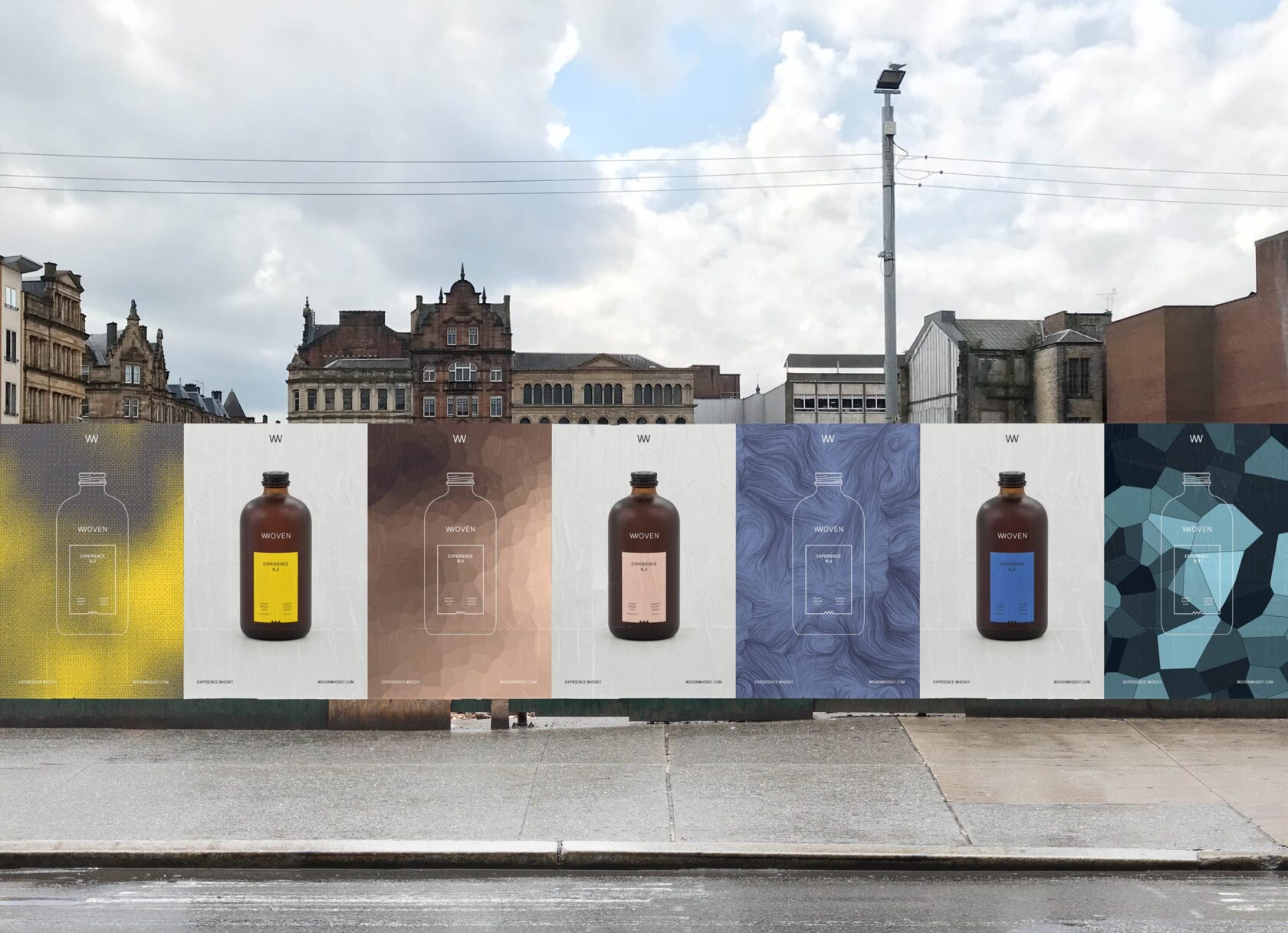
GRAPHIC: Brand Identity
Company
Freytag Anderson
Client
Woven Whisky
Summary
Pete and Duncan approached us to help them create a new brand to challenge and disrupt the blended whisky space. They wanted to celebrate the ‘blend’ and just what it can (and should) be. Their goal is to make whisky more accessible, targeting the next generation of whisky drinkers with a modern set of values: inquisitive, daring and passionate about the brands they choose to engage with.
Over the past few decades, the whisky industry has done a great job of creating the image of whisky. Establishing what drinkers should look for in a whisky, what they should taste, what words they should use to describe their experience. This has resulted in a saturated and homogenised brand landscape where things tend to look and sound much the same. Whilst this isn’t necessarily a bad thing, it has provided the opportunity to create something different.
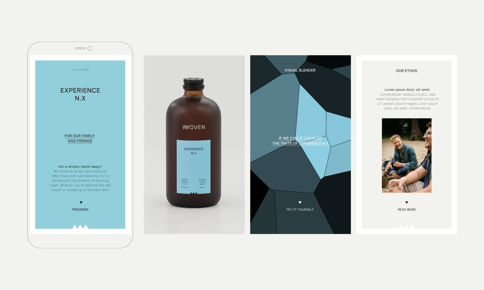
We started by exploring the idea of ‘experience’ and how each person has their own unique way of experiencing the world. Instead of telling people what to taste and look for in a whisky, we wanted to find a more accessible and inclusive way of connecting with their audience. From this we developed the positioning ‘Experience Whisky’.
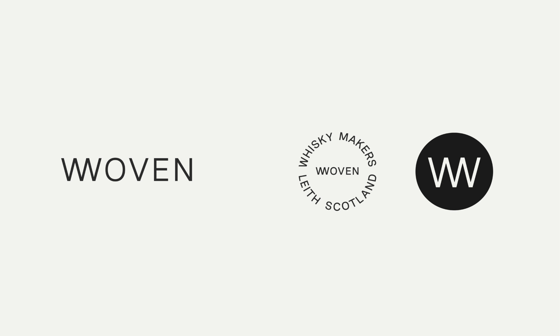
Coming up with the right name for the business was a challenge. For us the word ‘Blend’ was the starting point and central to the creative brief. We liked the way the word represents a way a life or, perhaps more accurately, an approach to life. Things coming together to create something bigger, richer, better. We came up with ‘Woven’ as it communicates a sense of warmth and intimacy. It also hints at process and community which are both important to the founders. Alongside the name we also developed a distinct brand voice - straightforward, inclusive and real, it should be immediately apparent that Woven is something different and exciting.
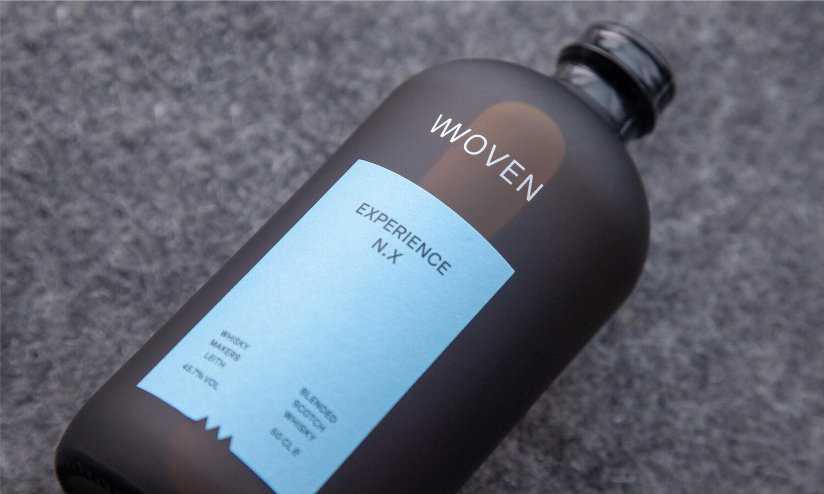
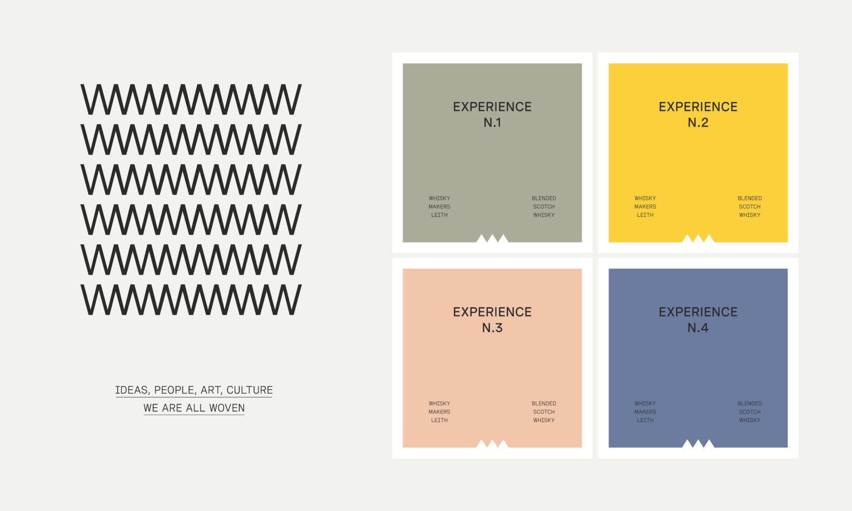
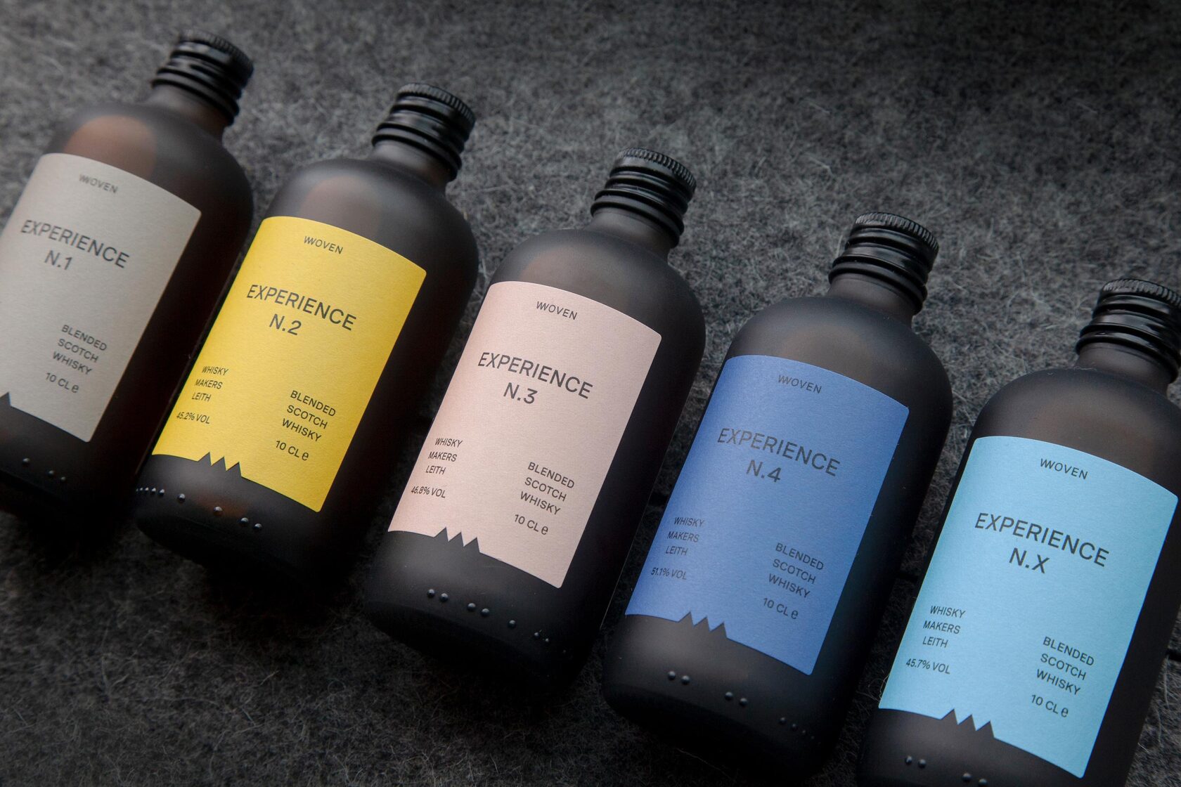
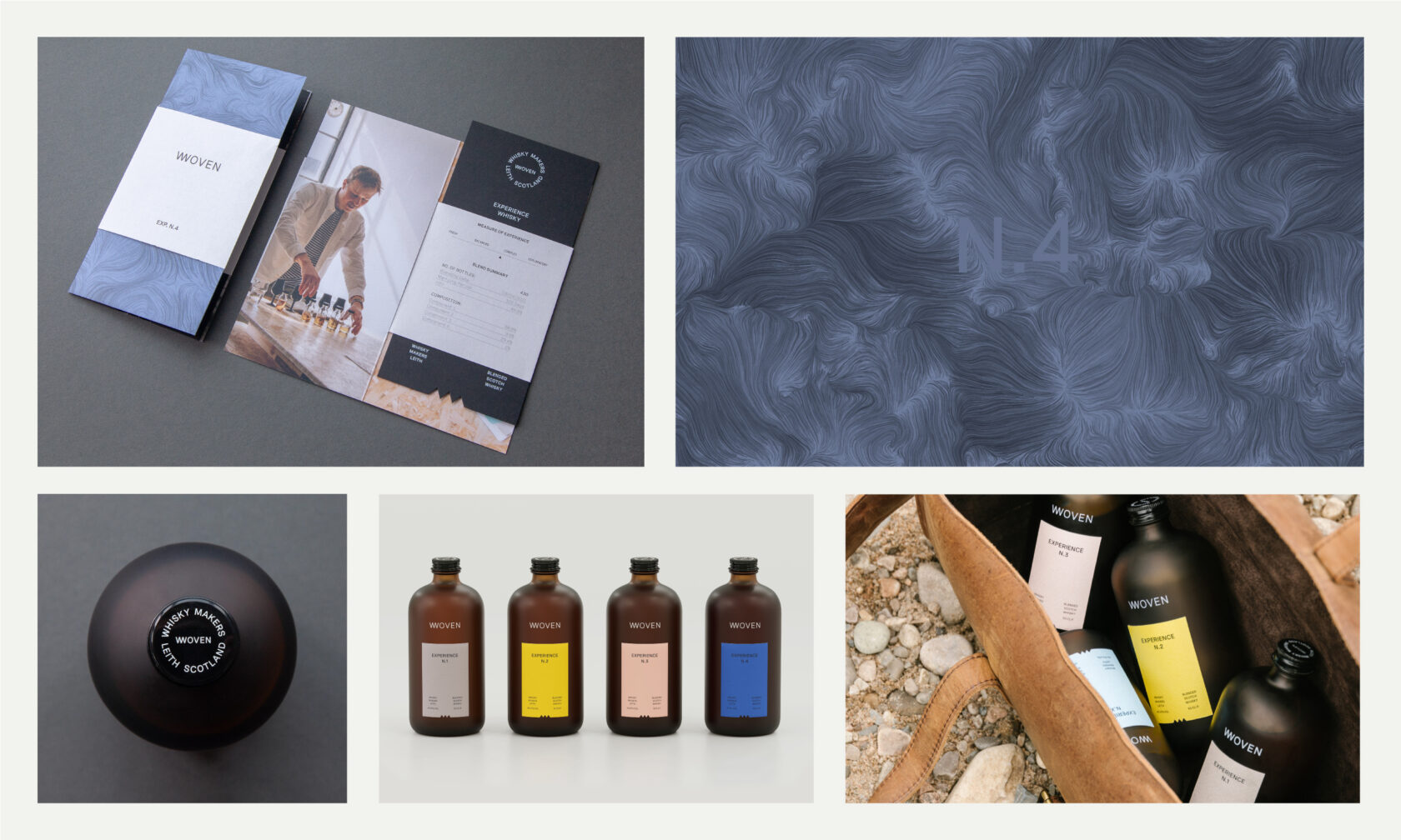
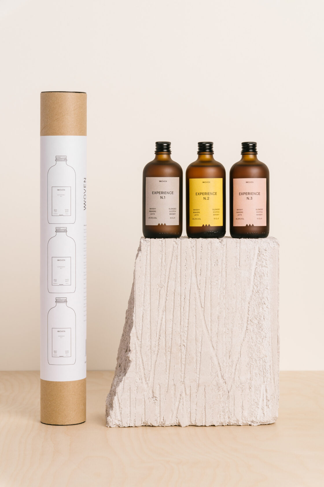
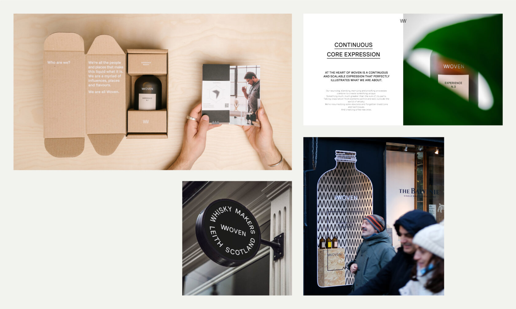
To further challenge perceptions we designed a bottle that looked very different from what might be expected. The frosted brown apothecary style glass is tactile, warm and covetable - it’s something you want to touch and hold. Each blend experience is released in chronological order. The single colour front label is intentionally minimal, designed to create a sense of curiosity and anticipation. The outer box acts as both a display box as well as a shipper with addition of a postal label. The fluted cardboard box is digitally printed in white to create a minimal yet covetable packaging solution which also contains the unique experience leaflet.
To introduce individual blends, drive social engagement and reinforce the brand positioning ‘Experience Whisky’, we developed the ‘Visual Blender’. We were intrigued by the question ‘What does flavour look like?’ and worked with Amsterdam based generative artist Loïc Schwaller to develop a custom interface that would allow us to create dynamic flavour profile visualisations by inputting data unique to each blend. These are then shared in both motion and as static images.
0