Finn Thomson Whisky – Packaging
Images


Videos
Direct link: https://vimeo.com/699405237
Direct link: https://vimeo.com/699405445
Direct link: https://vimeo.com/699409066
Direct link: https://vimeo.com/699405339
Direct link: https://vimeo.com/699808924
Direct link: https://vimeo.com/699813078
Category
GRAPHIC: Packaging
Company
Form Digital
Elsk
A total creative collaboration - Elsk & Form
Creative Director & Strategist, Reeve Rixon, Elsk
Creative Director, Mark Gordon Form
Special collaboration partners
Creative Director, Tom Lane
Creative Producer, Tom Booth
Account handler, James Young
Cinematography, Will Gardner / Simon Williamson
CGI Director, Peter Moore
Client
Finn Thomson Whisky
Summary
Eye On The Past, Vision For The Future
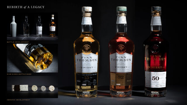
Finn Thomson’s multifaceted family history imbues every element of our design, as typified in the bottle itself. We designed a one-of-a-kind nine-sided bottle to celebrate the nine generations of Thomson whisky. The FT monogram, which unites the initials of all nine family members, sits front and centre. The bottle tapers in at the bottom into the shape of a nonagon sunburst, symbolising the moment when Finn and his father resolved to reignite the family business under a sunset in the Cairngorms.
Every whisky presented by Finn Thomson is from a single cask that has been nurtured, perfected and signed off by Finn himself. This is the antithesis of whisky en masse that can be repeated again and again – it’s hyper-personalised, exclusive, and unique. Finn refers to the process of bringing a whisky from barrel to bottle as “uncasking” and we wanted to evoke this experience for the consumer through packaging.
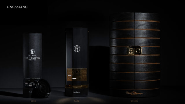
We created three tiers of packaging for the Core, Rare and Crown ranges – all based around this notion of “uncasking”. In each instance we turned the hypothetical cask inside out, bringing the charred interior to the fore. We brought this to life for the Core range through the textural charcoal grain of a carton with nine sides, each side uniting like staves in a cask – one for each Thomson in the lineage. A simple gold lining inside the carton elevates the feeling of occasion when the whisky bottle is withdrawn.
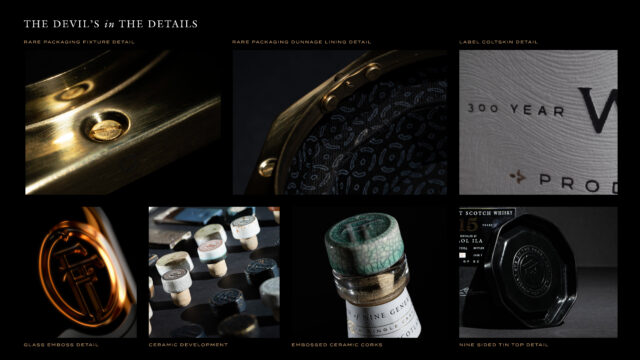
For Rare, we opted for a more modern and luxurious box, with a nine-sided black satin finish displaying only the monogram and Finn’s signature. We created a participative “uncasking” experience by implementing a tactile opening mechanism, encouraging the consumer to unlock the whisky within. The bottle is then revealed on an internal pedestal which is lined with a nonagon cask pattern, a nod to the whisky’s dunnage storage and, again, the nine members of the lineage.
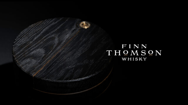
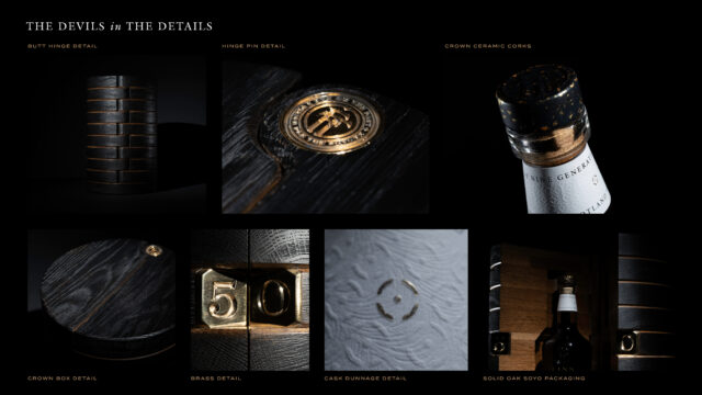
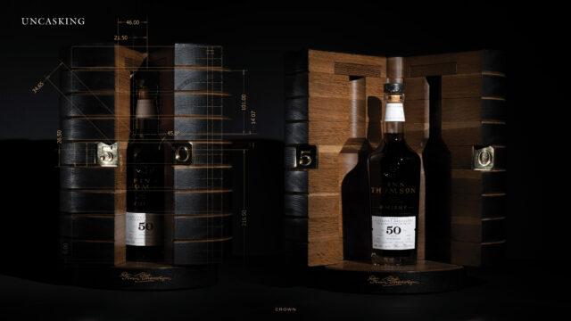
The Crown packaging fully embodies “uncasking” by physically re-encasing the whisky back into oak. The cylindrical textured black-fumed exterior is pierced by nine rings and Finn’s signature in gold. A polished brass number 50 invites the consumer to pry open the “cask” and reveal the whisky within, cocooned in a warm solid oak interior and accompanied by an inscription on each side: “Eye On The Past” // “Vision For The Future”.
