Anna Aalto
Images

Category
Young Designer of the Year
Summary
Anna is an integral part of our working community here at Whitespace. She is valued both as a designer and as a colleague, bringing a thoughtful and considered approach to each and every project. Anna is a multi-faceted creative with experience working across brand, print and digital. A strong and informed contextual awareness allows her to explore new and exciting ways of creating beautiful work rooted in powerful concepts. She creates well-executed and striking designs inspired by a passion for typography and visual culture, rooted in a strong desire to push the boundaries of graphic design and explore projects, ideas and subjects that can speak to people in more meaningful ways. Anna’s has experience working in the design industry in Scotland and further afield. At 19, she completed her first internship with Graphical House in Glasgow before stints with O Street and Tangent Graphic, with her studies in between. After completing her degree, she undertook an internship in the Czech Republic before moving to and working for agencies in London. Anna has now been a designer at Whitespace for nearly four years, in that time has worked on a variety of branding experiences – from Scottish Government to Nike. In 2021, Anna found a new and reinvigorated passion for her work, after she came out to her work and friends as transgender. In the last 12 months her work as served as a platform for her own voice. Anna finds beauty in the structure and logic of design and exploring her own practice has allowed her to express herself separate from the constraints of her gender identity. In short, her design has allowed her to feel beautiful. She is now an integral part of Dentsu UK’s LGBTQ+ group and regularly contributes her writing to both educate and inspire others. She also has a passion for mentoring the next generation of create talent here in Scotland, having worked with both interns in-house and contributed as a workshop leader at Graphic Design Festival Scotland. She has been a long-term proponent of the design industry in Scotland. Anna has a strong work ethic and a passion for design. She is ambitious and have no doubt that the combination of considered work and creative intellect will lead to great success. (Due to her gender identity, Anna has chosen not to include a headshot in her submission.)
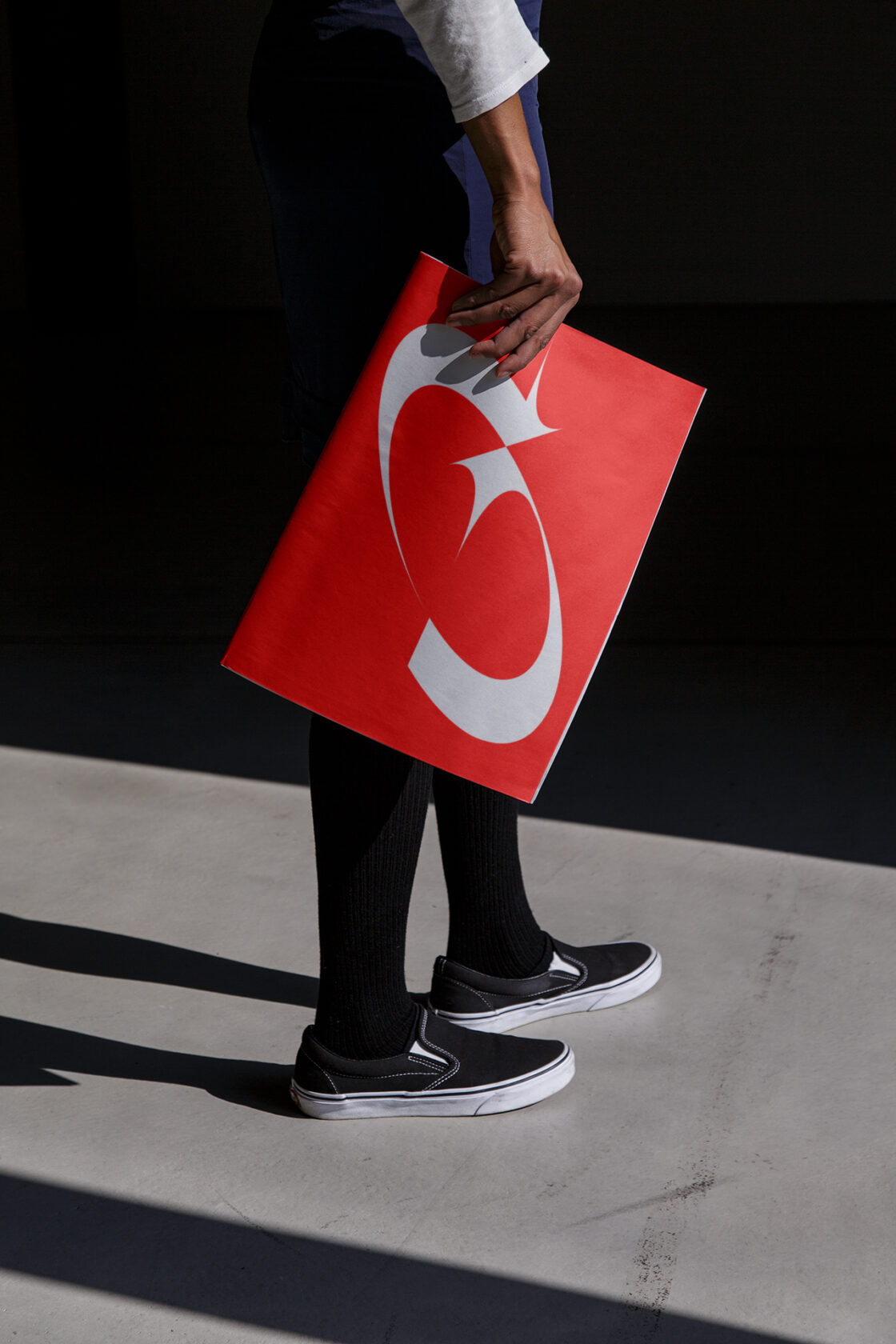
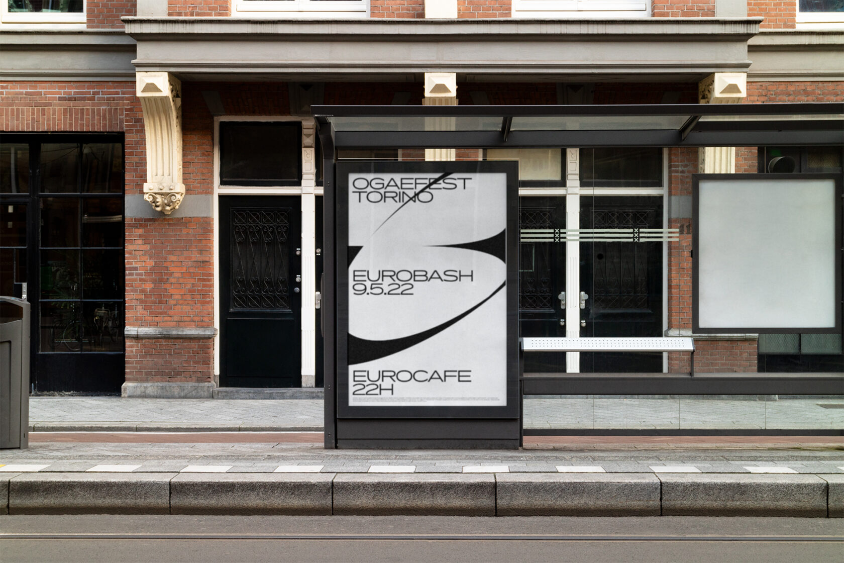
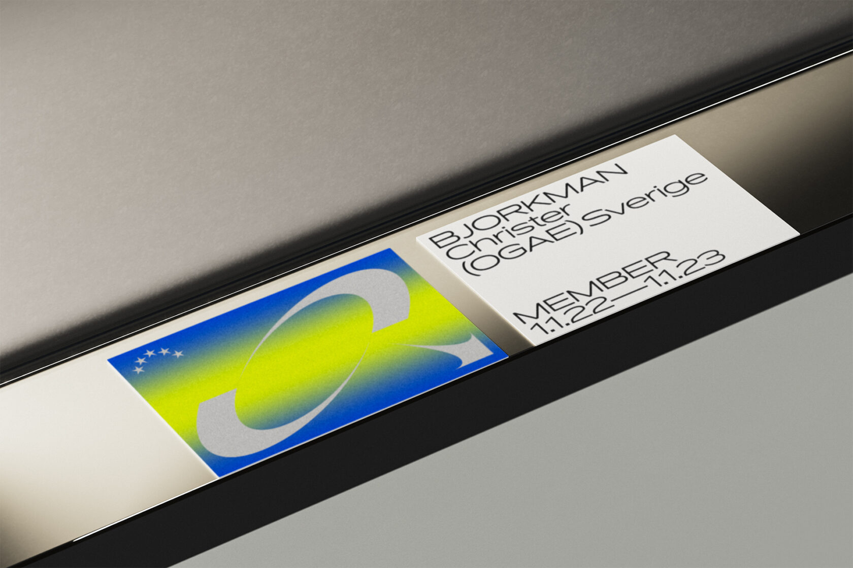
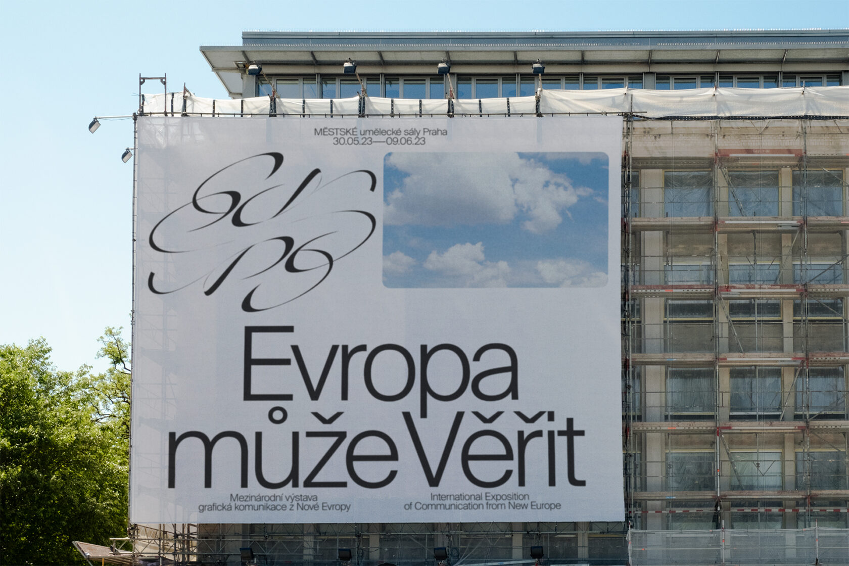
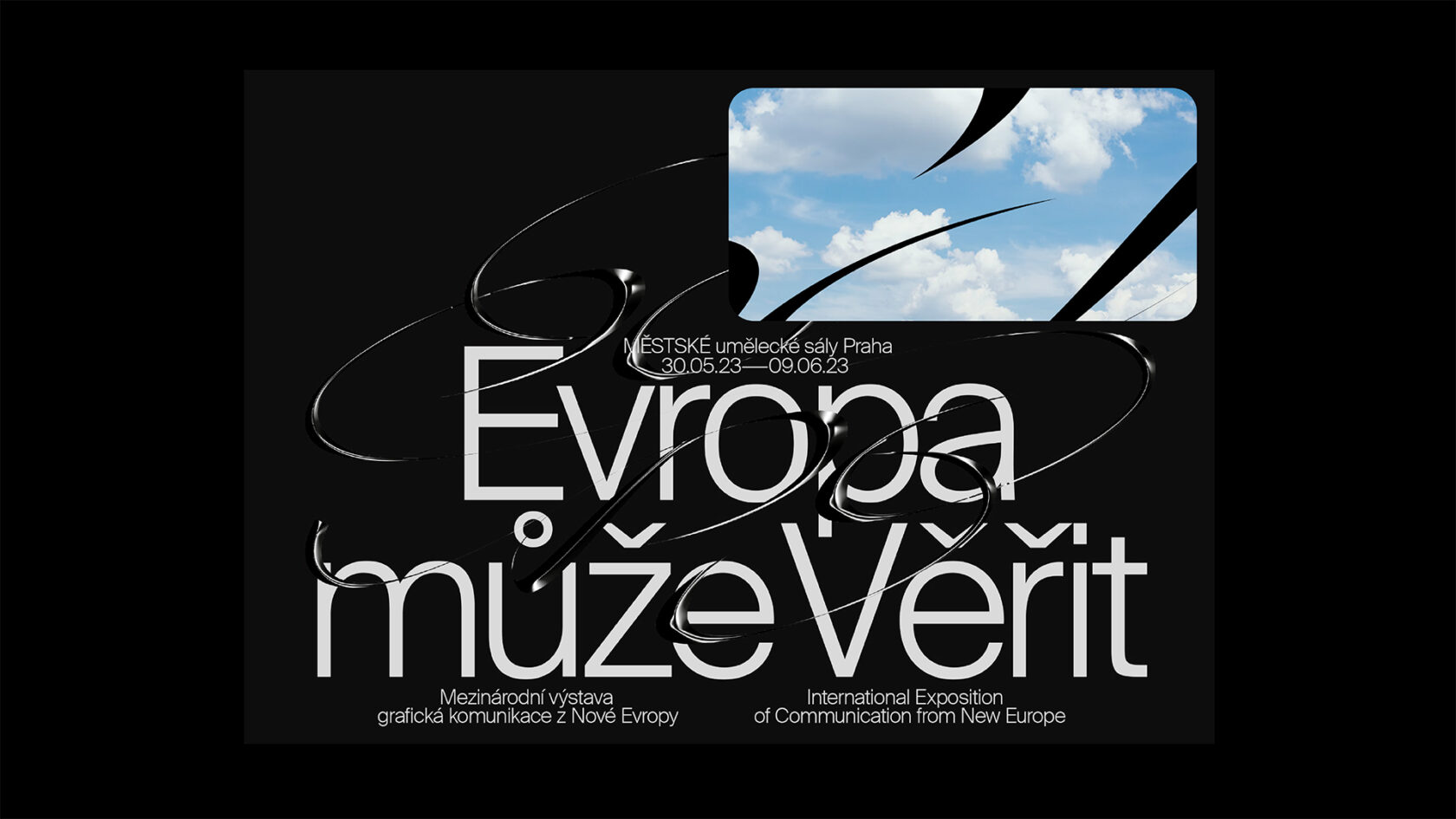
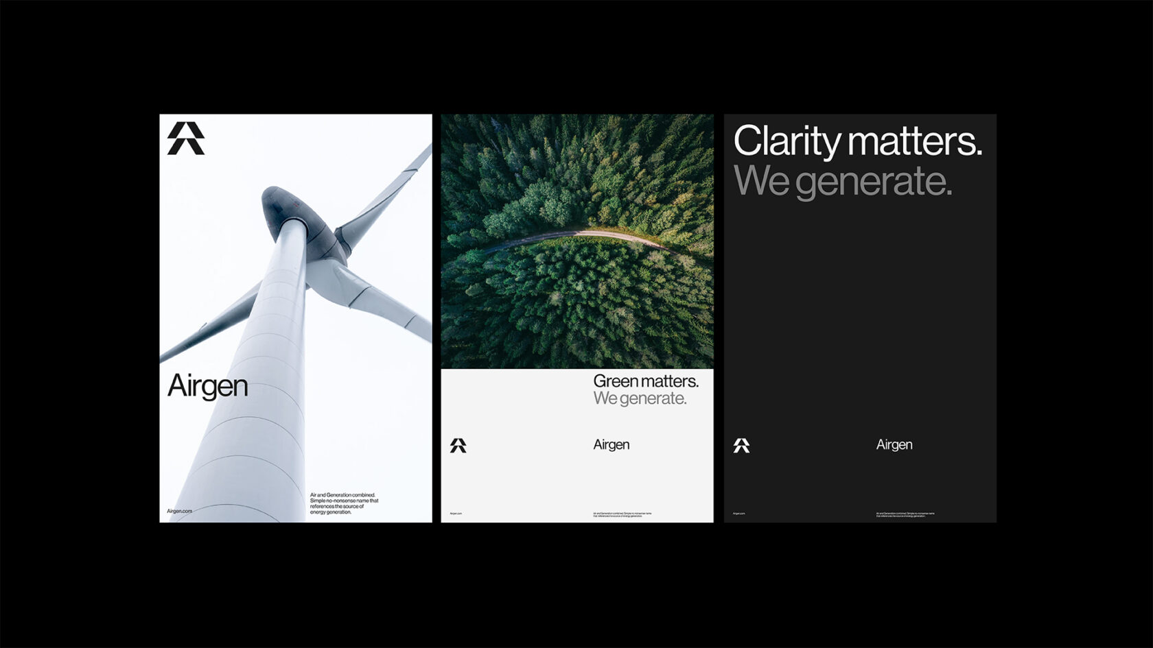
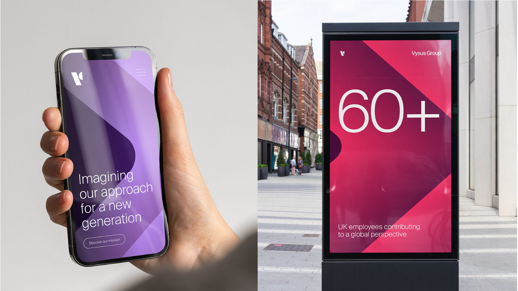
This selection of work mixes playful experimentation with professional contexts and represents my personal interest in design criticism and a challenge of aesthetic preconceptions. An example of this critical approach to design is an identity experiment for the fan organisation of Eurovision, OGAE. Inspired by the paradoxical visual themes of both civic symbology and the fan-orientated look of science fiction and gaming, the marque subverts traditional logo ideals to create a badge-like aesthetic which represents glamour, transcendence, cohesion and globalism. This is then expanded across a broader identity. The modern-yet classical typography harks back to the golden age of Eurovision and its own identity systems, as well as providing a tangible sense of nostalgia that both speaks to its fan audience as well as providing a visual cue back to the key themes of the marque. Membership cards are interchangeable – a striking gradient which adapts to the colour of an individual’s home country whilst poster work employs an unfinished and flexible aesthetic that speaks to the daring and often garish character of the event. Interning in Central Europe has allowed me to expand my practice to incorporate cues, processes and theories otherwise inaccessible. ‘Europe/Evropa’ is a theoretical exposition of graphic communication from Europe that has allowed me to play with my love of Czech design and interpret it more individually. The more orthodox and traditionally modernist typographic structure is challenged by a whimsical and expressive palindromic symbol, that reads ‘Europe’ viewed either above or below, representing togetherness, as well as ideas of translation and communication. A viewfinder or screen is filled with clouds, as the viewer is transcended into a subconscious clarity. My practice’s interest in challenging and criticising the norm can be felt in many of my client-led projects. Concept work for a wind-farm construction agency, at this point named Airgen, employs simplicity over complexity, reflecting their green and sustainable outlook. An understated yet impactful use of Neue Haas Grotesk offers a functional beauty that is reflective of the turbines themselves, as well as offering a stayed softness against arresting art direction and a marque which is both simple and energetic. This consideration of simplicity does not always stand alone, however – as with the identity for Vysus Group, which combines similar principals with a dynamic chevron motif that wraps colour and dynamism around an otherwise neutral and type led system.