The Municipal Hotel
Nomination
Images
Category
Craft - Incorporating: Photography, Typography, Illustration, Copywriting
Company
Paragon DCX
Client
Fragrance Group
Summary
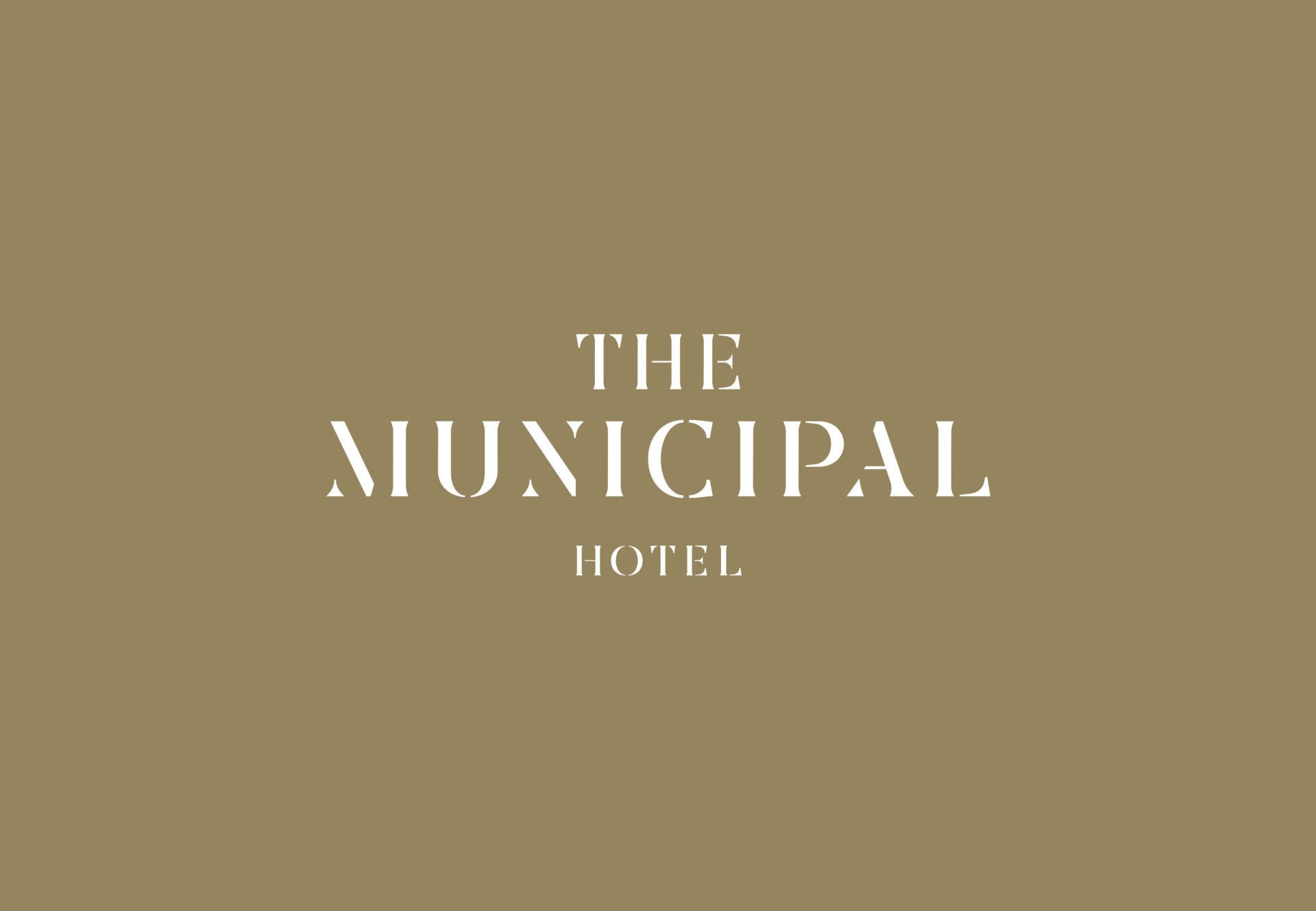
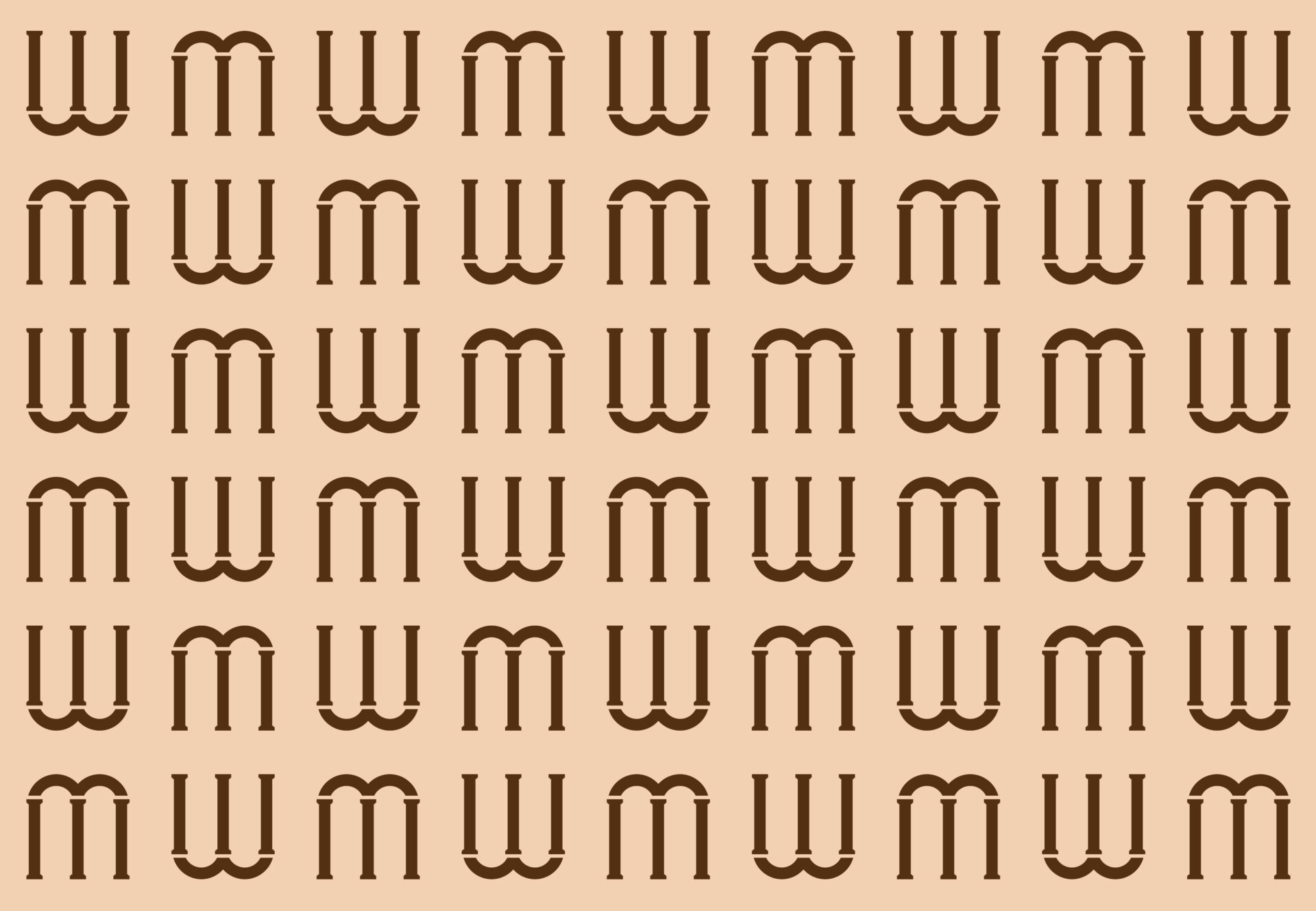
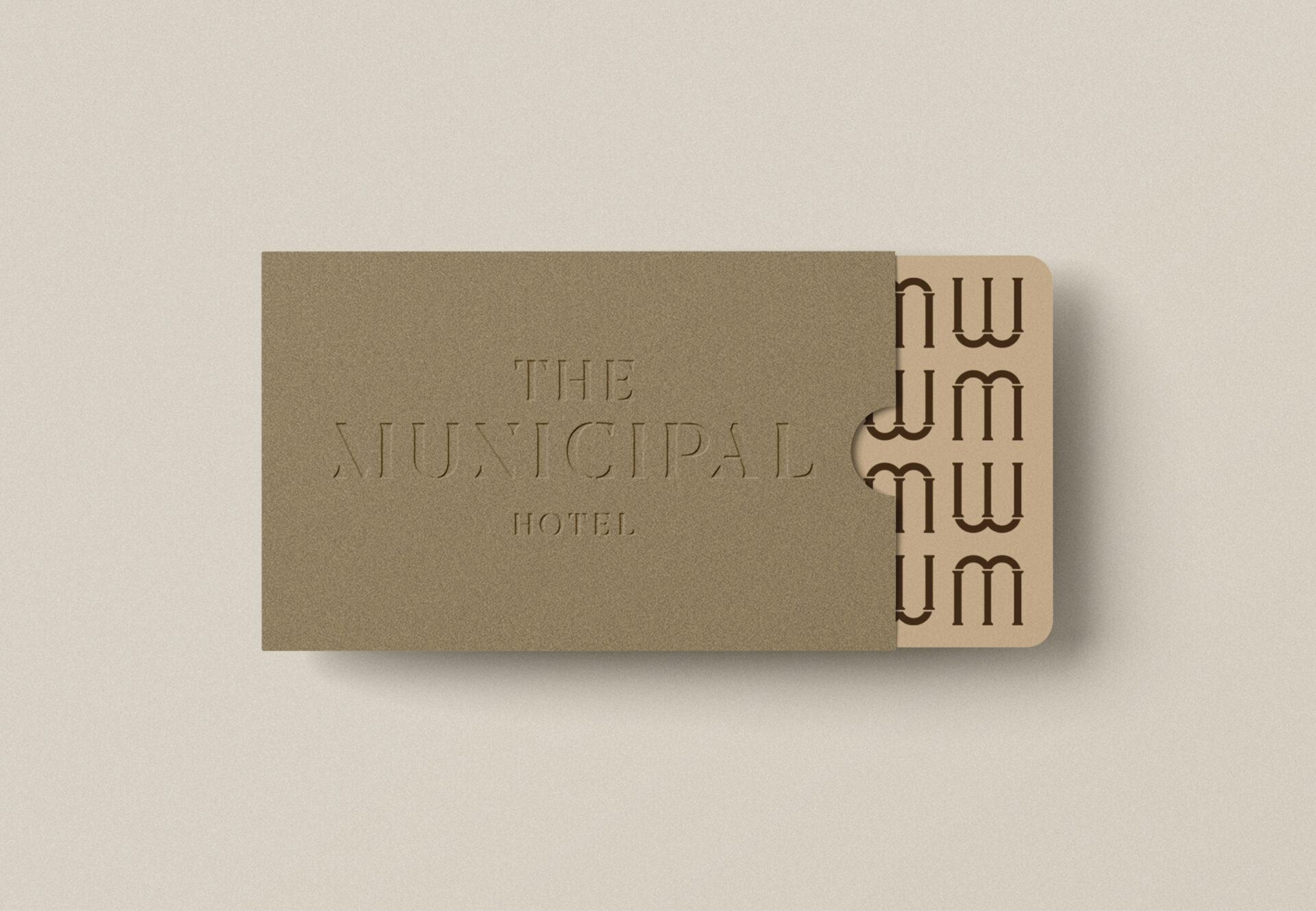
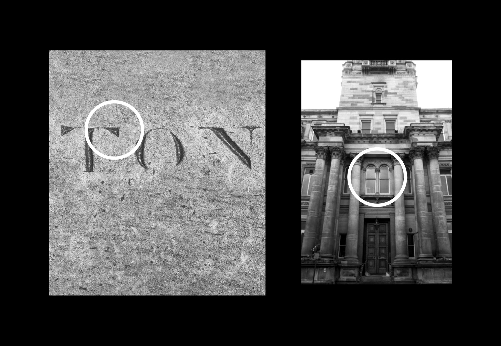
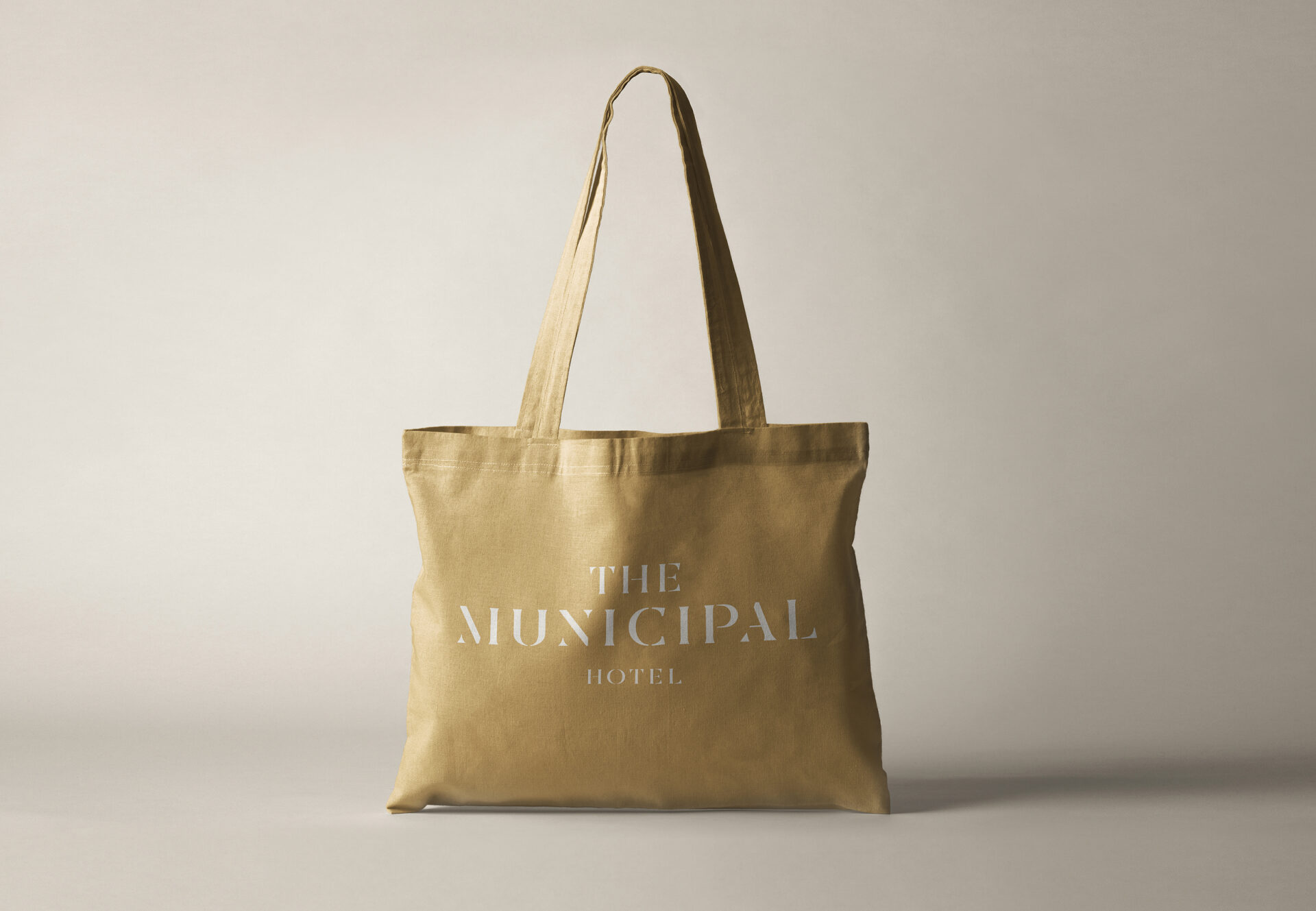
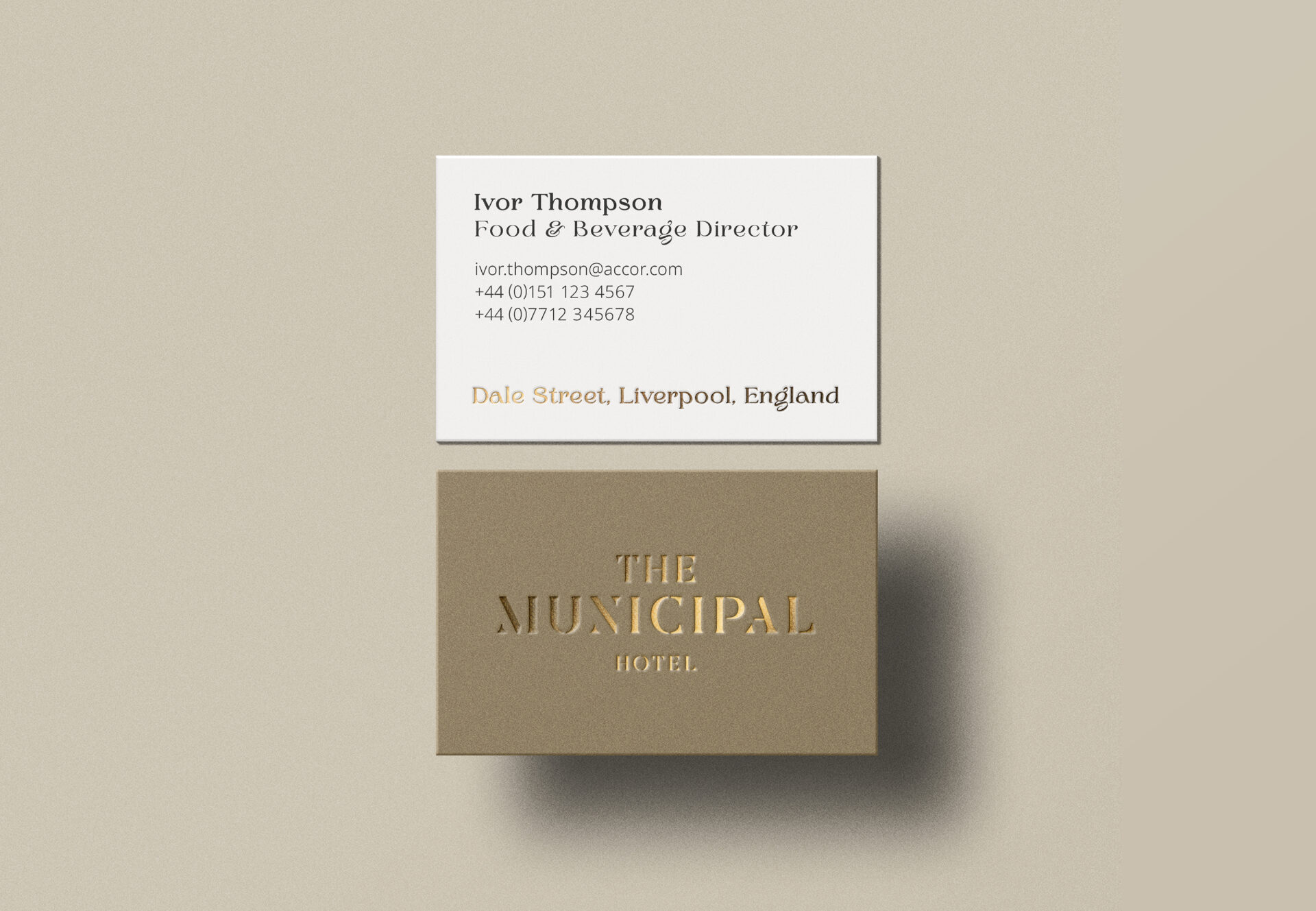
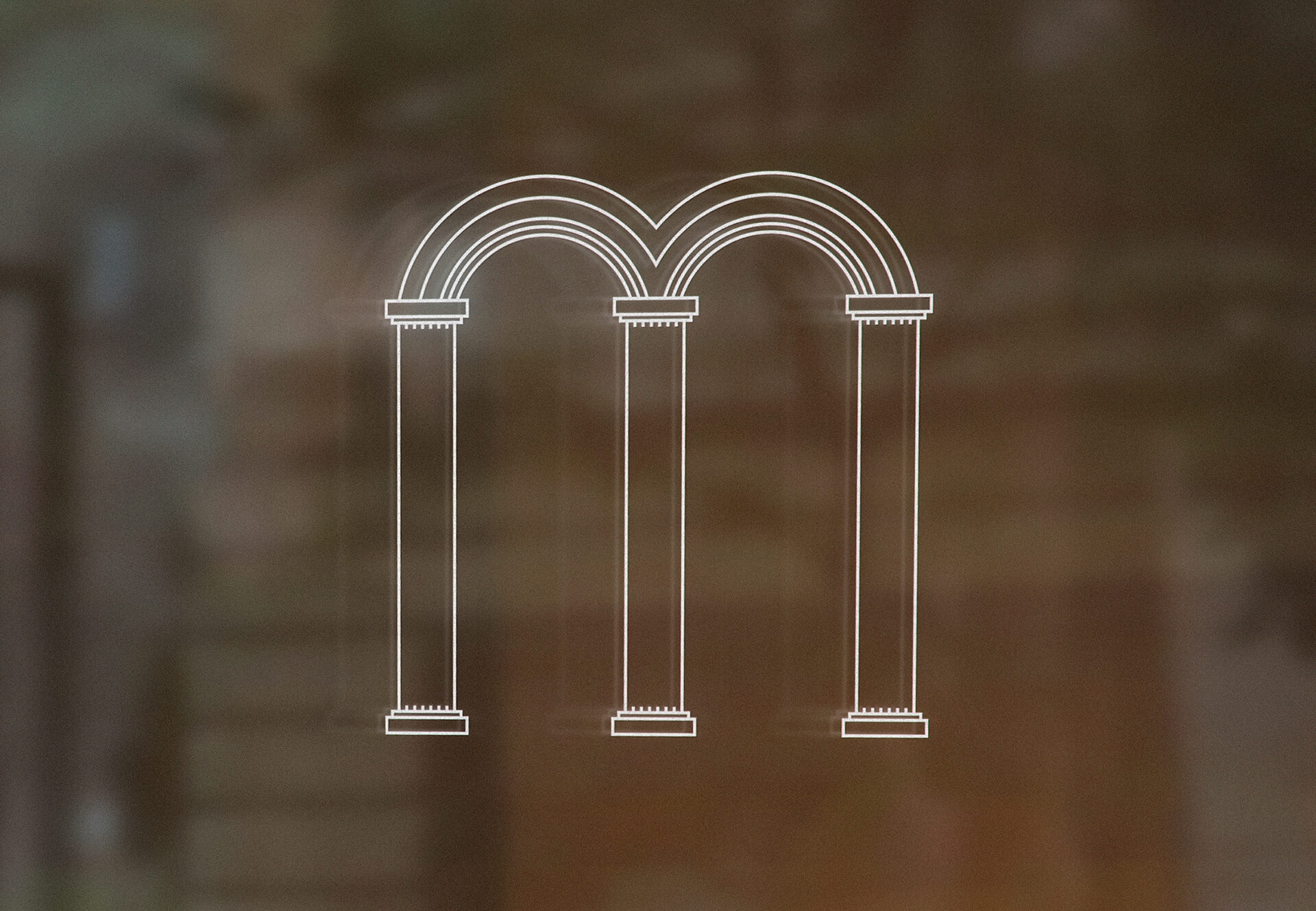
How do you reposition a building in the eyes of a city? And nod to the classic design in its DNA? Fragrance Group had carried out a large scale heritage refurbishment of an iconic 155 year old listed building in the heart of Liverpool, turning it from city council offices into a luxury four star hotel (opening summer 2023). They approached us to develop a brand identity for the new 179 bed hotel. To create a strong connection between the brand and the hotel – our approach to the project was to focus on authentically representing the impressive building, through its architectural features, history and construction materials. The logo mark for The Municipal Hotel is a modern interpretation of type engraved into sandstone. It reflects how engraved letters look after 150+ years of weathering – where the fine detail of individual characters slowly erode to form separate, fragmented sections of letter. The end result is an elegant and unique typographic logo mark which links strongly both to the building’s sandstone exterior, and 155-year presence in the city. The vertical shapes within the type also help to echo the iconic entrance pillars which surround the building’s main entrance on Dale Street. The monogram M is taken from recognisable and visually accessible architectural features of the building. The framing of the first floor double window forms a natural M shape centred above the main entrance on Dale Street. Combining this with the entrance pillars helps to create the monogram icon. By using the building itself to create the monogram, the icon links very strongly with the hotel and creates a unique and recognisable mark which guests will be able to associate with The Municipal Hotel. Brand colours have been taken from the interior and exterior of the building – to help further represent The Municipal Hotel authentically and intimately. The sandstone set represents the original exterior of the building, with colour samples taken from the different tones within the sandstone. The dark brown is taken from the listed parquet wall panels found on the interior walls of the building. Metallic bronze references the bronze cladding of the hotel’s new spa complex extension. And the result? A classic, refined brand identity for a much-loved Liverpool landmark.