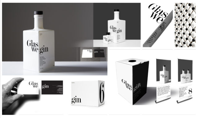
Glaswegin packaging
Award
Images

Category
GRAPHIC: Packaging
Company
Glaswegin Distilling Co Limited
Suisse Design/Paul Gray
Client
Glaswegin Distilling Co. Ltd
Summary
Glaswegin is a new gin entering into a busy and saturated market. Important therefore to design packaging that is distinct to pull it clear of the market. Objective from the very start was to steer clear of what we saw as the 'norm in a great many of the competitors. The failing with most as we saw it was their presence behind the bar on the gantry. Bottles need to work very hard there. This is a very important part of the sales mix. Our simple design solution and very simple palette make that powerful in that we have typographic scale and stark contrast with the monochrome treatment. It's stand out is powerful. The simple phonetic treatment of the title (with the turn of the face) emphasises gin and that was done purposely to be read at distance. It should still however feel good in your hand close up. The quality finishing and good production values support that. Quality in hand. Power at distance.