Forest of Black Brand Identity
Category
GRAPHIC: Brand Identity
Company
Fourtwentyseven Design
Client
Forest of Black
Summary
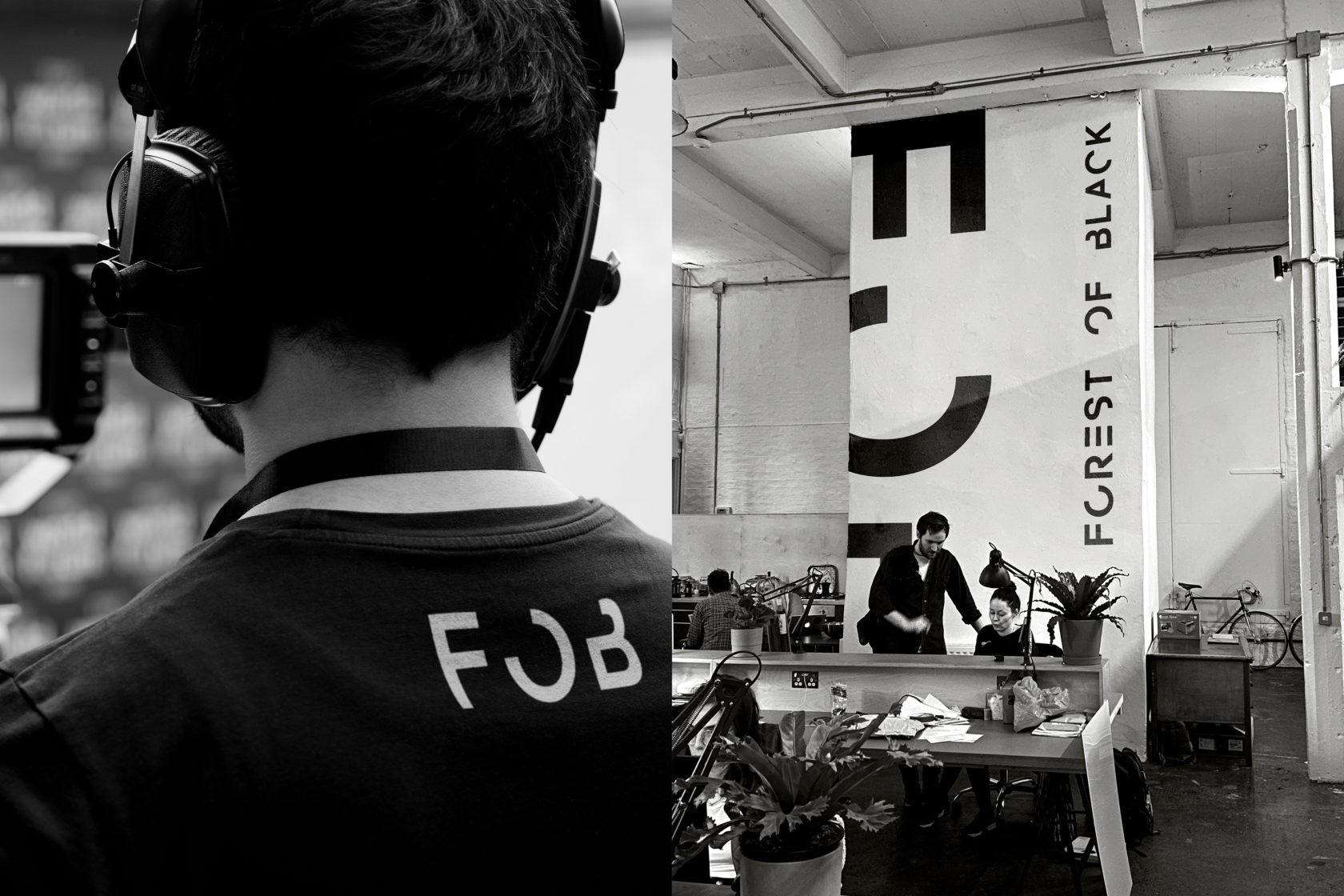
We were tasked by internationally renowned filmmakers Forest of Black with developing a new brand identity to help refresh their visual language and position within the industry. Forest of Black are a small, focused team who produce commercials, music promos and brand films in the UK and across the world. FOB have a unique vision of how their output should be produced and deliver distinct and innovative films to a wide, diverse range of clients.
The brief the client gave us required that we create an identity that reflected the calibre of the organisation. Over the years they felt that their brand presence had been neglected and didn’t reflect them both in terms of creativity and prestige. We were also asked to ensure that the identity, and the application of it, was contemporary in nature and provided a feeling of modernity to reflect the work that the client produces.
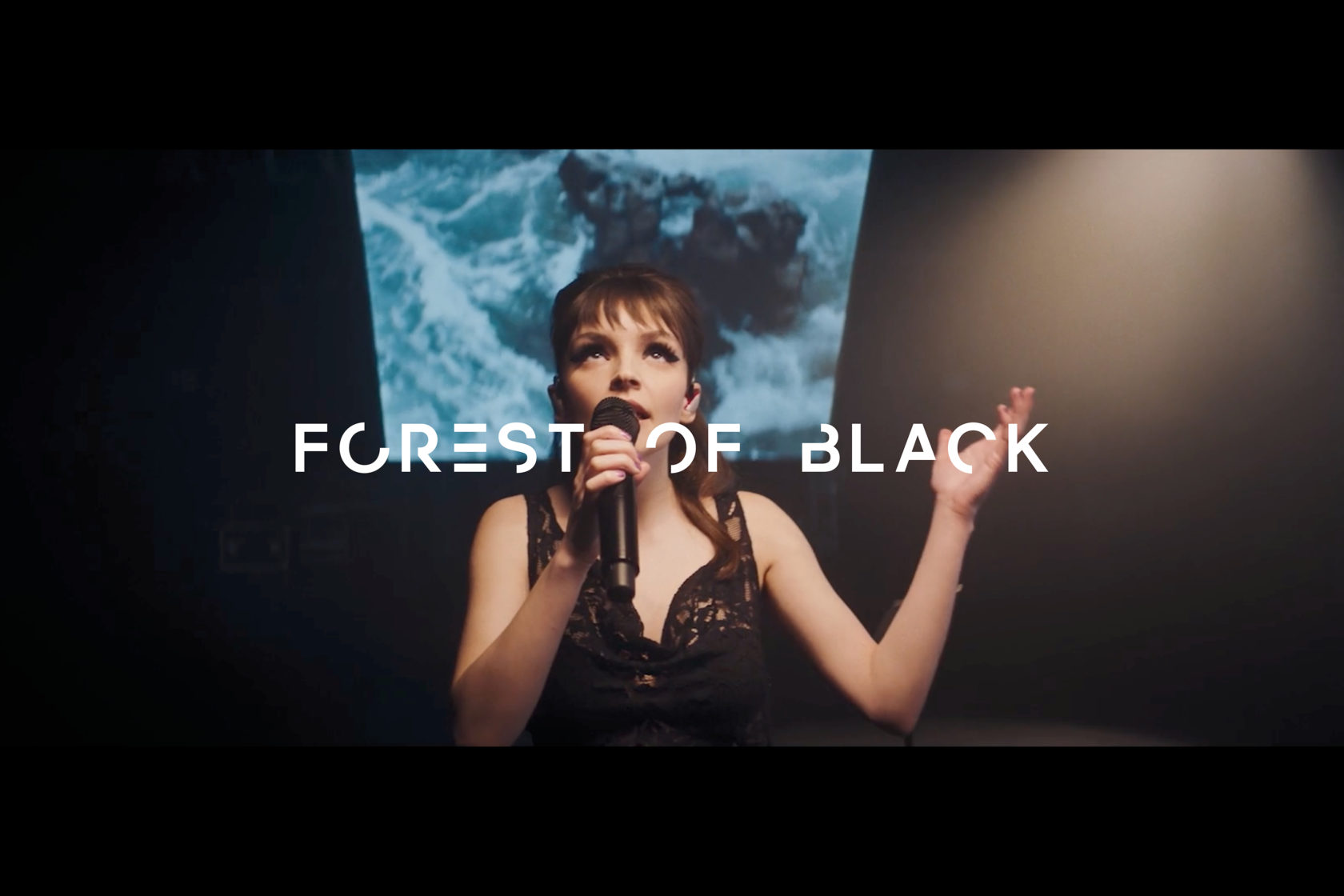
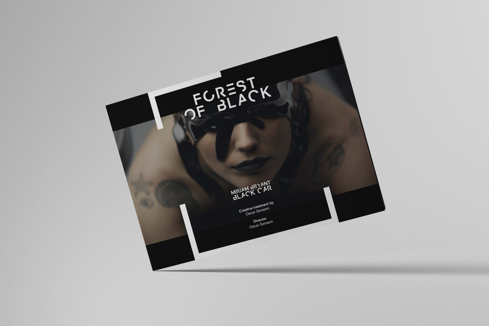
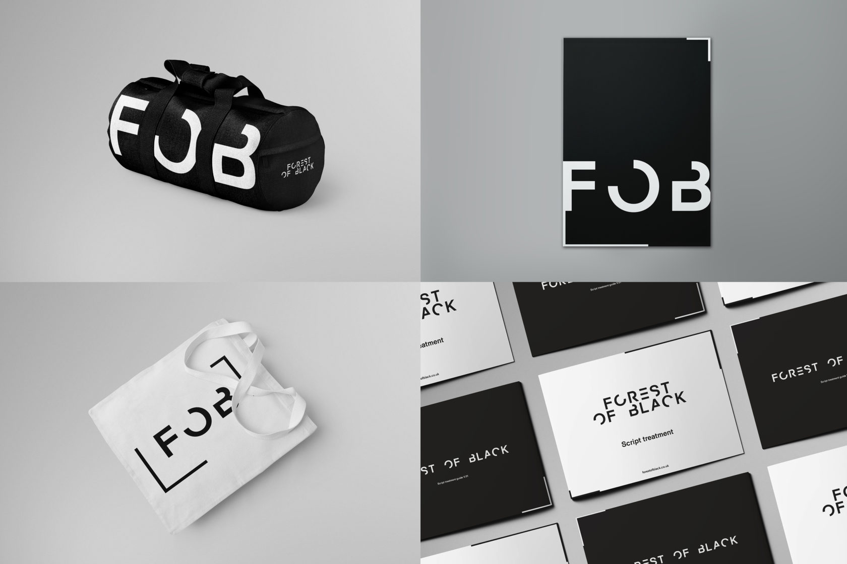
We created a striking, versatile visual identity that uses the idea of a break in continuity. This was a concept that we settled on with the client as it was felt that this was reflected of their brand principles and reflected their position as a creative outsider and risk taker.
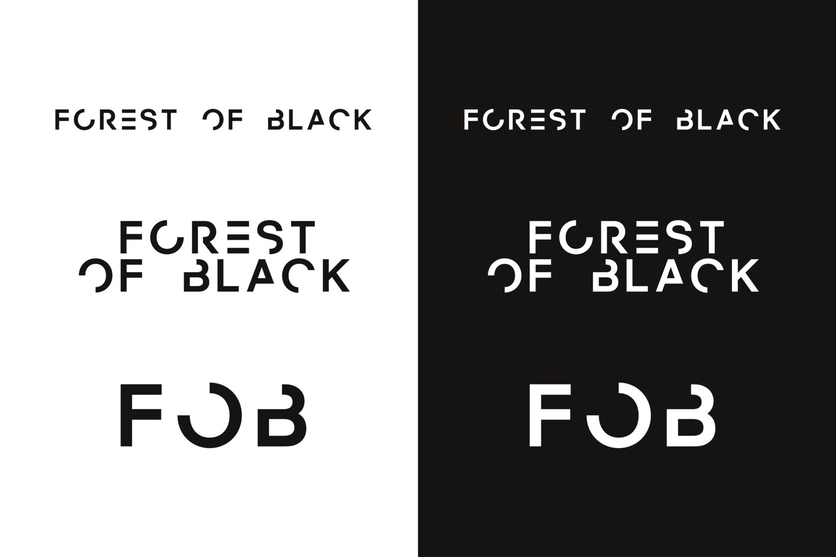
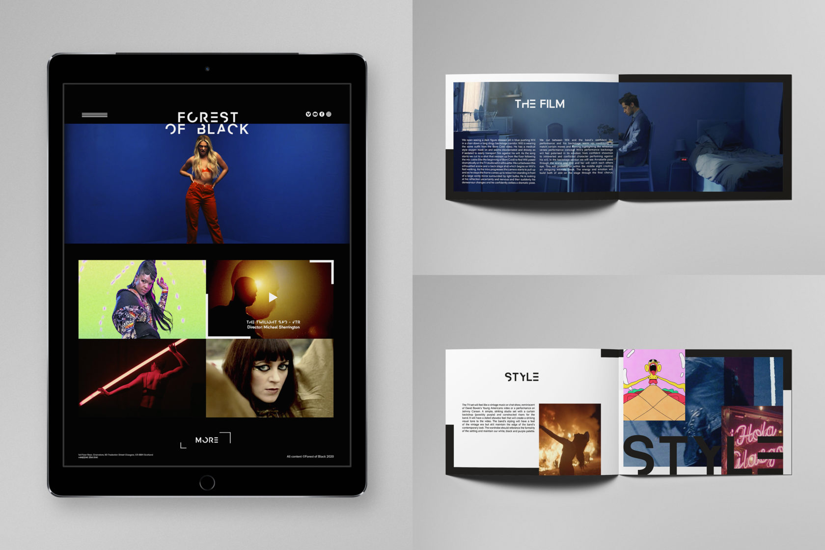
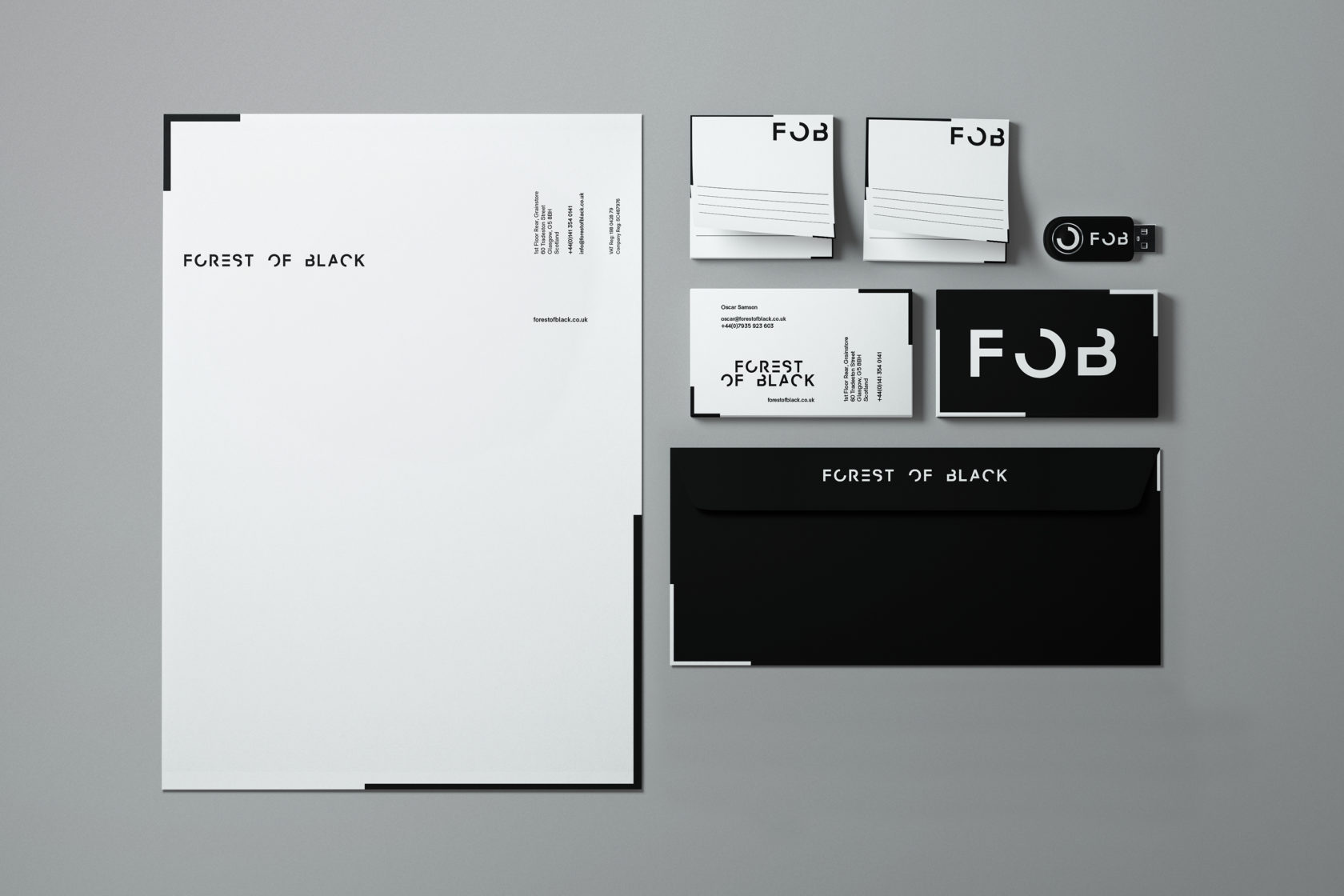
An adaptable type based identity was created that can be used in three different ways, a long version (suitable for widescreen productions), condensed (more suitable for mobile or print applications) and one as a device. Coupled with the identity is a variable framing device that hangs on the same principles but is used to draw the viewers eye in and ensure the visual content is the central focus for all communications.
During the creative process we felt it was important to create a living visual identity, something with more fluidity than a resolved static entity. It was also important to give a sense of making and creativity through the identity. The whole creative treatment is underpinned by a black and white palette, to reflect the name but also to allow for the creative visuals of the films to take pride of place and not be overpowered by the identity.
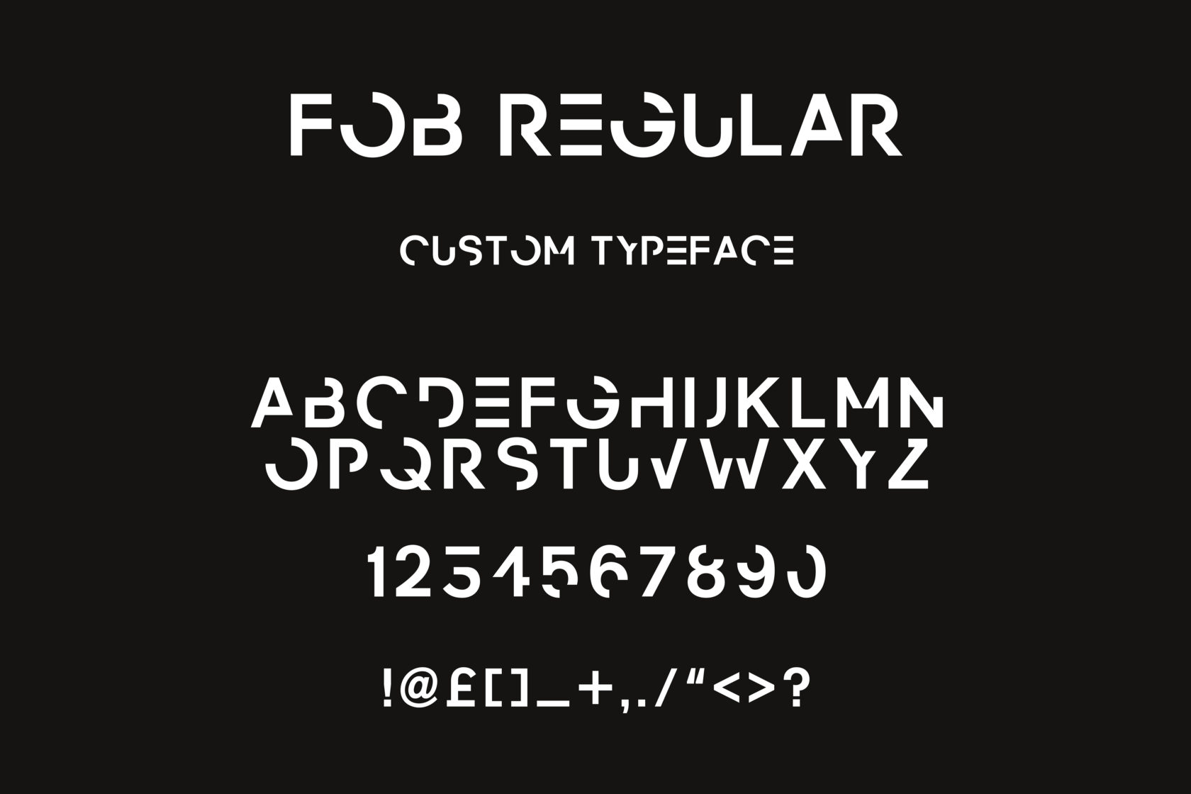
To complete he visual language we also created a bespoke typeface to accompany the brand. The face is based upon the type treatment of the identity and developed out across the full set of characters. The typeface allows the client to have a completely unique element to the collateral that they produce.